
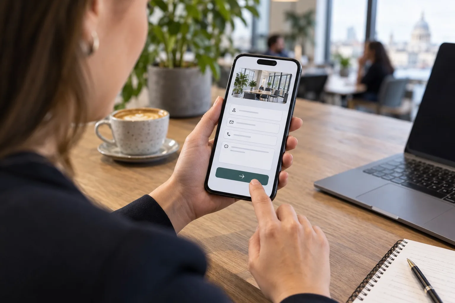
Many website enquiries begin on a mobile screen, even when the final decision is made later on a desktop, over the phone or in person. For UK business owners, that means mobile website design is no longer just about making a site fit a smaller device. It is about removing every delay, doubt and awkward interaction that stops a visitor from contacting you. In 2026, the businesses winning more mobile enquiries are usually not those with the most complicated websites. They are the ones that make the next step obvious, quick and reassuring.
Whether you run a trade business, professional services firm, clinic, e-commerce brand, venue or local organisation, the same principle applies: a mobile visitor should be able to understand what you offer, trust that you are credible and send an enquiry without having to pinch, zoom, hunt or wait. The following guidance focuses on the areas that make the biggest difference: speed, tap-friendly layouts, simplified forms, readable content, clear navigation and better tracking.
Why mobile enquiries fail before the form is submitted
A visitor rarely abandons a mobile enquiry for one single reason. It is usually a build-up of small frustrations. A page takes too long to load. A button is slightly too close to another link. The form asks for information that feels unnecessary. The content is visually cramped. The menu hides important pages. The phone number is not tappable. By the time the visitor reaches the enquiry form, they have already lost confidence.
Good mobile website design reduces that friction at every stage. It recognises that mobile users are often multitasking, comparing several options and using variable network connections. They may be on a train, between meetings, on a building site, at home in the evening or walking through a town centre. They need clarity quickly.
For many UK businesses, the opportunity is significant because the competition is still inconsistent. Plenty of websites are technically responsive but not genuinely mobile-friendly. They resize for smaller screens, yet still expect users to read dense copy, complete long forms and navigate desktop-style structures. In 2026, a responsive layout is the starting point, not the finish line.
Start with speed: faster pages create more confident enquiries
Mobile visitors are less forgiving of slow websites because the delay feels personal. They tapped with intent and expect the page to respond. If a service page, product page or contact page hesitates for too long, the visitor may assume the business is outdated, overloaded or simply not worth the effort.
Speed improvements should focus on what visitors experience first. The top of the page should load quickly, show meaningful content and make the main action visible without unnecessary movement. Large image files, bloated scripts, excessive tracking tags, unused plugins and heavy animations can all make a mobile site feel sluggish. The aim is not to strip away personality, but to prioritise useful content and remove anything that slows down the enquiry journey.
Practical speed checks for 2026
- Compress and correctly size images: Uploading oversized imagery is still one of the most common causes of slow mobile pages. Use efficient formats and ensure images are only as large as they need to be.
- Reduce third-party scripts: Chat widgets, booking tools, review embeds, analytics tags and advertising scripts can be useful, but each one should justify its impact on performance.
- Prioritise visible content: The first screen should not be blocked by unnecessary sliders, large video backgrounds or complex effects.
- Review hosting and caching: A well-built website can still feel slow if server response times are poor or caching is misconfigured.
- Test on real mobile conditions: Do not rely only on fast office broadband. Check how the site feels on common mobile networks and mid-range devices.
Search visibility, conversion rate and brand perception are all affected by speed. If your enquiry pages are slow, any investment in SEO, paid search or social media will work harder than it should.
Make calls to action obvious and tap-friendly
On a desktop website, a visitor may browse several tabs, compare services and hover over menus. On mobile, the decision path is more condensed. Calls to action need to be easy to see, easy to understand and easy to tap with a thumb.
A strong mobile call to action uses clear language. Phrases such as Request a quote, Book a consultation, Call the team, Send an enquiry or Check availability usually work better than vague wording such as Submit or Find out more. The action should tell the visitor what will happen next.
Button placement matters as much as wording. A mobile page should usually include a clear primary action near the top, repeated after key sections and available again near the end. For longer pages, a sticky enquiry or call button can work well if it does not cover content, interfere with cookie controls or feel intrusive.
Tap-friendly design principles
- Use generous button sizes: Buttons should be large enough to tap comfortably without precision.
- Leave space around interactive elements: Avoid placing phone numbers, menu links, form fields and buttons too close together.
- Use strong contrast: A button should stand out from the surrounding content while still fitting the brand.
- Keep one main action per section: Too many competing buttons can make the visitor pause instead of enquire.
- Make phone numbers tappable: If phone calls are important to your business, the mobile experience should support that immediately.
Tap-friendly design is not just a usability detail. It is a conversion issue. If a visitor has to correct mis-taps, zoom in or scroll back and forth to find the right action, the enquiry becomes less likely.
Simplify enquiry forms without reducing lead quality
Forms are often the biggest barrier between mobile interest and a real enquiry. Businesses naturally want useful information, but every extra field adds effort. A form that feels reasonable on a desktop may feel demanding on a mobile screen.
The best mobile enquiry forms ask for the information needed to start a helpful conversation, not everything the business might eventually want to know. For many service-led businesses, that means name, contact details, a brief message and perhaps one qualifying field, such as service required, preferred location or project timeframe.
What to remove from mobile forms
- Unnecessary mandatory fields: If a field is not essential for the first response, consider making it optional or removing it.
- Repeated information: Do not ask for details that can be captured through one clear message field.
- Long dropdown lists: These can be awkward on mobile and may hide the right choice. Use simpler options where possible.
- Unclear error messages: If something goes wrong, explain exactly what needs fixing beside the relevant field.
- CAPTCHA barriers that frustrate users: Anti-spam protection is important, but it should not make genuine visitors work harder than necessary.
It is also worth considering alternative enquiry routes. Some visitors prefer a short form, while others prefer a phone call, email link, booking calendar or messaging option. The right mix depends on your business model, but the mobile page should make the available options clear rather than forcing everyone down one route.
Confirmation messages are another overlooked detail. After a visitor submits a form, tell them what happens next. For example, confirm that the enquiry has been received and explain when they can expect a reply. This builds trust and reduces duplicate submissions.
Write readable mobile content that supports decisions
Mobile content should not be thinner by default, but it does need to be easier to scan. Visitors still need reassurance, proof and detail, especially for higher-value services. The difference is that information must be structured in a way that works on a narrow screen.
Use short paragraphs, descriptive headings and clear sequencing. The first section should quickly explain who the service is for, what problem it solves and why the visitor should continue. Avoid opening pages with vague brand statements that do not help the user make a decision.
Content that helps mobile visitors enquire
- Plain-language service explanations: Say what you do before adding nuance or technical detail.
- Location and service area clarity: Local visitors need to know whether you cover their area.
- Trust signals: Include relevant accreditations, reviews, case study summaries, guarantees or years of experience where genuine and appropriate.
- Process summaries: A simple three or four-step explanation can reduce uncertainty and make an enquiry feel easier.
- Helpful FAQs: Answer common objections before the visitor reaches the form.
Readability also depends on visual presentation. Text should be large enough to read comfortably, line spacing should feel open and contrast should meet accessibility expectations. Avoid placing important wording over busy images. If the design looks stylish but the message is hard to read, it is not doing its job.
Keep mobile navigation simple and purposeful
Mobile navigation should help visitors reach the pages that influence enquiries. Too many menu items can turn a simple journey into a search task. Too few can hide important information. The right balance depends on your site structure, but the navigation should be organised around user intent rather than internal departments.
For a typical UK business website, the mobile menu might prioritise services, sectors, case studies, about, FAQs and contact. E-commerce sites will need product categories, search and account or basket access. Appointment-led businesses may need booking, locations and opening hours in prominent positions.
Mobile navigation improvements to consider
- Use clear labels: Avoid clever menu wording if it makes the destination less obvious.
- Limit deep nesting: Multi-level menus can become awkward on a small screen.
- Add a visible contact route: Do not bury the contact page at the bottom of a long menu.
- Include site search where useful: Larger websites benefit from search, especially when visitors know what they need.
- Check the footer experience: Mobile visitors often scroll to the bottom for contact details, links and reassurance.
Navigation should also reflect the real enquiry journey. If most visitors enquire after reading a service page and checking reviews, make those routes easy to move between. If visitors need to compare options, provide clear internal links rather than leaving them to rely on the menu alone.
Build trust into the mobile journey
Trust is a major part of mobile conversion. Visitors may be making quick comparisons and looking for signals that your business is credible, active and suitable. A polished design helps, but trust also comes from specific, verifiable information.
Include accurate contact details, opening hours where relevant, company information, service coverage, review snippets, recognised memberships and clear privacy wording near forms. If your business relies on expertise, show who is behind the service. If your work is visual, use well-optimised examples. If visitors are likely to worry about response times, explain what happens after they enquire.
Trust can be weakened by small inconsistencies. Outdated copyright years, broken links, old blog posts presented as current, missing contact details and vague claims all create doubt. In mobile website design, credibility must appear quickly because the visitor has less screen space and less patience.
Measure the actions that lead to enquiries
You cannot improve mobile enquiries properly if you only count final form submissions. A useful measurement setup should track the actions that show intent across the mobile journey. These may include phone taps, email taps, form starts, form completions, booking button clicks, quote requests, location clicks and key page engagement.
Analytics should be reviewed by device type, traffic source and landing page. A page that performs well on desktop may underperform badly on mobile. Likewise, paid traffic may behave differently from organic search visitors or returning customers. Segmenting the data helps you find the real problem rather than guessing.
Questions your data should answer
- Which mobile pages generate the most enquiries?
- Where do visitors drop out before contacting you?
- Are form errors causing abandonment?
- Do mobile visitors prefer calling or submitting a form?
- Which traffic sources bring enquiries rather than just visits?
- Are important buttons being tapped, ignored or missed?
Qualitative feedback is useful too. Watching anonymised session recordings, reviewing heatmaps and asking new customers how they found the enquiry process can reveal issues that numbers alone do not explain. The aim is to identify friction, test improvements and keep refining the experience.
Examples of mobile enquiry improvements by business type
Professional services
A solicitor, accountant, consultant or financial services provider should make expertise and reassurance visible early. Mobile service pages can include a concise summary, sector-specific proof points, a clear consultation call to action and a short form asking for the type of support required. Avoid making visitors read long biographies before they understand how to enquire.
Trades and home services
For plumbers, electricians, builders, landscapers and similar businesses, speed and immediacy matter. Prominent tap-to-call buttons, service area information, emergency availability where relevant and photo examples of completed work can all support mobile enquiries. Forms should be quick and should allow visitors to describe the job in their own words.
Clinics, salons and appointment-led businesses
Visitors often want to know availability, location, treatment details and how to book. Mobile pages should make booking routes obvious, show opening times, include accessible directions and explain what to expect. If a consultation is required before booking, make that process clear.
B2B and specialist services
B2B mobile visitors may not convert instantly, but the mobile experience still shapes the shortlist. Case study summaries, sector pages, downloadable resources, clear credentials and low-friction enquiry forms can help turn research into a conversation. Avoid hiding all useful information behind gated forms, especially on mobile.
A mobile enquiry checklist for 2026
Use this checklist to review your website from a visitor’s point of view. Ideally, test it on more than one device and ask someone outside your business to complete the same exercise.
- Load your key service or landing page on mobile data, not just Wi-Fi.
- Check whether the main offer is clear within the first few seconds.
- Confirm that the primary call to action is visible and easy to tap.
- Tap the phone number, email address and enquiry button to ensure they work correctly.
- Complete the form yourself and note any fields that feel unnecessary.
- Read the page aloud to identify vague wording or overly long sentences.
- Open the mobile menu and check whether important pages are easy to find.
- Look for trust signals before the form, not only at the bottom of the page.
- Review the thank-you message or confirmation page after submission.
- Check analytics to see whether mobile users behave differently from desktop users.
If several points feel weak, it may be time to review the mobile journey rather than make isolated cosmetic changes. Improving enquiries is usually about the whole path from search result to submission.
FAQs about improving mobile website enquiries
What is the most important part of mobile website design for enquiries?
The most important part is reducing friction. Fast loading, clear content, tap-friendly calls to action and simple forms all work together. If one part fails, the whole enquiry journey can suffer.
Should mobile pages have less content than desktop pages?
Not necessarily. Mobile visitors still need useful information, especially when choosing a service provider. The content should be better structured, easier to scan and supported by clear headings, shorter paragraphs and well-placed calls to action.
How many fields should a mobile enquiry form have?
There is no fixed number, but fewer fields usually perform better. Ask only for what you need to respond helpfully. For many businesses, name, contact details, a short message and one relevant qualifying question are enough to start.
Are sticky buttons a good idea on mobile websites?
They can be effective when used carefully. A sticky call, enquiry or booking button can keep the next step visible, but it should not cover content, clash with accessibility features or make the page feel aggressive.
How does mobile speed affect SEO and enquiries?
Speed affects both user experience and search performance. A faster mobile site can reduce abandonment, support stronger engagement and help visitors reach enquiry pages with more confidence.
Can Giraffe Digital help improve an existing mobile website?
Yes. Giraffe Digital can review your current mobile experience, identify barriers to enquiry and recommend improvements across design, content, SEO, performance and conversion strategy.
Clear next steps for UK business owners
If your website receives mobile traffic but not enough enquiries, start by reviewing the journey rather than blaming the traffic source. Look at the pages visitors land on, how quickly they load, what they see first, how the calls to action behave and how much effort the enquiry form demands.
The most effective improvements are often straightforward: compressing images, rewriting the first section of a service page, simplifying a form, improving button placement, clarifying the menu or adding stronger trust signals. Small changes can have a significant impact when they remove real barriers.
For a more strategic approach, Giraffe Digital can help assess your mobile website design and create a plan that connects user experience, search visibility and enquiry generation. The goal is not just a better-looking mobile site, but a website that helps the right visitors take the next step with confidence.