
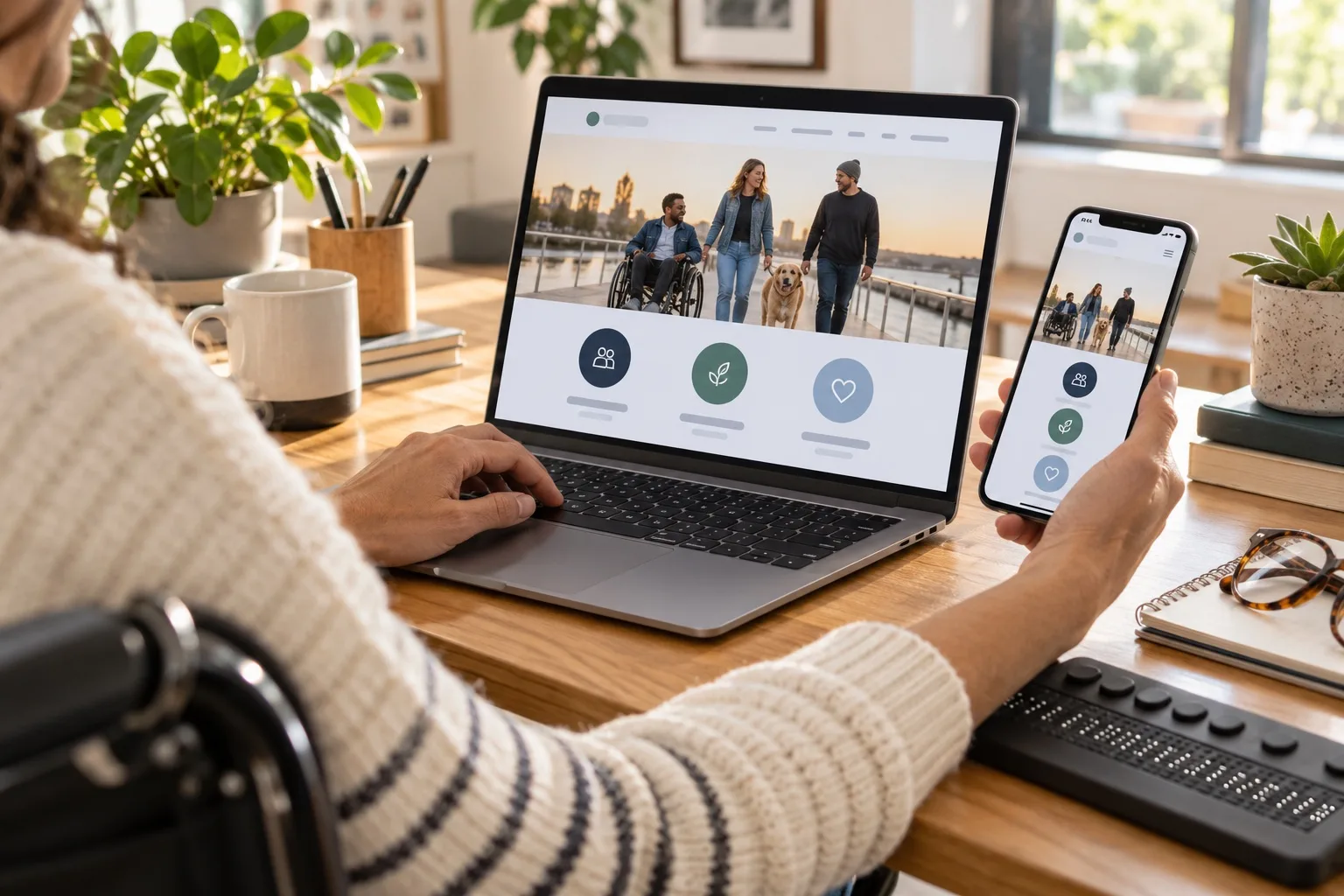
Accessible website design is not a finishing touch or a compliance exercise to leave until launch week. For UK businesses in 2026, it sits at the centre of effective website design because it affects how quickly people can use your site, how much they trust your brand and whether they can complete the actions that matter to your organisation. A fast website that is confusing, hard to read or impossible to navigate by keyboard will still lose enquiries. A beautiful website that excludes users with visual, motor, cognitive or hearing needs is leaving value on the table.
The strongest websites balance performance, clarity and inclusion from the start. That means designing pages that load quickly on mobile connections, explain your offer without unnecessary friction, support search visibility, reflect your brand consistently and work for people using a wide range of devices and assistive technologies. For business owners, this is not just a technical concern. It is a practical route to better enquiries, stronger credibility and more resilient digital marketing.
Why accessibility now belongs in every serious website brief
Many businesses still think of accessibility as something relevant only to large organisations or public sector websites. In practice, accessible website design benefits almost every visitor. Clear headings help busy decision-makers scan a service page. Strong colour contrast helps people reading outdoors on a phone. Captions support viewers who cannot play sound. Descriptive button text makes conversion journeys easier for everyone. Keyboard-friendly navigation helps users with mobility needs, while also improving the underlying structure of the site.
In the UK, businesses already need to consider their responsibilities under equality law, and expectations around digital access continue to rise. For organisations selling products or services online, accessibility also supports commercial performance. If a user cannot read your form labels, understand an error message or operate a menu without a mouse, they are less likely to enquire, book, buy or return.
Accessibility is also closely linked with brand trust. A website that feels considered, readable and dependable sends a message about how the business treats its customers. This matters particularly for professional services, health and wellbeing brands, property firms, education providers, e-commerce businesses and any organisation where reassurance is part of the buying decision.
Speed, trust and accessibility work together
Website design decisions are often discussed in separate categories: performance, branding, search engine optimisation, conversion rate optimisation and accessibility. In reality, these areas overlap. A leaner page structure helps speed and accessibility. Better copy helps SEO and customer confidence. Consistent navigation improves usability and reduces frustration. The design challenge is to make the website feel polished without making it heavy, cluttered or difficult to use.
Speed affects whether people stay
Visitors rarely wait patiently for slow pages. Mobile users in particular expect a site to respond quickly, even on less reliable connections. In 2026, Core Web Vitals remain an important part of how businesses assess user experience, with metrics such as Largest Contentful Paint, Cumulative Layout Shift and Interaction to Next Paint helping teams understand loading speed, visual stability and responsiveness.
Good performance starts with restrained design choices. Oversized hero images, excessive animation, bloated scripts and unnecessary third-party embeds can make a website feel sluggish. This is especially common when a site tries to impress visually without considering the real browsing conditions of its audience. A faster site is usually a simpler, better-planned site: images are properly sized, fonts are used carefully, code is clean and key content appears quickly.
Trust depends on clarity and consistency
Trust is built through dozens of small signals. Clear service descriptions, visible contact routes, consistent branding, accurate opening information, genuine photography where appropriate, transparent policies and easy-to-find supporting content all play a role. Users also notice when a website feels neglected. Broken links, outdated copyright dates, unclear domain names and confusing page layouts can all weaken confidence before a conversation has even started.
Accessible design strengthens trust because it removes avoidable uncertainty. A clear form label is more reassuring than a vague placeholder. A visible keyboard focus state shows that the site has been built with care. A well-structured page with meaningful headings feels easier to navigate and understand. These details tell visitors that the business has thought about their experience.
Accessibility improves more than compliance
The Web Content Accessibility Guidelines, including WCAG 2.2, provide a useful framework for digital teams. They cover areas such as perceivability, operability, understandability and robustness. For business owners, the important point is that these principles translate into better real-world experiences. People should be able to perceive the content, operate the interface, understand what to do next and rely on the website across different technologies.
Accessible website design also supports long-term maintainability. When components are designed properly, they can be reused across the site without introducing new barriers each time a page is added. This matters for growing businesses that publish articles, case studies, landing pages, recruitment content or seasonal campaigns.
Practical accessibility improvements that make a commercial difference
Accessibility can sound technical, but many improvements are practical and visible. They should be considered during planning, design, copywriting, development and content management, not simply tested at the end.
- Use clear heading structures: Pages should have a logical order so users and assistive technologies can understand the content hierarchy. This also helps search engines interpret the page.
- Write meaningful link and button text: Phrases such as read our accessibility services or book a consultation are more useful than vague text such as click here.
- Check colour contrast: Text, buttons and form fields need enough contrast to remain readable on different screens and in different lighting conditions.
- Design visible focus states: Keyboard users should always be able to see where they are on the page.
- Label forms properly: Every field should have a clear label, helpful instructions and error messages that explain how to fix a problem.
- Provide alternatives for media: Captions, transcripts and descriptive alt text help users access information in the format that works for them.
- Avoid relying on colour alone: Important states such as errors, availability or selected options should use text, icons or patterns as well as colour.
- Keep navigation predictable: Menus, search, footer links and calls to action should behave consistently across the website.
These improvements are not only useful for disabled users. They reduce friction for customers who are tired, distracted, using a small screen, browsing in a hurry or comparing several suppliers at once. That is why accessibility should be viewed as a quality standard rather than a niche requirement.
Designing for mobile users without weakening the desktop experience
Most businesses now receive a significant share of visits from mobile devices, but many high-value enquiries still involve multiple sessions across mobile and desktop. A user may first discover a business through social media on a phone, revisit the website on a work computer, then submit an enquiry from a tablet at home. The design needs to support that journey without forcing the visitor to relearn the interface each time.
Responsive design is more than making columns stack on smaller screens. Touch targets need enough space. Mobile menus should be easy to open and close. Key information such as services, locations, proof points and contact options should not be buried. Forms should be short enough to complete comfortably on a phone, with appropriate input types for details such as email addresses and telephone numbers.
Desktop pages still matter. They often carry more detailed research behaviour, especially for business-to-business services. On larger screens, accessible design means maintaining readable line lengths, avoiding distracting motion, using white space intelligently and ensuring that interactive components still work without a mouse. The best designs feel coherent across devices rather than treating mobile and desktop as separate projects.
How accessible design supports SEO and digital marketing
Accessible website design and search marketing share many fundamentals. Search engines need to crawl, understand and evaluate pages. Users need to find, read and trust them. When a website has clear structure, descriptive headings, useful internal links and fast-loading pages, it is usually better for both people and search visibility.
Business owners should avoid treating SEO as a layer added after the site is built. The website architecture should reflect how customers search, compare and decide. Service pages need enough detail to answer common questions. Location pages should be genuinely useful, not thin duplicates. Blog content should help users understand problems, options and next steps. Metadata should be written for search intent, but it must still match the page content honestly.
Accessibility also affects content quality. Plain, specific language is easier for users to understand and easier for search engines to interpret. Alt text can support image understanding when it describes the image accurately rather than being stuffed with keywords. Video transcripts can make useful spoken content indexable and accessible. A well-built FAQ section can help users make decisions, provided it is based on genuine questions rather than filler.
Social media marketing also benefits from accessible thinking. Captions on videos, readable text in graphics, careful colour contrast and descriptive post copy make campaigns easier to engage with. If a campaign sends users to a landing page, that page must continue the same level of clarity. There is little value in an accessible social post that leads to a slow, confusing or inaccessible form.
Domain registration, brand confidence and technical foundations
A website’s domain name is one of its first trust signals. For UK businesses, a clear, memorable domain that matches the trading name or service area can support brand recognition across search, email, social media and offline marketing. The right choice depends on the organisation, but consistency is important. If customers hear your name in conversation, see it on a vehicle, find it on social media and type it into a browser, the domain should feel natural and credible.
When registering a domain, avoid unnecessary complexity. Hyphens, unusual spellings and long strings of words can make the address harder to remember and easier to mistype. Consider whether a UK-focused extension or a broader extension best reflects the business and its audience. If the organisation may grow into new regions or services, think about future flexibility before committing to a very narrow name.
Domain management should also be treated seriously. Keep registration details up to date, use a secure account, enable renewal reminders and maintain control of related email records. A domain is not just a web address; it underpins email deliverability, brand continuity and customer confidence. If a domain expires unexpectedly or DNS records are mismanaged, marketing campaigns, enquiries and reputation can all be affected.
Security matters too. A valid SSL certificate, secure hosting, regular updates, sensible user permissions and robust backups are part of a trustworthy website. Visitors may not know every technical detail, but they do notice browser warnings, broken forms and suspicious behaviour. Search engines and social platforms also have little patience for unsafe or unreliable destinations.
Content and brand design should make decisions easier
Good design is not only visual. It is the way information is prioritised, written and arranged. A business website should quickly answer three questions: what do you offer, who is it for and why should the visitor trust you? Accessible website design makes those answers easier to find.
For a service business, this may mean a homepage that introduces the core offer, a clear services section, useful proof points, team or process information, and obvious enquiry options. For an e-commerce business, it may mean clear product information, accessible filters, readable delivery details and checkout steps that do not surprise the user. For a local organisation, it may mean prominent location information, opening times, directions and contact methods.
Brand personality should support clarity rather than compete with it. Distinctive colours, typography, photography and illustration can make a website memorable, but they need to be used with discipline. Very light text, decorative fonts, constant animation or overcomplicated layouts may look striking in a mock-up while making the live site harder to use. A polished brand experience is one where visual choices guide the visitor, not distract them.
Testing with real journeys, not just checklists
Automated accessibility tools are useful, but they cannot judge everything. They may identify missing alt attributes, contrast issues or form problems, yet they cannot fully assess whether a page makes sense, whether instructions are clear or whether the content supports a customer’s decision. Manual testing remains essential.
Useful checks include navigating the site with a keyboard, zooming the browser, testing on mobile devices, reviewing pages with screen reader considerations in mind and completing important journeys such as submitting an enquiry, booking an appointment or making a purchase. It is also worth asking people outside the project team to use the site. Fresh users often reveal assumptions that designers, developers and business owners miss.
Testing should continue after launch. New pages, plugins, forms, tracking scripts and campaign landing pages can introduce problems over time. A quarterly review of performance, accessibility, analytics and conversion journeys helps keep the website aligned with business goals. This is especially important when the website supports paid advertising, email marketing or regular social campaigns, where even small barriers can reduce return on effort.
What UK business owners should ask before commissioning a new website
If you are planning a new website or redesign, accessibility should be part of the first conversation. It affects the brief, sitemap, content plan, design system, development approach and testing process. Waiting until the end usually makes improvements harder and less effective.
- Who are the priority users? Consider customers, prospects, employees, partners and anyone who may need to access important information.
- What actions must the website support? Enquiries, bookings, purchases, downloads, calls and newsletter sign-ups should all be designed and tested carefully.
- How will performance be protected? Ask how images, code, fonts, hosting and third-party tools will be managed.
- How will accessibility be tested? Look for a combination of standards-based checks, manual review and real user journey testing.
- How will content be maintained? Editors need guidance so new pages, images and posts remain accessible after launch.
- How will the website support marketing? SEO, social media, analytics, email campaigns and landing pages should be considered as part of the wider digital strategy.
These questions help move the conversation beyond surface-level design. A website should not simply look modern on launch day. It should provide a dependable platform for sales, service, recruitment, reputation and long-term digital marketing.
A better website is easier to use, easier to trust and easier to grow
Accessible website design brings together the qualities that UK businesses need from their digital presence in 2026: speed, trust, usability, search visibility and flexibility. It helps more people understand your offer, reduces friction in important journeys and supports marketing activity across search, social media and email.
The best results come when accessibility is treated as a core design principle rather than a late-stage fix. Plan the structure carefully, write clearly, design with contrast and focus states in mind, build for performance, choose a sensible domain, protect the technical foundations and test the journeys that matter. A website that works well for more people is not only fairer and more inclusive. It is usually better business.