
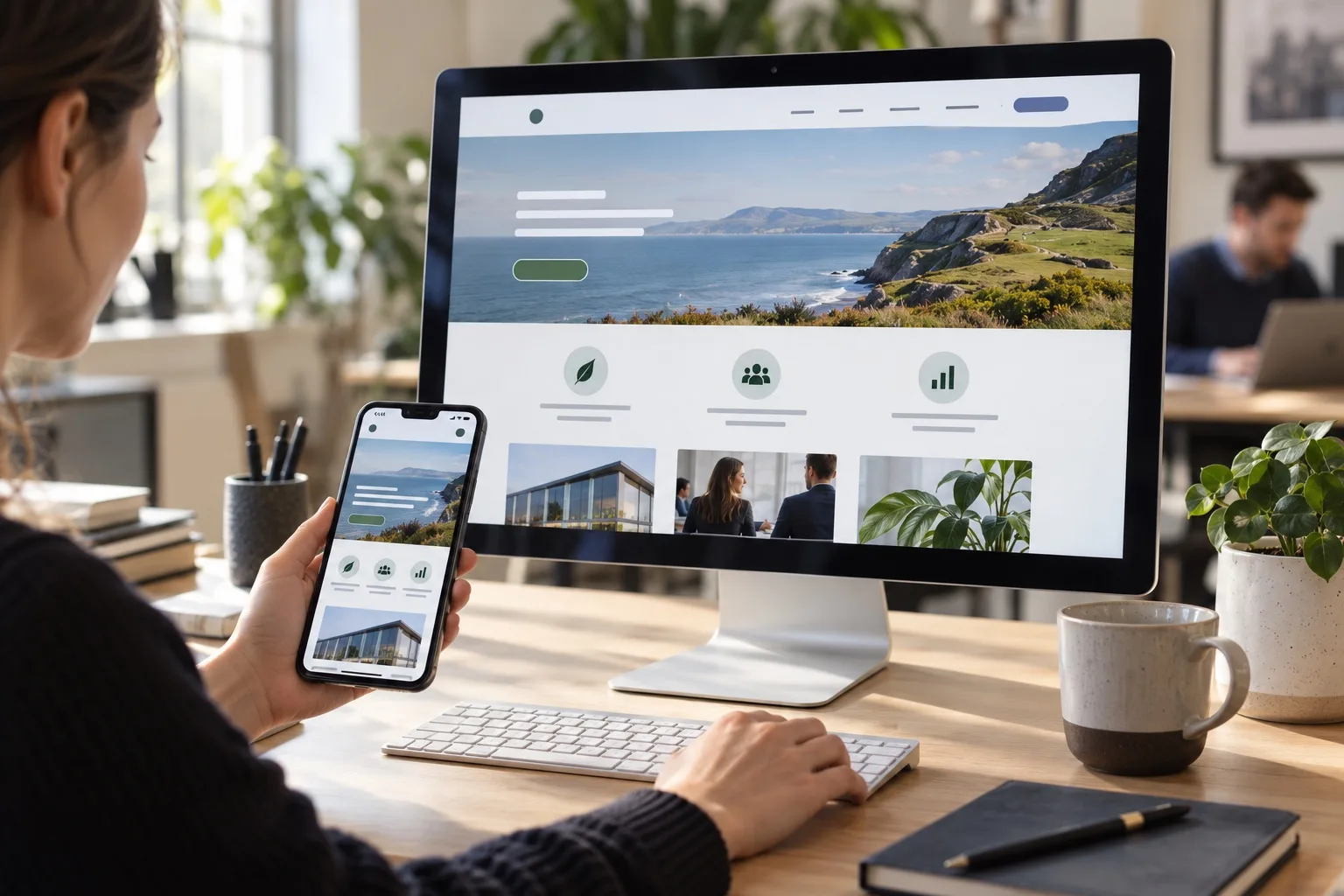
Your homepage has a hard job. It has to explain who you are, why you are relevant, what you offer and what someone should do next, often within a few seconds. For UK business owners planning a new website or reviewing an existing one, homepage design in 2026 is less about adding more sections and more about making sharper decisions. The strongest homepages are clear, fast, accessible, credible and focused on the visitor’s next step.
A good homepage is not simply a digital brochure or a visual showcase. It is the central routing point for your website, your brand positioning and your commercial goals. It should help the right people understand whether they are in the right place, guide them towards the most useful service or product page, build confidence through relevant proof and make it easy to enquire, book, buy or continue exploring.
Start with clear positioning
The first test of any homepage is whether a new visitor can understand your business quickly. If your opening message could apply to almost any company in your sector, it is not doing enough work. Strong positioning tells people who you help, what problem you solve and why your approach is worth considering.
Your hero section should avoid vague phrases such as innovative solutions for ambitious businesses unless they are backed by immediate specifics. A clearer alternative might explain the audience, service and outcome in one concise statement. For example, a specialist accountancy firm, a regional construction supplier and a professional services consultancy will all need different homepage messaging because their buyers have different concerns.
Good homepage copy should answer three questions early: what do you do, who is it for and why should someone trust you? This does not mean writing long paragraphs above the fold. It means using a focused headline, a useful supporting sentence and a direct call to action. If visitors have to scroll, guess or decode your offer, many will leave before they reach your service pages.
Make service links obvious and useful
A homepage should not try to contain every detail about every service. Instead, it should act as a confident signpost. For many UK businesses, service links are among the most important parts of the page because they connect broad homepage traffic with specific search intent. Someone landing on your homepage may be looking for web design, SEO, branding, e-commerce, maintenance, consultancy or a related service. If those pathways are hidden, your website creates unnecessary friction.
Clear service links help both people and search engines understand your website structure. Use descriptive labels rather than clever internal terminology. A link labelled Search engine optimisation is more useful than one labelled Growth Engine if the visitor is deciding where to click. You can still express your brand personality in the surrounding copy, but navigation and service cards should be unmistakable.
Where appropriate, include a short explanation under each service link. This helps visitors choose the right route and adds semantic relevance for search. For example, a homepage section might include separate links for website design, local SEO, content strategy, paid search and digital strategy, each with a short line explaining who the service is for. The aim is not to overload the page, but to guide visitors towards deeper pages where more detailed information can live.
Use proof that feels specific and credible
Trust is central to homepage design. Visitors are asking themselves whether your business looks credible, whether you understand their needs and whether contacting you is worth their time. Proof helps answer those questions, but only when it feels relevant.
Strong proof can include testimonials, accreditations, sector experience, project examples, review snippets, process explanations, awards, partner credentials or evidence of long-term client relationships. The best choice depends on your business. A trades business may benefit from local reviews and before-and-after project imagery. A consultancy may need sector expertise and senior team credibility. A digital agency should show the quality of its thinking, process and outcomes without relying on vague claims.
Avoid filling the homepage with generic statements such as trusted by hundreds of clients unless they are supported by genuine context. Proof should reduce risk in the mind of the buyer. If your audience worries about reliability, show evidence of process and communication. If they worry about expertise, show relevant work and specialist knowledge. If they worry about making the wrong investment, explain how you diagnose needs before recommending a solution.
A good homepage does not ask visitors to take your word for it. It gives them enough evidence to feel that the next step is safe, sensible and worthwhile.
Design for speed from the beginning
Website speed is still one of the clearest signs of a well-planned website. A slow homepage can weaken conversion, frustrate mobile users and make every marketing channel less efficient. In 2026, visitors expect pages to load quickly and respond smoothly, particularly when browsing on mobile networks during a commute, between meetings or while comparing suppliers.
Speed is not only a development issue. It is a design and content issue too. Oversized video backgrounds, heavy animation, uncompressed imagery, excessive scripts and unnecessary third-party tools can all make a homepage feel sluggish. Every feature should earn its place. If an animation does not improve understanding, confidence or action, it may be costing more than it contributes.
Practical speed improvements include using well-compressed images, choosing modern image formats where appropriate, limiting autoplay media, reducing unused code, keeping fonts under control and testing the page on real mobile connections. A fast homepage feels professional before a visitor has read a word. It also supports SEO, paid advertising performance and user satisfaction.
Build accessibility into the experience
Accessibility should not be treated as a final checklist item. It belongs at the centre of good homepage design because it improves usability for everyone. Clear contrast, readable typography, meaningful headings, descriptive links and keyboard-friendly navigation all make a homepage easier to use.
For UK businesses, accessibility is also a matter of professionalism and inclusion. Your visitors may use screen readers, keyboard navigation, browser zoom, voice control or other assistive technologies. Others may simply be reading on a small screen in bright sunlight, scanning quickly between tasks or dealing with slow connectivity. Accessible design supports all of these situations.
Good accessibility practice includes writing descriptive button text, avoiding important text embedded inside images, using headings in a logical order and ensuring forms are labelled clearly. Colour should not be the only way to communicate meaning. If your homepage has interactive elements, they should be usable without a mouse and should not create confusing movement or focus behaviour.
Accessibility also strengthens content quality. Plain English, clear hierarchy and predictable layouts help visitors find what they need. That is good for conversion, brand perception and search performance.
Create strong calls to action
A homepage without clear calls to action is like a shop with no till, no counter and no visible staff. Calls to action should tell visitors what they can do next and why it is useful. The right call to action depends on the buying journey. Some visitors are ready to enquire. Others need to compare services, view work, read guidance or understand your process first.
Most business homepages benefit from one primary call to action and a small number of secondary options. A primary call to action might be Book a consultation, Request a proposal, Speak to our team or Start your project enquiry. Secondary calls to action might send visitors to service pages, case studies, resources or an about page.
Calls to action should be repeated naturally throughout the homepage, especially after sections that build understanding or trust. Do not make visitors scroll back to the top once they have made a decision. At the same time, avoid making every section feel pushy. The best CTAs feel timely, helpful and aligned with the visitor’s intent.
Balance brand personality with clarity
Your homepage should look and sound like your business, but brand expression should not get in the way of comprehension. Distinctive design, photography, illustration, tone of voice and motion can all help your homepage stand out. However, if visitors cannot understand the offer, find the services or read the content comfortably, the design is working against the business.
For many UK SMEs, the best approach is to combine a strong visual identity with a simple content structure. Use brand elements to create recognition and confidence, not confusion. Keep navigation familiar, make key messages easy to scan and ensure important pages are no more than a click away from the homepage. Good branding should make the visitor feel they have found the right organisation, not force them to solve a puzzle.
Think about search intent and page structure
Homepage SEO has changed from keyword stuffing to clarity, relevance and authority. Homepage design is a good example: a page can be optimised around core themes without repeating the same phrase unnaturally. Search engines are better at understanding related concepts such as website design, user experience, conversion rate optimisation, information architecture, mobile performance, internal linking and brand positioning.
A well-structured homepage uses headings to organise information, links to important internal pages and copy that reflects how customers describe their needs. If you serve specific locations or sectors, include that context naturally where it is useful. A local service business might need to mention the areas it covers. A B2B supplier might need to name the industries it supports. Relevance should always be helpful rather than forced.
Internal linking is especially important. Your homepage will often be one of the strongest pages on your site, so use it to pass visitors and authority towards priority service pages. Make sure those pages are substantial, useful and aligned with the promises made on the homepage.
What to include on a strong homepage in 2026
There is no single homepage layout that works for every business, but most effective homepages include a similar set of building blocks. The order may vary depending on your audience, sales process and services, but each element should have a clear purpose.
- A focused hero section: explain your offer, audience and value quickly.
- Primary and secondary calls to action: guide both ready-to-act visitors and those who need more information.
- Service or product pathways: link clearly to the main areas of the site.
- Trust signals: use testimonials, credentials, reviews, project examples or sector experience.
- A concise explanation of your process: show what happens after someone gets in touch.
- Relevant brand story: explain what makes your business different without drifting into generic claims.
- Accessible content and design: make the page readable, navigable and inclusive.
- Fast-loading media: use imagery and motion carefully so the page remains smooth.
- Clear internal links: help visitors move towards services, case studies, insights and contact options.
Common homepage mistakes to avoid
Many underperforming homepages fail for predictable reasons. The page may look attractive but say very little. It may have too many competing messages. It may rely on a large image carousel that few people interact with. It may hide the most important services behind vague menu labels. Or it may focus heavily on the business itself before explaining how it helps the customer.
Another common mistake is treating the homepage as a one-off design task. Your homepage should evolve as your services, audience, search behaviour and evidence base change. Review it regularly using analytics, enquiry quality, user feedback and search performance. If visitors are not clicking through to key services, if enquiries are poorly matched or if users drop off quickly on mobile, the homepage may need adjustment.
FAQs about homepage design in 2026
How long should a homepage be?
A homepage should be long enough to explain the business, guide visitors and build confidence, but not so long that it becomes unfocused. For many service-based businesses, a moderate-length homepage with clear sections works well. The key is relevance. Every section should help the visitor understand, trust or act.
Should my homepage target SEO keywords?
Yes, but naturally. Your homepage should reflect your core services, market and positioning. Include important terms where they fit the message, headings and internal links. Avoid repeating keywords in a way that makes the copy sound awkward. Strong homepage SEO comes from clarity, structure, authority and useful internal linking.
Is video a good idea on a homepage?
Video can work well when it explains something quickly, shows real value or supports trust. It can also slow a page down if handled badly. Avoid heavy autoplay video that distracts from the message or damages performance. If you use video, provide a clear purpose, an accessible alternative and a fast-loading implementation.
How often should a homepage be reviewed?
Review your homepage at least a few times a year, and whenever your services, audience or positioning changes. You should also review it after a brand refresh, SEO strategy update, website redesign, new campaign launch or noticeable change in enquiry quality.
What is the most important part of a homepage?
The opening section is critical because it shapes the visitor’s first impression, but the overall journey matters too. A strong homepage combines clear positioning, useful pathways, credible proof, accessible design, fast performance and well-placed calls to action.
Make your homepage easier to understand, trust and act on
A good homepage in 2026 is not defined by decoration or trend-led design. It is defined by how effectively it helps the right visitors move from uncertainty to confidence. Clear positioning tells people they are in the right place. Service links help them choose the right path. Proof reduces risk. Speed and accessibility make the experience feel professional. Strong calls to action turn interest into meaningful enquiries.
If your homepage feels unclear, slow, dated or difficult to navigate, it may be holding back the rest of your marketing. Giraffe Digital can help you plan, design and optimise a homepage that supports your brand, search visibility and conversion goals. Speak to the Giraffe Digital team about improving your website for 2026 and beyond.