
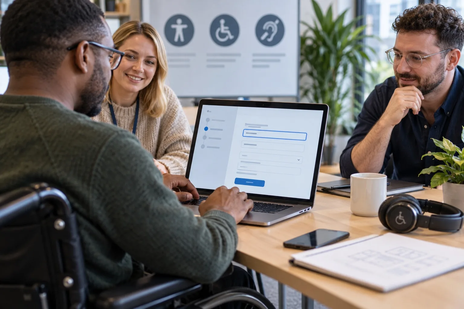
Accessibility is often discussed as a legal or technical requirement, but that framing is too narrow for most UK businesses. In April 2026, accessible web design is better understood as a practical way to make websites easier to use, easier to understand and easier to act on. It supports people with permanent, temporary and situational access needs, but it also improves the experience for customers who are tired, distracted, using a mobile in poor light, completing a form in a hurry or comparing suppliers under pressure.
For business owners planning a new website, redesign, SEO project or digital strategy, accessibility should not sit at the end of the process as a checklist. It belongs in the structure, content, visual design, development and testing of the website from the start. When handled well, it reduces friction, strengthens communication and helps more visitors reach the point of enquiry, booking or purchase.
Accessibility is not only about meeting a standard
Standards matter. The Web Content Accessibility Guidelines, commonly referred to as WCAG, provide a recognised framework for making digital content more perceivable, operable, understandable and robust. UK organisations also need to be aware of the Equality Act 2010, while public sector bodies have additional accessibility obligations. Businesses selling digital products or services into the EU may also need to consider the European Accessibility Act, which has applied since June 2025.
However, treating accessibility only as a compliance exercise can lead to a minimum-effort approach. A site might pass some automated checks and still be frustrating for real people. A form may technically have labels but still use vague instructions. A page may include alternative text but describe images poorly. A colour palette may pass contrast tests in one state but fail when buttons are hovered, disabled or shown on mobile.
Strong accessibility work asks a more useful question: can people actually use this website with confidence, regardless of how they browse, read, navigate or interact?
Better usability for more everyday situations
Accessible design improves usability because it removes uncertainty. Clear navigation, visible focus states, readable typography and predictable page layouts help everyone understand where they are and what to do next.
Consider a local service business with a busy website. A potential customer may arrive from search, scan the page for evidence of expertise, compare locations, check availability and then complete an enquiry form. If the text is cramped, the buttons have low contrast and the mobile menu is difficult to operate, that visitor may leave before making contact. Accessibility improvements address those practical issues directly.
- Readable text helps visitors understand services without pinching, zooming or straining.
- Clear headings let people scan a page quickly and help assistive technologies communicate structure.
- Keyboard navigation supports users who cannot, or prefer not to, use a mouse, while also helping experienced users move faster.
- Consistent layouts reduce the mental effort needed to compare pages and make decisions.
- Descriptive buttons, such as Request a consultation or View service options, are more helpful than repeated vague links such as Click here.
These are not niche enhancements. They are everyday usability improvements that make a website feel more professional and easier to trust.
Wider reach without changing the core offer
Many businesses look for growth by expanding campaigns, investing in more content or increasing visibility. Those activities can be valuable, but they are less effective if the website quietly excludes a portion of the audience once they arrive.
Accessible web design broadens reach by making your existing proposition available to more people. This includes disabled users, older customers, neurodivergent visitors, people with temporary injuries, users with slow connections and people browsing on different devices or in challenging environments.
For example, captions on video content are essential for deaf and hard-of-hearing users, but they also help visitors watching without sound on public transport or in an office. Strong colour contrast supports people with low vision, but it also helps anyone using a screen outdoors. Plain English benefits people with cognitive access needs, but it also helps busy decision-makers understand value quickly.
Accessibility also supports search visibility indirectly. Search engines need structured, understandable content. When pages use meaningful headings, descriptive link text, relevant image alt text and clear page copy, they become easier for both people and systems to interpret. Accessibility is not a shortcut to rankings, but it aligns closely with good content quality and technical clarity.
Stronger forms mean fewer lost enquiries
Forms are one of the clearest places where accessibility affects business results. Contact forms, quote requests, bookings, downloads, account registrations and checkout journeys often decide whether a visitor becomes a lead or leaves the site.
An inaccessible form can fail in small but costly ways. A field may not have a proper label. Error messages may appear only in red. Required fields may not be clearly identified. A date picker may be impossible to use with a keyboard. The submit button may be disabled without explaining why. On mobile, fields may be too small or the wrong keyboard may appear for phone numbers and email addresses.
Improving form accessibility usually improves completion for everyone. The best forms reduce effort, explain what is needed and recover gracefully when something goes wrong.
Practical form improvements for UK business websites
- Use visible labels for every field rather than relying only on placeholder text.
- Group related fields logically, such as contact details, project details and preferred times.
- Provide examples where formatting matters, such as postcode or phone number formats.
- Write error messages that explain the problem and how to fix it.
- Make sure errors are announced to screen reader users and visible to sighted users.
- Allow people enough time to complete longer forms without losing progress.
- Use accessible autocomplete attributes where appropriate to speed up completion.
- Keep optional fields genuinely optional and avoid asking for information that is not needed.
For many businesses, improving the enquiry form is one of the fastest ways to reduce digital waste. If visitors have already decided to contact you, the website should not make that decision harder to complete.
Better content helps people make decisions
Accessibility is not only a design or development task. Content plays a major role. Visitors need to understand what you offer, who it is for, what happens next and why they should trust you. If the copy is vague, dense or full of unexplained terminology, the website creates a barrier, even if the code is technically sound.
Accessible content is structured, direct and useful. It avoids unnecessary complexity while still respecting the reader. For UK business owners, this is especially important on service pages, landing pages, help content and policy pages, where visitors may be comparing options or trying to resolve a concern.
Content choices that support accessibility
- Use meaningful headings so readers can scan the page and understand the journey.
- Explain specialist terms where they are useful, rather than assuming prior knowledge.
- Write descriptive link text that makes sense out of context.
- Keep paragraphs focused so pages are easier to read on mobile and with assistive technology.
- Provide useful alt text for informative images and avoid cluttering screen reader output with decorative image descriptions.
- Make calls to action specific so visitors know what will happen next.
Good accessible content also supports brand perception. A business that communicates clearly feels more organised, reliable and considerate. That matters when the website is often the first meaningful interaction a customer has with the company.
Fewer barriers across the full customer journey
Accessibility is sometimes assessed page by page, but customers experience websites as journeys. They move from a search result to a landing page, from a service explanation to a comparison point, from a case study to a contact form, and from confirmation messages to follow-up communication.
Each step can introduce barriers. A cookie banner may trap keyboard focus. A carousel may move before someone has finished reading. A PDF brochure may be untagged and difficult to navigate. A booking tool may not announce available times properly. A map may show a location visually but fail to include the address in text. A confirmation message may disappear too quickly.
Reducing these barriers requires looking beyond the most obvious pages. It means reviewing templates, components and third-party tools. It also means considering the practical tasks customers want to complete: find a phone number, compare services, check coverage, book a consultation, download a document, complete payment or ask a question.
Accessible web design works best when it is treated as part of the customer experience, not as a final technical patch.
Accessibility also supports trust and brand quality
A website that is difficult to use can make a capable business look less dependable. Visitors may not describe the problem as an accessibility issue; they may simply feel that the site is awkward, unclear or not designed for them.
By contrast, accessible design sends positive signals. It shows attention to detail, respect for users and confidence in the information being presented. For sectors such as professional services, healthcare, education, property, finance, hospitality and local trades, those trust signals can influence whether someone feels comfortable taking the next step.
Accessibility can also reduce pressure on internal teams. If customers can find information, understand options and submit accurate enquiries online, staff spend less time clarifying basic details or resolving avoidable mistakes. That does not replace human service; it makes human service more efficient and better focused.
How to start improving accessibility in 2026
For many businesses, the challenge is knowing where to begin. A full accessibility programme may be appropriate for larger organisations, but smaller businesses can still make meaningful progress by focusing on high-impact areas first.
- Audit key journeys. Review the homepage, main service pages, contact page, enquiry forms and any booking or checkout steps.
- Test with more than automated tools. Automated checks are useful, but manual testing is needed for keyboard navigation, screen reader behaviour, content clarity and real-world usability.
- Prioritise blockers. Fix issues that stop people completing essential tasks before refining smaller improvements.
- Review design components. Buttons, menus, cards, accordions, modals and forms should be accessible wherever they appear.
- Improve content structure. Use clear headings, concise paragraphs, descriptive links and plain explanations.
- Check colour and interaction states. Test contrast for normal, hover, focus, active, disabled and error states.
- Build accessibility into future work. Include it in briefs, design reviews, development acceptance criteria and content publishing processes.
The aim is not perfection in a single week. The aim is to stop accessibility being accidental. Once it is part of your normal digital process, your website becomes easier to maintain and improve.
Common accessibility mistakes to avoid
Some accessibility problems appear repeatedly on business websites. Avoiding these can make an immediate difference.
- Using low-contrast brand colours for important buttons or text.
- Removing visible keyboard focus styles because they are considered untidy.
- Publishing images of text instead of real text that can resize and be read by assistive technology.
- Adding video without captions or transcripts where the audio carries meaning.
- Creating long pages without clear headings or internal structure.
- Using pop-ups that are hard to close or impossible to navigate by keyboard.
- Writing generic link text that gives no context.
- Assuming a plugin or overlay can make a website fully accessible without fixing underlying design, code and content issues.
Accessibility overlays and quick-fix widgets may appear appealing, but they cannot solve many structural issues. A better approach is to design and build the website properly, then test and refine it with accessibility in mind.
FAQs about accessible web design
Is accessible web design only for disabled users?
No. It is essential for disabled users, but it also improves usability for a much wider audience. Clear layouts, readable content, captions, better forms and predictable navigation help people in many situations, including mobile browsing, poor lighting, noisy environments and time pressure.
Will accessibility limit creativity?
Accessibility does not mean plain or dull design. It sets useful constraints that encourage clearer choices. Strong visual identity, engaging layouts and distinctive branding can all work within accessible design principles when they are planned properly.
Can automated tools confirm that a website is accessible?
Automated tools can identify some issues, such as missing alt attributes or certain contrast failures, but they cannot judge everything. Manual review, keyboard testing, screen reader checks and content assessment are still needed to understand the real user experience.
Does accessibility help SEO?
Accessibility and SEO are not the same, but they often support one another. Clear headings, descriptive links, meaningful alt text, fast pages, structured content and usable mobile experiences all help people and can make pages easier for search engines to understand.
When should accessibility be considered in a redesign?
From the start. Accessibility should influence the brief, information architecture, wireframes, visual design, content, development and testing. Retrofitting accessibility after launch is usually slower and less effective than building it into the project.
Clear next steps for business owners
If you are planning a new website or reviewing an existing one, start by looking at the tasks your visitors need to complete. Can they find the right service? Can they read the page comfortably? Can they navigate without a mouse? Can they understand the form? Can they recover from an error? Can they contact you without unnecessary effort?
Accessible web design improves more than compliance because it improves the path between interest and action. It helps more people understand your business, trust your message and complete the next step. For UK businesses investing in digital strategy, that makes accessibility a commercial, ethical and practical priority.
Giraffe Digital can help you review your website, identify accessibility barriers and plan improvements across design, content, SEO and user experience. The best time to consider accessibility is before problems are built in, but meaningful improvements can still be made at any stage.