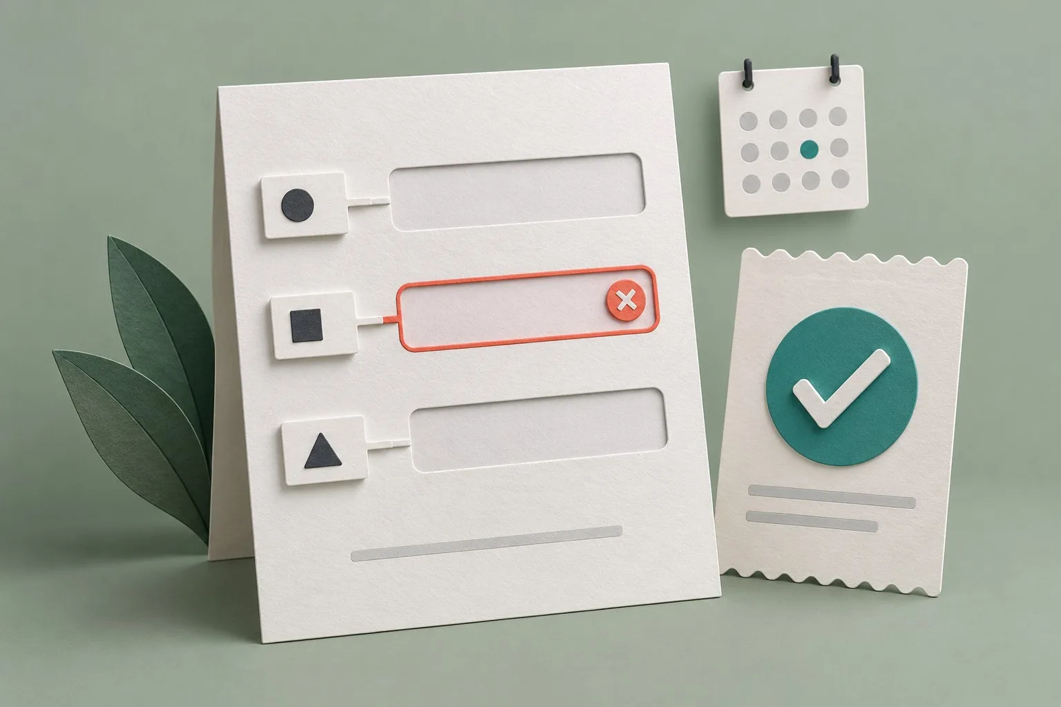
A useful form asks for information the business needs, explains how to provide it and helps the customer recover when something goes wrong. The final confirmation should reflect what the service has actually completed.
Explain why each question is needed
List each question, its purpose, who uses the answer and whether it is necessary at this stage. Remove fields collected only because an old template included them. Allow uncertainty when it is a valid answer rather than forcing customers to invent details.
For a quotation, an approximate requirement may be sufficient to begin a conversation. A later delivery decision may need more precise information. Match the questions to the actual process and explain what can be supplied later.
Associate clear labels with the controls
Give each control a label describing its purpose. Placeholder text can provide an example but should not replace the label. For an explicit HTML association, the label's for attribute matches the control's id. Duplicate identifiers can associate a label with the wrong control.
Check activation of labels and how controls are presented to assistive technologies. Visual proximity alone does not establish the relationship. Keep the accessible name consistent with visible wording where required for users relying on speech input.
Make formats and required answers understandable
Explain required information and expected formats before an error occurs. Use suitable hints and programmatic indications alongside visible wording. Choose input modes for the expected data and test actual device keyboards.
Do not assume a number input is appropriate for every value containing digits. Identifiers, telephone numbers and quantities have different requirements. Check leading zeroes, decimal formats and accidental value changes with representative information.
Distinguish input errors from service problems
If the customer can correct an answer, identify the field and explain the correction. Show a specific message near the control. An error summary can help locate outstanding problems in a longer form and should connect to the relevant questions.
A server failure, unavailable capacity or permission decision is different from invalid input. Explain the actual problem and useful next step instead of blaming a correct answer. Preserve relevant entered information during recovery, so the customer can understand and edit it.
Keep staged forms coherent
Group questions logically and provide clear progress information. Test moving forward, returning to edit and resuming after an error. A keyboard user should encounter the controls and transitions in an order that preserves meaning.
Avoid unnecessary re-entry within the process, while accounting for applicable security or essential verification needs. Check both the form's own navigation and relevant browser behaviour. Dividing a short form into arbitrary stages can add work without improving clarity.
Choose date controls for the actual task
Entering a known date is different from finding an available appointment. Direct day, month and year entry may suit a memorable or easily looked-up date. A calendar can help compare available dates when that is the customer's task.
For a calendar dialogue box, test focus placement, keyboard movement, selection feedback and leaving the control. An example demonstrating a date-picker pattern still requires implementation and assistive technology testing before production use.
Handle revealed content and dialogue boxes carefully
Keep conditionally revealed questions simple. More complicated or multipart questions may be clearer on a subsequent page. Check whether newly shown content is discoverable and communicated appropriately; adopting a visual pattern alone does not resolve its known interaction limitations.
If a modal dialogue is used, give it a clear purpose and label. Move focus inside appropriately, keep its active keyboard sequence coherent, provide dismissal and return focus to a suitable location afterwards. Test the actual component rather than treating a dimmed background as sufficient evidence.
Confirm the real outcome and next step
Explain what was completed, what happens next and how the customer can obtain help. Include a useful reference where the process supplies one. Do not say an enquiry was accepted or a booking confirmed merely because a button was clicked.
For dynamic progress, errors or confirmation, arrange suitable status communication to assistive technologies. Do not rely on colour alone. Place task-specific decisions in the relevant content instead of depending entirely on a general notification banner.
Use a task list only when it helps explain meaningful remaining actions. If the sequence is fixed, do not imply it can be freely reordered. A customer with one outstanding action may need a simple explanation rather than a project dashboard.
Test a complete form journey
- Review field purpose, labels, required information and formats.
- Complete valid and invalid examples.
- Test keyboard and assistive technology use.
- Check dates, revealed questions and dialogue behaviour.
- Preserve useful answers when editing or recovering.
- Verify delivery, confirmation and the promised follow-up.
Our user research guide explains realistic task observation. The software testing checklist helps record acceptance evidence before release.