Dark mode design is becoming a more visible part of digital product planning. What began as a preference for developers, designers and late-night users is now appearing across operating systems, apps and major online platforms. For UK businesses considering a new website, refreshed branding or a wider digital strategy, it is worth understanding what dark mode can offer, where it helps, and where it can cause problems if it is treated as a simple colour swap.
At its best, dark mode design gives users a comfortable alternative interface, helps certain types of content stand out, and can make a digital brand feel more considered. It is not suitable for every website, and it should never come at the expense of readability, accessibility or search performance. However, as more people become used to choosing darker interfaces on their devices and favourite apps, businesses should expect questions about whether their own digital products can support the same experience.
Why dark mode is gaining attention
The rise of dark interfaces is connected to wider changes in how people use digital products. Many users now move between a desktop computer, smartphone and tablet throughout the day. They may browse a business website in the evening, read social content on public transport, or compare service providers while sitting in a dimly lit room. A bright white interface is not always the most comfortable option in those situations.
Operating systems have also helped make dark mode more familiar. Apple introduced a system-wide dark appearance in macOS Mojave, and Windows 10 includes dark theme options in supported areas of the interface. Android Q, currently being discussed and tested in 2019, also places more emphasis on dark theme support. Social platforms and content services have been moving in a similar direction, with darker viewing options appearing in apps such as Twitter, YouTube and Messenger.
This matters because user expectations often travel from major platforms to business websites. When customers become accustomed to choosing between light and dark interfaces elsewhere, they may start to value that control in other digital experiences. For some businesses, particularly those in technology, entertainment, design, gaming, finance, media or premium consumer sectors, dark mode can also help support a sharper and more modern brand impression.
What dark mode design actually involves
Dark mode design is not simply a case of changing a white background to black and leaving everything else in place. A usable dark interface requires careful decisions around contrast, typography, imagery, buttons, form fields and brand colour. Designs that look stylish in a mock-up can quickly become tiring if the text is too stark, the colour palette is too saturated, or important calls to action disappear into the background.
Most effective dark interfaces use dark greys rather than pure black for large background areas. Pure black can be useful in some contexts, especially on OLED screens, but it can also create harsh contrast when paired with pure white text. A softer palette often feels more polished and is easier to read for longer periods. Text colour should also be chosen carefully. Off-white or light grey text can reduce glare while still providing sufficient contrast.
Brand colours need particular attention. A bright orange, blue or green that looks balanced on a white background may appear much stronger on a dark one. Businesses should test primary and secondary colours across both interface styles, especially for buttons, links, navigation states and form validation messages. The aim is to keep the brand recognisable without making the interface feel loud or difficult to scan.
Business value for UK websites
For a business website, dark mode design should be judged by its practical value rather than by trend appeal alone. A dark interface can support user comfort, help visual content feel more cinematic, and make certain product or service pages feel distinctive. It can also encourage visitors to spend longer exploring content if the experience feels pleasant in low-light conditions.
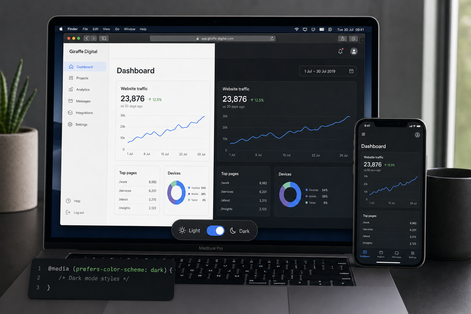
Businesses with image-led portfolios may benefit from dark layouts because photography, video stills, illustrations and product visuals can appear more prominent against a darker background. This can work well for creative studios, venues, luxury products, software interfaces, architectural practices and event brands. Similarly, a dark design can help dashboards, charts and technical information feel focused when used carefully.
There may also be a brand positioning advantage. A well-executed dark mode can suggest sophistication, confidence and attention to detail. For a business competing in a crowded market, small experience improvements can help the website feel more memorable. That said, dark mode is not a shortcut to better branding. If the underlying messaging, navigation and conversion journey are weak, a darker colour scheme will not solve the problem.
For many businesses, the best answer may be to offer dark mode as an option rather than making it the only design. A visitor looking at a solicitor, accountant, healthcare provider or public service may expect clarity, reassurance and straightforward reading. A full-time dark design could work for some brands in those sectors, but it needs to be tested carefully with real content and real user tasks.
Accessibility and readability must come first
Accessibility is one of the most important considerations in dark mode design. A darker interface can be more comfortable for many people, but it can also create barriers if contrast, spacing and hierarchy are poorly handled. Small light text on a dark background can become difficult to read, especially for longer articles, detailed service pages or legal information.
Businesses should not assume that dark mode is automatically more accessible. The design still needs to support legible font sizes, strong headings, clear link states and visible focus states for keyboard users. Forms need obvious labels, helpful error messages and enough contrast around input fields. Icons should not rely on colour alone to communicate meaning.
It is also worth considering content length. A short landing page with bold statements and strong visuals may work beautifully in a dark theme. A 2,000-word guide, policy page or technical explanation may need a softer background, wider line spacing and a carefully selected text colour to remain comfortable. If a website contains both promotional and educational content, the design system should account for both.
Designing for SEO and conversion
Dark mode design does not directly improve search rankings. Search engines do not reward a website simply because it offers a dark interface. The SEO value comes from the same foundations that matter in any good website: useful content, crawlable pages, fast loading, mobile-friendly design, clear structure and a positive user experience.
However, design choices can influence user behaviour. If visitors can read content comfortably, understand the offer quickly and find the next step without friction, they are more likely to enquire, subscribe or make a purchase. Poor colour contrast, hidden calls to action or confusing navigation can damage performance, regardless of how fashionable the interface looks.
Businesses should also avoid implementing dark mode in a way that creates duplicate content or unnecessary pages. A dark version and a light version should not be separate competing URLs with the same content unless there is a very specific technical reason. In most cases, it is better to manage appearance through the design layer while keeping one clear page for search engines and users.
Page speed remains important. Additional style sheets, scripts, images or animations should be handled efficiently. If a dark mode toggle delays loading or causes a jarring flash between themes, it can weaken the experience. A well-built site should feel smooth on common devices and connection speeds, not only on the latest hardware in a design studio.
Social media marketing and dark interfaces
Dark mode is not only a website consideration. Social media marketing assets also need to work in darker app environments. As platforms introduce or promote darker viewing options, images, videos, profile graphics and advert creative may be seen against darker surrounding interfaces. This can affect how colours, borders and transparent elements appear.
For example, a white logo placed on a transparent background may look clean on a dark interface but disappear on a light one if it is reused elsewhere. A dark graphic with little contrast may look striking in isolation but become lost in a dark feed. Businesses should test social images in both light and dark surroundings before committing to a campaign style.
Paid social advertising also benefits from this awareness. Creative that stands out clearly in a feed is more likely to attract attention, but it should still feel consistent with the landing page experience. If an advert uses a premium dark visual style and the landing page is a bright, unrelated layout, the journey can feel disjointed. A coherent design direction helps build trust from the first impression through to the enquiry form.
Technology considerations in 2019
From a technical perspective, dark mode support is still developing across browsers, operating systems and devices. Some modern browsers are beginning to support ways for websites to respond to a user’s system colour preference, including the emerging prefers-colour-scheme media feature. However, support is not yet universal, so businesses should treat it as progressive enhancement rather than a requirement that every visitor will experience in the same way.
A sensible 2019 approach is to design a strong default experience first, then add dark mode thoughtfully where it is supported or where a user can choose it manually. A visible toggle can be useful when appropriate, particularly for content-heavy websites or logged-in digital products. If a toggle is used, the site should remember the visitor’s preference where possible, without making the interface dependent on intrusive tracking.
Developers should also plan for images, logos and icons. A logo designed for a white background may need an alternative version for dark mode. Illustrations with transparent areas should be checked carefully. Photographs may require different overlays or gradients to keep text readable. SVG icons can be especially useful when they are built to inherit appropriate colours from the design system.
Domain registration, branding and dark mode
Domain registration may seem separate from dark mode design, but both are part of a wider brand experience. Before investing in a new visual direction, a business should make sure its chosen domain name supports the brand clearly. A good domain is easy to spell, easy to say aloud, and closely connected to the trading name or main service.
For UK businesses, it is sensible to think about how the domain will appear across search results, email addresses, printed material, social profiles and adverts. Shorter names are usually easier to remember, but clarity matters more than cleverness. Avoid unnecessary hyphens, confusing spellings or wording that could limit future growth if the business expands its services.
It is also wise to consider brand consistency before launching a redesigned site. The domain, logo, colour palette, social handles and email presentation should feel aligned. If a business is moving towards a more premium dark visual style, the rest of the identity should support that positioning. A sophisticated website can be undermined by an unclear domain or inconsistent naming across channels.
When dark mode may not be the right choice
Dark mode design is not suitable for every business or every audience. Some sectors rely heavily on long-form reading, official information or a sense of openness and simplicity. In those cases, a light design may still be the most effective primary experience. Dark mode can also make some products feel more niche or technical than intended, which may not suit a brand trying to appear warm, accessible or family-friendly.
There are practical content issues too. If a website has hundreds of legacy images, diagrams, PDFs or embedded elements designed for light backgrounds, adapting them all for a darker environment can take time. A partial dark mode, where some elements look polished and others look awkward, can feel less professional than a consistent light design.
The decision should be based on user needs, brand strategy and the role of the website. If most visitors arrive during working hours to gather clear information and make quick enquiries, dark mode may be a lower priority. If the site is used regularly in the evening, showcases rich media, or forms part of a software product, it may deserve more serious consideration.
How to plan a dark mode project
A sensible dark mode project starts with discovery rather than decoration. Businesses should review audience behaviour, analytics, brand goals and content types before choosing a direction. It is useful to identify the pages where dark mode could add the most value, such as product showcases, dashboards, portfolios, blogs or resource centres.
The next step is to create a small design system. This should define background colours, text colours, link colours, button styles, form states, borders, shadows and image treatments for both light and dark contexts. Without a system, dark mode can become inconsistent as new pages and campaigns are added.
Testing should include real copy, real images and real devices. A design that looks excellent on a large monitor may feel cramped or too contrast-heavy on a phone. Users should be able to complete key actions, such as reading a service page, comparing options, submitting a form or navigating back to the home page, without confusion.
Finally, dark mode should be maintained. New campaign pages, blog posts, downloadable resources and social assets should be checked against the design approach. As with SEO, performance and content quality, dark mode works best when it is treated as an ongoing part of the digital strategy rather than a one-off visual feature.
A considered opportunity, not a gimmick
Dark mode design is becoming a meaningful consideration for websites and digital products in 2019. It reflects changing user habits, greater demand for personalisation and a growing appreciation of interface comfort. For UK business owners, the opportunity is not simply to follow a trend, but to create a more polished and flexible digital experience.
The best results come from balancing style with substance. Dark mode should support the brand, improve usability and sit comfortably alongside SEO, content and conversion goals. When planned properly, it can add genuine value. When rushed, it can make a website harder to read and harder to trust.
If your business is planning a new website or a design refresh, dark mode is worth discussing early in the process. It may become a central part of the visual identity, an optional enhancement, or something to revisit later. The right answer depends on your audience, your content and your commercial goals.