Flat web design is beginning to make a noticeable impression on business websites. After several years of glossy buttons, heavy textures, bevelled panels and imitation leather or paper effects, more organisations are considering a cleaner visual approach. The style is not simply about removing decoration for the sake of fashion. Used well, it can make a website easier to understand, quicker to browse and more consistent across desktop computers, tablets and mobile phones.
For UK business owners, the question is not whether a website should look fashionable, but whether it helps visitors find information, trust the organisation and take the next useful step. Flat design can support those aims when it is planned around content, navigation, branding and search visibility, rather than treated as a purely cosmetic exercise.
What flat web design means in practical terms
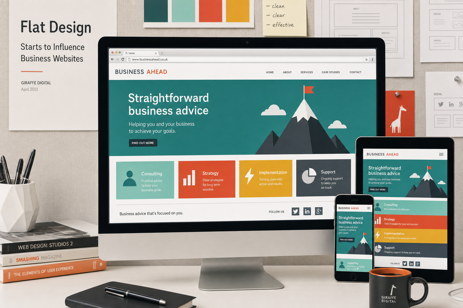
Flat web design favours simple shapes, solid colours, clear typography and straightforward layouts. It generally avoids visual tricks that try to imitate real-world materials, such as stitched edges, embossed icons, highly polished gradients or drop shadows used to make every element appear three-dimensional.
This does not mean that a flat website has to look plain or unfinished. A well-designed flat interface uses proportion, spacing, colour and contrast to create hierarchy. The visitor should still be able to tell which items are clickable, where the main navigation sits, what the primary message is and how to get in touch. The skill lies in reducing clutter without removing useful signposts.
The influence can be seen in tile-based interfaces, simplified icon sets and the growing preference for larger type, bolder colour blocks and cleaner content panels. Business websites are beginning to borrow these ideas because they can make pages feel more direct. A solicitor, manufacturer, retailer, charity or professional services firm does not always need heavy ornamentation to appear credible. Often, clarity creates more confidence than decoration.
Why the style is gaining attention in 2013
Website design is being shaped by changes in browsing behaviour. More visitors are arriving from smartphones and tablets, while many office users still view sites on a desktop monitor. A design that relies on detailed textures, tiny interface elements or large image files can feel awkward on smaller screens and slower connections.
Flat design is well suited to this changing environment because it encourages simplicity. Buttons can be larger and easier to tap. Menus can be clearer. Content areas can be arranged in a way that works more naturally when a layout is adapted for different screen sizes. Although not every business site needs a fully responsive design immediately, most organisations should now be thinking carefully about how their website performs beyond the traditional desktop setting.
There is also a branding reason. Many businesses have spent years adding visual effects to make their websites look more advanced. The result, in some cases, is that pages have become busy and difficult to scan. A cleaner design can make a brand feel more confident, particularly when paired with good photography, consistent colours and well-written content.
The business value of a simpler interface
The strongest argument for flat web design is usability. Visitors rarely come to a business website to admire decorative effects. They want to check services, compare expertise, read contact details, understand locations, browse products, request information or make an enquiry. If the design supports these tasks, it is doing its job.
A simpler interface can help by drawing attention to the most important actions. For example, a local accountancy firm may want visitors to book a consultation, download a tax guide or call the office. A flat layout can give these calls to action more prominence without surrounding them with unnecessary shine or shadow. A manufacturing company may need to guide visitors towards product specifications, technical downloads and sector pages. A cleaner navigation system can make those routes easier to follow.
There may also be performance benefits. Pages with fewer decorative images and lighter interface elements can often be made to load more efficiently. Speed is important for users and should also be considered as part of search marketing. A faster, easier website is more likely to keep visitors engaged, reduce frustration and encourage enquiries.
Flat design still needs strong branding
One risk of any popular design direction is that websites start to look too similar. Flat design should not mean replacing a distinctive brand with a few generic coloured squares. The visual style must still reflect the organisation behind the site.
Colour is especially important. A flat design often relies on solid colour areas, so the palette needs to be chosen carefully. A firm with an established identity should adapt its existing colours in a way that works online. Where a brand feels dated, the website project may be a good opportunity to refine the palette, improve contrast and create clearer visual rules.
Typography also carries more weight in a flat layout. Without heavy textures or decorative panels, headings, body copy and navigation labels need to be legible and consistent. Web fonts are increasingly practical, but they should be selected with care. A font that looks attractive in a design mock-up may not work as well for long service pages, product descriptions or mobile visitors. Readability should come first.
Icons can be useful, particularly for service categories, feature lists and short explanatory sections. However, they should be meaningful. A simple line or solid icon is only helpful if visitors can understand it quickly. If an icon needs a long explanation, the wording is probably doing the real work.
Designing for content rather than decoration
Flat web design places greater emphasis on the quality and structure of content. When a page has fewer visual effects, weak copy becomes more obvious. Business owners should therefore treat a redesign as a content project as well as a design project.
Start by identifying the pages that matter most. These will usually include the home page, main service pages, about page, contact page, location information, case study or portfolio areas where appropriate, and any pages that explain specialist knowledge. Each page should have a clear purpose. The visitor should be able to answer three questions quickly: what does this organisation offer, why should I trust it, and what should I do next?
Headings should be descriptive rather than vague. Instead of relying on phrases such as Our Solutions, a business may be better served by headings that name the service or sector clearly. This helps visitors and can also support search visibility. Search engines need clear signals about the subject of each page, and users scanning results pages are more likely to click when the wording matches their intent.
Flat design works particularly well with concise content blocks, but that does not mean every page must be short. Some services require detailed explanation. The key is to organise information with useful headings, short paragraphs, bullet points where helpful and clear links to related pages.
Search marketing considerations
A move towards flat web design should not ignore search engine optimisation. A visually clean website can still perform poorly if pages are thin, titles are duplicated, navigation is unclear or important content is hidden in images. Search marketing in 2013 continues to reward websites that are useful, relevant and technically accessible.
When redesigning, businesses should review page titles, meta descriptions, headings, internal links and URL structure. If old pages are being replaced, redirects must be planned so that visitors and search engines can find the new locations. Losing established search visibility during a redesign is a common and avoidable problem.
Flat design should also avoid the temptation to put too much text into graphic panels. A beautifully designed banner that contains important wording as part of an image may look neat, but it can be less useful for search engines and less flexible for mobile layouts. Important copy should usually be real HTML text, styled cleanly with CSS.
For local businesses, address details, telephone numbers, service areas and location-specific pages should be easy to find. A cleaner design can make contact information more prominent, particularly on mobile devices where a visitor may want to call immediately.
Social media and flat visual presentation
Social media marketing is also influencing the move towards simpler visuals. Many businesses are now using Facebook, Twitter, LinkedIn, Google+, Pinterest or YouTube to share updates and direct people back to their websites. A website that presents content in a clean, shareable format can support those efforts.
Blog posts, guides, news articles and project updates should be easy to read and easy to share. A flat layout can help by giving content more space and reducing distractions. Social buttons should be visible but not overpowering. The aim is to encourage sharing without making the page feel cluttered.
Businesses should also consider consistency between their website and social profiles. Profile images, cover images, colours and messaging should feel connected. This does not mean every platform must look identical, but visitors should recognise the organisation wherever they encounter it. A simple design system can make that consistency easier to maintain.
Domain names and planning a redesign
A website redesign is a sensible time to review domain name arrangements. For many UK businesses, a .co.uk domain remains a strong choice, particularly when serving a primarily UK audience. Where appropriate, securing related domain extensions can help protect the brand and reduce confusion, but the main website should still have one clear primary address.
Choose a domain that is easy to say, spell and remember. Avoid unnecessary hyphens where possible, and be careful with abbreviations that may be misunderstood over the phone. If a business name is long, it may be worth considering whether a shorter, brand-safe version is available, provided it does not create confusion.
It is also important to keep domain registration details organised. The business should know who controls the domain, which email address is used for renewals and how access will be managed if staff or suppliers change. Domain ownership is a practical matter, but it can become a serious problem if ignored.
Technology choices that support flat design
Flat design is often achieved through efficient use of HTML and CSS. CSS3 allows designers to create colour, spacing, rounded corners and simple transitions without relying on as many image files as older approaches required. However, support can vary between browsers, so sensible fallback design remains important.
Business owners do not need to know every technical detail, but they should ask practical questions. Will the website work well in commonly used browsers? Is the navigation accessible without relying on unusual effects? Can content be edited without breaking the layout? Will the site load acceptably on typical broadband and mobile connections?
Content management systems can make updates easier, but they should be configured carefully. A clean front-end design can still be undermined by messy page templates, oversized images or inconsistent editing. If staff will be updating the site, they need a clear structure and guidance on how to add pages, images and headings properly.
When flat design may not be enough
Flat design is not a cure for every website problem. If an organisation has unclear services, weak positioning, poor photography or no content plan, simply removing gradients and shadows will not create a successful website. The style is best treated as part of a wider digital strategy.
Some brands may also need a more layered visual approach. Luxury products, heritage organisations or highly tactile consumer goods may benefit from carefully chosen texture and depth. The important point is not to follow a trend blindly. The design should support the audience, the message and the commercial objective.
There is room for subtle depth within a largely flat design. A small shadow, a gentle colour change or a clear hover state can improve usability when used with restraint. The problem is not depth itself, but decoration that distracts from the visitor's task.
A practical checklist for business owners
Before committing to a flat redesign, it is worth reviewing the project against a few practical criteria:
- Purpose: Does every key page have a clear job?
- Navigation: Can visitors find services, products and contact details quickly?
- Branding: Do colours, typography and imagery feel distinctive and appropriate?
- Content: Is the copy useful, current and written in the language customers use?
- Search: Have titles, headings, redirects and important landing pages been planned?
- Mobile use: Are buttons, menus and forms comfortable to use on smaller screens?
- Speed: Are images and interface elements kept as efficient as possible?
- Maintenance: Can the business update content without damaging the design?
Making flat web design work for your organisation
Flat web design is likely to appeal to many businesses because it feels modern, clear and adaptable. Its real value, however, is not in the label. The value comes from presenting information in a way that visitors can understand quickly and act upon with confidence.
For a business website, the best results will come from combining strong planning, sound technology, well-structured content and a visual style that supports the brand. A flat approach can reduce clutter, improve readability and make calls to action more obvious. It can also fit well with search marketing and social media activity when the site is built around useful, shareable content.
If your organisation is considering a new website or a refresh of an existing one, flat design is worth discussing. The aim should not be to copy a trend, but to create a cleaner, more effective online presence that helps the right people find you, understand you and get in touch.