As we move into 2012, business websites are being asked to do much more than present a few pages of company information. Customers are comparing suppliers online, checking social media profiles, reading reviews, browsing on mobile phones and expecting a clear route from interest to enquiry. The strongest web design trends to watch in 2012 will not simply be about visual fashion; they will be about creating faster, clearer and more useful websites that help organisations win trust and generate measurable business value.
For UK business owners, this is a good time to review whether a website still reflects how customers behave. A site built even three or four years ago may look acceptable on a desktop computer, yet feel awkward on a smartphone, lack strong calls to action, or fail to support social media marketing and search engine optimisation. The trends below are worth watching because they connect design decisions with commercial outcomes: enquiries, sales, brand recognition and long-term digital visibility.
Mobile-friendly design becomes a business necessity
Mobile browsing has moved beyond being a novelty. More customers are using smartphones to look up opening hours, compare local businesses, read emails and follow links from social networks. Tablet use is also growing quickly, with many people now browsing comfortably from the sofa rather than at a desk. In 2012, a website that is difficult to use on a smaller screen risks losing enquiries before the visitor has properly understood the offer.
The practical issue is not simply whether a website can be viewed on a phone. Most desktop sites can technically be loaded, but visitors may need to pinch, zoom and scroll sideways just to read a paragraph or tap a navigation link. That creates frustration. A mobile-friendly approach considers the size of text, the space around buttons, the order of content and the speed of the page.
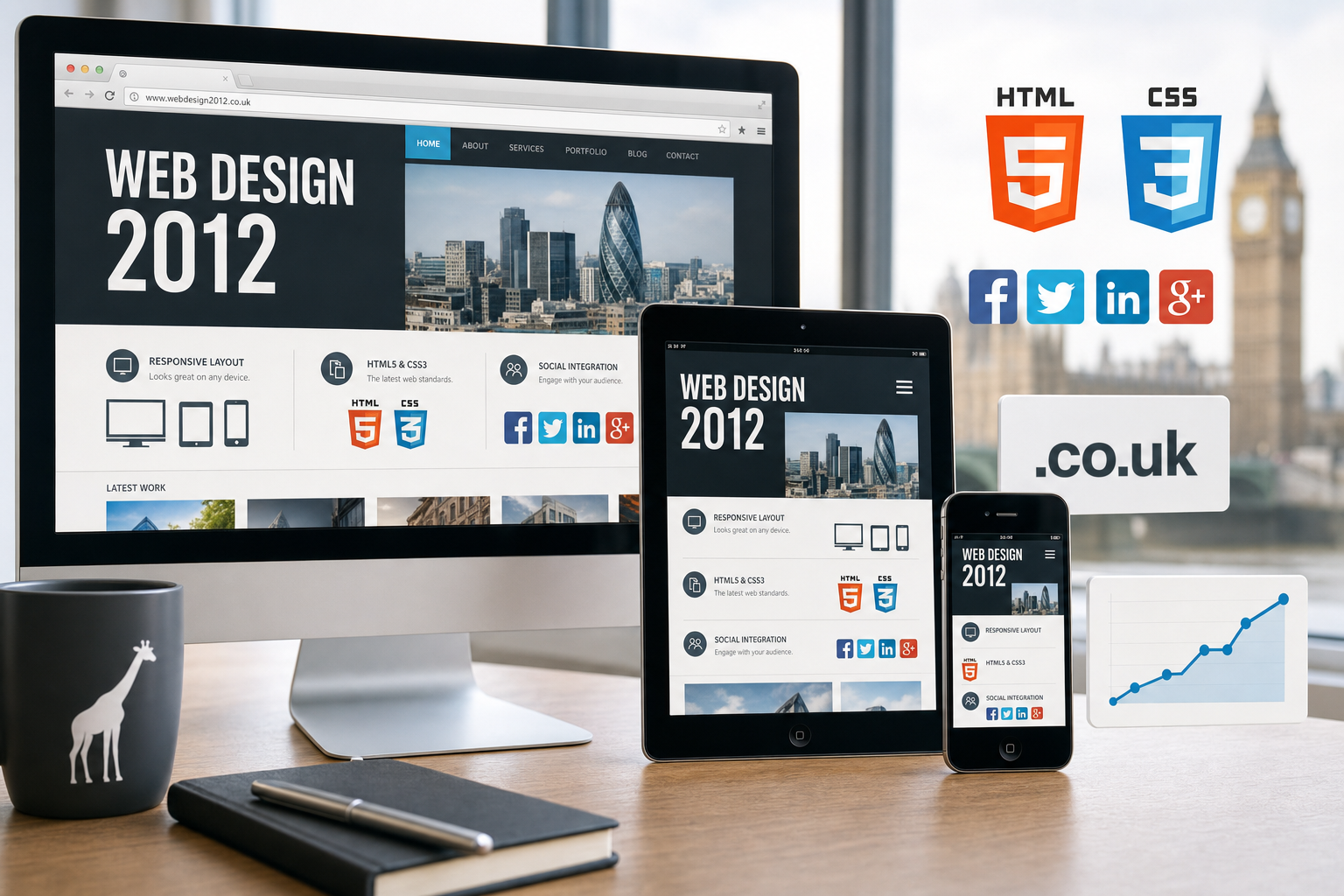
Responsive web design is likely to receive much more attention during 2012. Rather than building a completely separate mobile website, responsive design uses flexible layouts, fluid images and CSS media queries so that one website can adapt to different screen sizes. This approach is still developing, and browser support must be considered carefully, but it offers a sensible direction for many businesses that want to serve desktop, mobile and tablet visitors without maintaining several separate versions of the same content.
For business owners, the key question is simple: what does a customer most need when viewing your site on a phone? A restaurant may need menus, a map and a click-to-call number. A professional services firm may need concise service pages and a prominent enquiry form. An online retailer may need clear product photography, simple filtering and an efficient checkout. Designing around these priorities can produce a better experience and improve the likelihood of a conversion.
Cleaner layouts and stronger visual hierarchy
One of the most useful web design trends in 2012 is the move towards cleaner, more deliberate page layouts. Businesses have often been tempted to put everything on the home page: long welcome messages, news boxes, banners, accreditation logos, keyword-heavy copy and multiple competing calls to action. The result can be a page that says a great deal but communicates very little.
A stronger design uses hierarchy. The most important message is given prominence, supporting information is easy to scan, and the next step is obvious. This does not mean every website must look minimal or plain. It means the design should guide the visitor. Headings, spacing, colour, typography and imagery should work together to answer three questions quickly: who are you, what do you offer, and what should the visitor do next?
Large, well-chosen imagery can also help businesses communicate quality and personality. However, images should earn their place. Generic stock photographs can make a website feel interchangeable, while poor-quality photos can harm trust. Product photography, team images, premises, case study visuals and diagrams can all support a brand when they are planned carefully.
Navigation is another area where simplicity brings value. A visitor should not have to understand your internal company structure to find information. Service names, product categories and contact options should be worded in the language customers use. Good information architecture helps people move through the site and also supports search engine optimisation by giving important pages a clear place within the website.
Content quality and search marketing work together
Search marketing is changing. Search engines are becoming better at rewarding useful, original content and less tolerant of thin pages created only to target keywords. For UK businesses planning website design in 2012, SEO should not be treated as an afterthought added once the site is built. It should influence structure, copy, page names, internal links and the way products or services are explained.
The aim is not to repeat keywords awkwardly. It is to create pages that match genuine customer questions. A business offering accountancy services, for example, may need clear pages for bookkeeping, payroll, tax returns and business start-up advice, supported by articles that explain common issues in plain English. A retailer may need detailed product descriptions, buying guides and useful category pages rather than manufacturer text copied across many sites.
Google made significant quality-focused changes during 2011, and that direction is likely to continue. Websites with duplicated, shallow or overly automated content are less likely to build sustainable visibility. Businesses should invest in copy that demonstrates expertise, answers objections and gives visitors confidence. This also helps conversion, because the same information that supports rankings can help a prospective customer decide to get in touch.
Local search is also increasingly important. Many people search with a place name or expect results relevant to their area. Consistent contact details, clear location pages, well-written service descriptions and an up-to-date presence on local business listings can help. The website should make it easy for search engines and customers to understand where a business operates, while avoiding the temptation to create near-identical pages for every town simply to capture traffic.
HTML5, CSS3 and more considered use of technology
Technology will continue to influence the look and behaviour of websites in 2012. HTML5 and CSS3 are opening up new possibilities for more elegant layouts, video, form improvements, rounded corners, shadows, transitions and richer interfaces. Used carefully, these tools can reduce reliance on images for decorative effects and help create sites that feel more modern.
However, sensible implementation matters. Not every visitor will be using the newest browser, and many businesses still receive traffic from older versions of Internet Explorer. A website should not break simply because a visitor is using an older system. Progressive enhancement is a useful principle: provide a reliable core experience for everyone, then add refinements for browsers that support them.
Businesses should also be cautious about relying on Flash for essential content or navigation. Flash can still be useful in certain contexts, but it is not supported on some popular mobile devices and can create issues for search visibility and accessibility when used poorly. If important information is locked inside a format that cannot be viewed by part of the audience, the design is working against the business.
Performance is another technical trend to take seriously. Faster websites provide a better user experience and can support search visibility. Large images, unnecessary scripts and heavy visual effects may make a site feel polished in a design presentation, yet frustrate real users on slower connections or mobile networks. Good design in 2012 should feel attractive and efficient.
Social media integration becomes more purposeful
Social media marketing is no longer separate from website design. Many businesses now use Facebook, Twitter, LinkedIn, YouTube and, increasingly, Google+ to publish updates, share advice, promote offers and build relationships. A website should support that activity rather than sit apart from it.
The simplest step is to make social channels easy to find. Clear follow buttons, links to active profiles and well-placed sharing options can help visitors continue the relationship after leaving the website. Blog posts, guides, videos and news updates should be easy to share where appropriate. This can extend the reach of useful content and bring new visitors back to the site.
Purpose is important. Adding a row of social icons to every page will not compensate for an inactive profile or weak content plan. A business should consider which networks its customers actually use and what type of content is worth publishing. A recruitment company may find value in LinkedIn and regular advice articles. A café may benefit from Facebook updates, photos and local conversations. A business-to-business supplier may use Twitter to share industry commentary and drive traffic to helpful resources.
Design can also highlight social proof. Testimonials, reviews, press mentions, accreditations and project examples can reassure visitors, provided they are genuine and presented clearly. The aim is to reduce uncertainty. People want to know that a business is active, trustworthy and capable of delivering what it promises.
Stronger calls to action and conversion-focused design
A website should not leave visitors wondering what to do next. In 2012, more businesses will look beyond traffic figures and ask whether the website is producing enquiries, bookings, downloads, phone calls or sales. That shift makes calls to action a design priority.
Good calls to action are specific and visible. They might invite visitors to request a quotation, book a consultation, download a brochure, call the office or sign up for updates. The right wording depends on the business and the stage of the buying process. Someone choosing a solicitor may not be ready to request a quote immediately, but may appreciate a clear route to ask a confidential question. Someone browsing an e-commerce site may need reassurance about delivery, returns and payment security before completing a purchase.
Forms should be as simple as possible. Asking for too much information too early can reduce response rates. A short enquiry form with clear labels, helpful error messages and visible privacy reassurance will usually perform better than a long form filled with unnecessary fields. Telephone numbers should be easy to find, especially on service-led websites where many customers prefer to speak to someone.
Measuring behaviour is also important. Analytics can show which pages attract visitors, where people leave, which search terms are bringing traffic and which marketing activity is generating enquiries. This information helps businesses improve the website over time rather than relying on opinion alone.
Brand consistency across domains, websites and marketing channels
A website is often the centre of a company’s digital presence, but it is not the only place customers encounter the brand. Email signatures, search listings, social profiles, printed literature and online directories all contribute to the impression. In 2012, consistent branding across these touchpoints will become increasingly valuable.
Domain registration deserves careful thought at the start of a web project. A domain should be easy to spell, easy to say and closely connected to the business name or main brand. For many UK organisations, a .co.uk domain remains a strong choice, while securing the matching .com can also be sensible where available. Businesses should avoid overly long domains, confusing hyphens and spellings that customers are likely to mistype.
Ownership is vital. The business should know who controls the domain, which email address receives renewal notices and where the login details are stored. Losing track of a domain can cause serious disruption to websites, email and marketing. It is also wise to consider registering obvious variations or key brand-related domains where there is a clear reason to protect them, while avoiding unnecessary clutter.
Brand consistency extends into design. Colours, typography, tone of voice and imagery should support the same positioning across the website and wider marketing. A premium consultancy, a local trades business and an online fashion retailer will all need different visual approaches, but each should feel intentional and credible to its intended audience.
Planning for improvement rather than one-off redesigns
Perhaps the most important trend is a change in mindset. A website should not be treated as a brochure that is redesigned every few years and then left alone. Digital marketing works best when the website is reviewed, improved and expanded in response to customer needs, search behaviour and business goals.
That does not mean constant redesign for its own sake. It means building on a solid foundation. A business might add new service pages, publish useful articles, improve photography, test calls to action, refine navigation or create landing pages for specific campaigns. Small, informed improvements can often produce more value than occasional large changes made without evidence.
When planning a website for 2012, business owners should begin with objectives. What should the site achieve? Which audiences matter most? What questions do those people ask before buying? Which devices are they likely to use? How will social media, search marketing and offline promotion bring visitors to the site? Clear answers make design decisions easier and help ensure the final website is more than attractive decoration.
What UK businesses should take from web design trends in 2012
The best web design trends to watch in 2012 are not about chasing every new effect or technology. They are about making websites more useful, accessible, persuasive and connected to the wider marketing plan. Mobile-friendly layouts, cleaner design, better content, careful use of HTML5 and CSS3, purposeful social integration, stronger calls to action and sensible domain management all support the same goal: helping customers choose your business with confidence.
For any organisation considering a new website or a redesign, the practical starting point is an honest review. Look at the site on a desktop computer, a smartphone and a tablet. Read the main pages as if you were a first-time visitor. Check whether the next step is obvious. Search for your key services and see how competitors present themselves. Review whether your domain, content and social media activity are supporting the same brand message.
Web design in 2012 will reward businesses that combine good creative judgement with clear commercial thinking. A well-planned website should look professional, work smoothly, attract relevant visitors and turn more of them into customers. That is where design becomes more than appearance; it becomes a practical part of business growth.