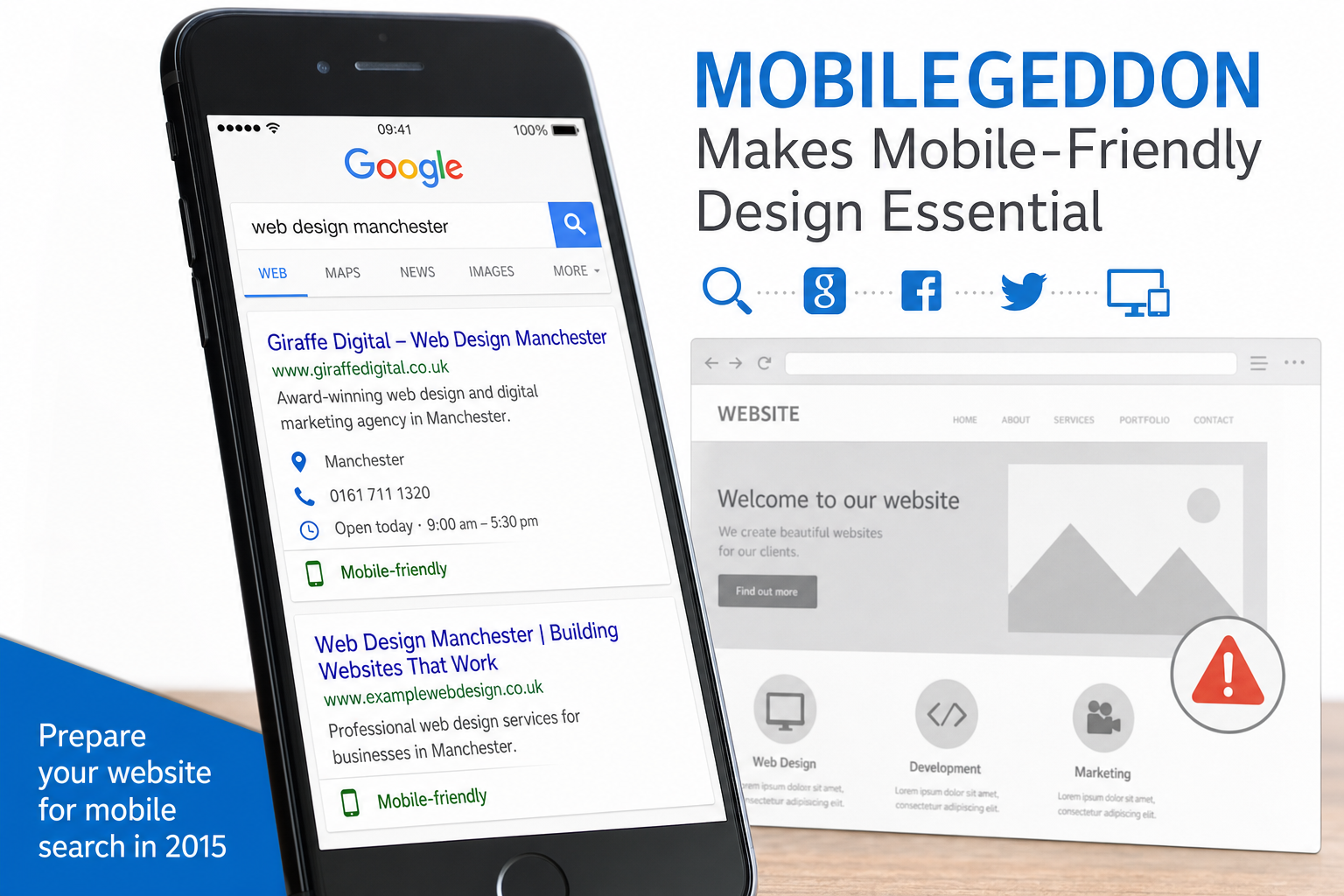
Google Mobilegeddon may sound dramatic, but the message behind it is simple: websites that are difficult to use on a mobile phone are becoming harder to justify. Google has already started showing mobile-friendly labels in mobile search results, and its Webmaster Tools now highlight mobile usability issues. For UK business owners, this is not only a search engine optimisation concern. It is a practical business issue affecting enquiries, credibility, social media traffic and the way potential customers experience your brand.
More people are using smartphones and tablets to search, compare and contact businesses while they are away from a desk. They may be looking for a local service, checking opening hours, reading reviews, clicking through from Facebook or Twitter, or comparing suppliers before making an enquiry. If your website forces them to pinch, zoom, wait or hunt for a telephone number, many will simply return to the search results and choose a competitor.
What Google Mobilegeddon means in practical terms
The phrase Google Mobilegeddon is being used to describe the growing importance of mobile-friendly websites in Google search. While the name is informal, the underlying trend is very real. Google wants its users to find pages that work well on the device they are using. A page that looks acceptable on a desktop computer but breaks down on a smartphone is no longer good enough.
Google’s mobile-friendly label is a visible sign of this direction. When a searcher uses Google on a mobile device, some results may display a mobile-friendly note. That small label can influence behaviour before a visitor even reaches your website. If two businesses appear in the same search results and only one is clearly marked as suitable for mobile, the more accessible option has an immediate advantage.
Google Webmaster Tools also provides mobile usability reporting, helping site owners identify problems such as text that is too small to read, content that is wider than the screen, links that are too close together, and pages using software that is not common on mobile devices. These are not abstract technical details. They describe the exact frustrations that cause visitors to leave.
Why mobile-friendly design matters to UK businesses
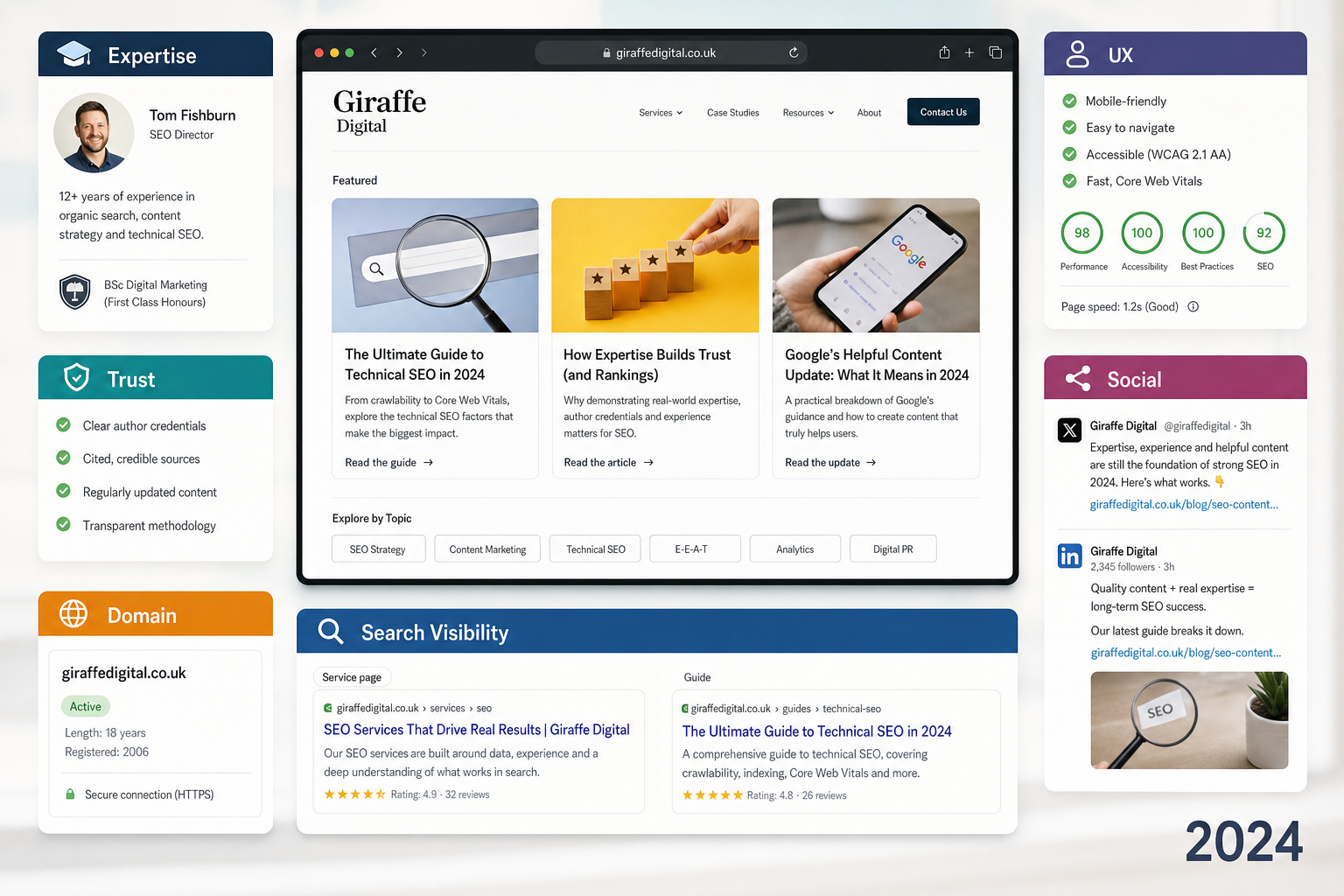
A mobile-friendly website supports the basic commercial goals of most businesses: being found, being trusted and being contacted. Whether you run a professional services firm, a restaurant, a trades business, an e-commerce shop, a charity or a growing regional brand, your website has to perform when a customer needs it.
Consider a potential customer searching for an emergency plumber on a phone. They are unlikely to read long paragraphs or navigate a complicated menu. They need to see where you operate, how to contact you and whether you look credible. A responsive, well-structured website can present that information clearly. A desktop-only website may hide it behind tiny navigation, slow-loading images and awkward forms.
The same applies to higher-value decisions. Someone researching an accountant, solicitor, architect or marketing agency might first discover your brand on a mobile device during a commute or lunch break. They may not submit an enquiry immediately, but their first impression still matters. If the site feels modern, fast and easy to use, they are more likely to return, share it with a colleague or save it for later.
Mobile-friendly design is therefore not only about ranking positions. It affects the quality of every visit. It can improve the likelihood that people read your content, understand your services, trust your brand and take the next step.
Responsive website design is usually the sensible starting point
For many businesses, responsive website design is the most practical approach. A responsive website uses flexible layouts, images and styling so the same page adapts to different screen sizes. Instead of maintaining a separate desktop site and mobile site, you manage one website that works across desktop computers, tablets and smartphones.
This approach has several advantages. It keeps content management simpler, helps avoid duplication and makes it easier for search engines to understand your pages. It also provides a consistent brand experience. Your logo, colours, tone of voice, navigation and calls to action remain recognisable whether a customer visits from an office computer or a mobile phone.
A good responsive design is not just a shrinking version of a desktop design. It should make deliberate decisions about priority. On a smaller screen, the most important content and actions should come first. A visitor should not have to scroll through large banners or decorative panels before finding your services, telephone number, location or enquiry form.
Key features of a mobile-friendly website
- Readable text: Visitors should be able to read content without zooming.
- Touch-friendly navigation: Buttons and links need enough space for fingers, not just a mouse pointer.
- Fast-loading pages: Heavy images and unnecessary scripts can make mobile browsing frustrating.
- Clear calls to action: Telephone numbers, email links, booking options and enquiry forms should be easy to find.
- Flexible layouts: Content should fit the screen without horizontal scrolling.
- Useful content hierarchy: The most important information should appear early on the page.
- Compatible technology: Avoid relying on features that many mobile devices cannot display properly.
Search marketing and Google Mobilegeddon
Search marketing in 2015 requires a balanced view of visibility and user experience. It is not enough to gain a click from Google if the page then disappoints the visitor. Google Mobilegeddon is a reminder that SEO should be connected to website design, content strategy and conversion planning.
Start by reviewing the pages that matter most to your business. These may include your homepage, main service pages, location pages, product categories, contact page and any landing pages used for advertising. Test them on a range of devices, not only in a desktop browser resized to a narrow width. Real phones and tablets reveal practical problems that can be missed during design reviews.
Use Google’s mobile-friendly testing tools and the mobile usability section in Webmaster Tools to identify issues. These tools will not replace professional judgement, but they provide a useful baseline. If Google reports that your pages are not mobile-friendly, it is wise to treat that as a priority.
For businesses running Google AdWords campaigns, mobile usability is also important. Paying for traffic that arrives on a difficult page is inefficient. A mobile visitor who clicks an advert should land on a page that matches their intent and makes the next action obvious. If the advert promotes a specific service, do not send the visitor to a general homepage and expect them to search again.
Social media traffic is increasingly mobile
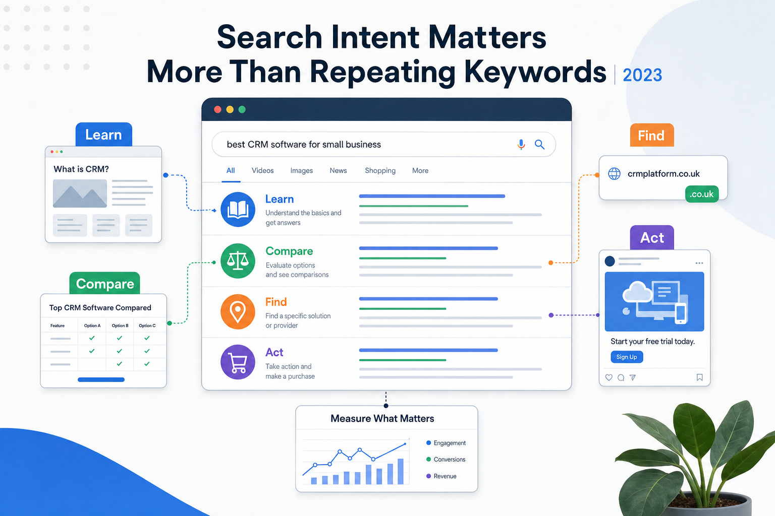
Mobile-friendly design is just as important for social media marketing. Many people use Facebook, Twitter, LinkedIn and Google+ on mobile devices. If your business shares a blog post, campaign page, event announcement or offer, a significant proportion of clicks may come from smartphones.
This creates a common problem. A business invests time in writing updates, building a following and encouraging engagement, but the website experience fails at the point of click-through. The post may be well written and visually appealing, yet the landing page may be slow, cramped or hard to navigate. That weakens the return on the whole campaign.
When planning social media content, think beyond the post itself. Ask what happens after the click. Is the page easy to read on a phone? Does the headline match the social update? Is there a clear next step? Can the visitor share the page, call the business or complete a form without frustration?
Blog articles are particularly important. A useful blog can support SEO, build authority and provide regular material for social channels. However, long-form content needs careful mobile formatting. Short paragraphs, clear headings, sensible spacing and descriptive subheadings make articles easier to scan on small screens.
Branding, trust and the mobile first impression
Your website is often the first serious interaction a customer has with your brand. On a mobile device, that first impression is shaped quickly. A visitor may decide within seconds whether the business looks current, organised and trustworthy.
A dated or awkward mobile experience can suggest that the business is behind the times, even if the service itself is excellent. Conversely, a clear and well-designed mobile site can make a small or growing business appear more professional. Good design gives confidence. It shows that the organisation understands its customers and values their time.
Brand consistency matters. Your mobile website should not feel like a stripped-down afterthought. It should use the same visual identity, tone and values as your wider marketing. The difference is in presentation: mobile design should simplify, prioritise and guide.
A mobile-friendly website is not merely a technical upgrade. It is a better way of welcoming customers who are already trying to find you.
Domain registration and mobile-friendly planning
Domain registration still plays an important role in digital strategy, particularly for new businesses, rebrands and campaign launches. A good domain should be memorable, easy to spell, appropriate for your market and consistent with your brand. For UK businesses, a relevant UK domain can help communicate location and trust, although it should be chosen as part of a broader brand and search strategy.
When choosing a domain, think about how it will work in mobile contexts. People may see it on a business card, van, shop sign, leaflet, social media profile or search result. A short, clear domain is easier to type accurately on a phone. Avoid unnecessary hyphens, confusing spellings and long strings of keywords that look unprofessional.
It is also sensible to register domains with future brand protection in mind. If your business has a distinctive name, consider securing the most relevant variations and extensions where appropriate. Keep registration details organised, renew domains on time and ensure the domain is connected to a reliable hosting and email setup. Do not treat domain ownership as an afterthought; losing control of a key domain can damage marketing, email and customer confidence.
Technology choices that support mobile performance
The technology behind a website affects how well it performs on mobile devices. A modern site should use clean HTML, well-structured CSS and efficient JavaScript. Images should be prepared at suitable sizes rather than uploaded directly from a camera and forced to shrink in the browser. Content management systems should be configured carefully so they do not add unnecessary weight or clutter.
Businesses should also review older features that may not suit mobile browsing. Large image sliders, automatic media, complex drop-down menus and dense sidebar layouts often create problems on smaller screens. Some may be useful in moderation, but they should never obstruct the visitor’s main task.
Forms deserve particular attention. Many enquiries are lost because forms are too long or awkward on a phone. Ask only for the information you genuinely need at the first stage. Use clear labels, logical field order and large submit buttons. If a phone call is a more natural action, make the telephone number prominent.
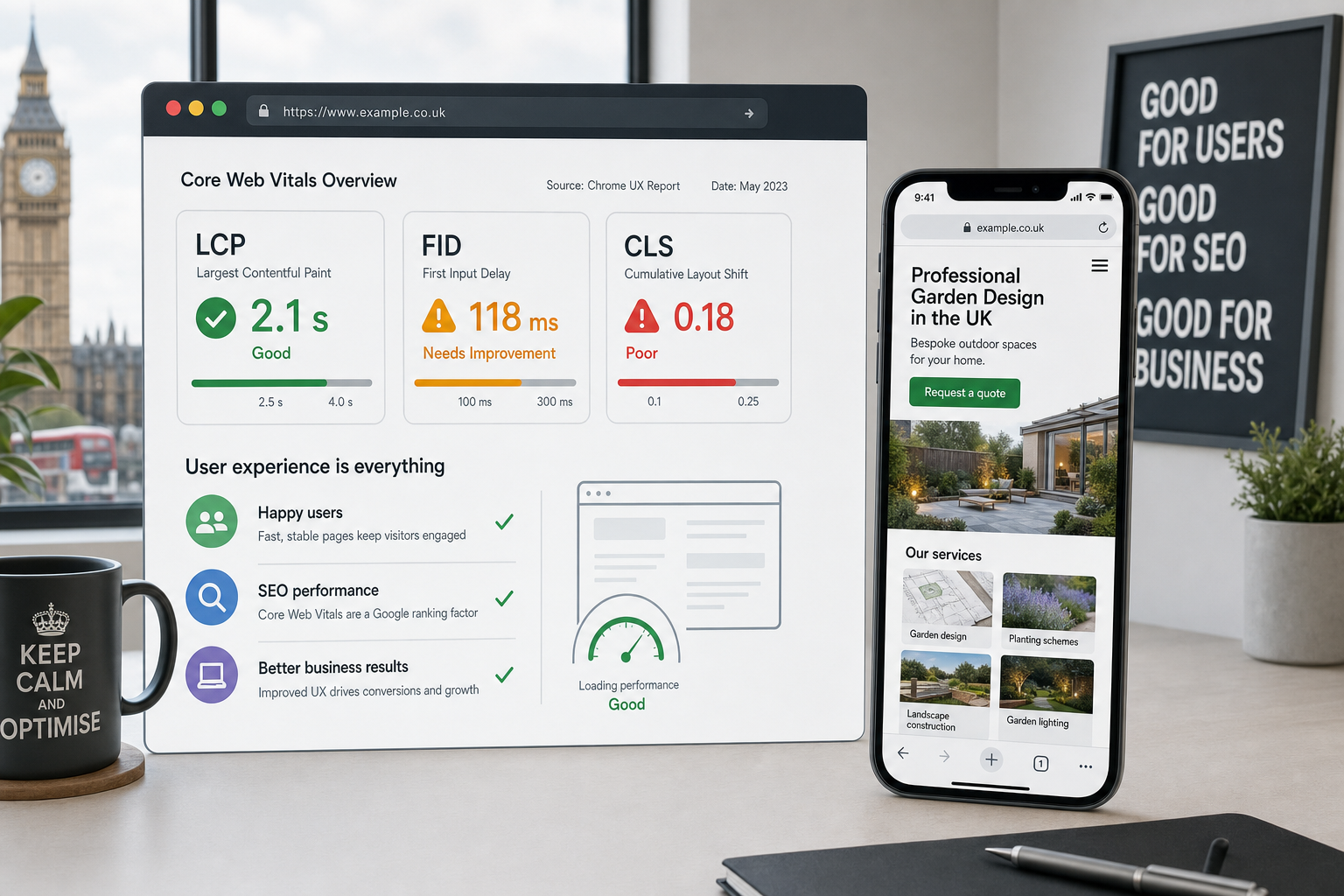
Page speed is another practical concern. Mobile users may be on slower connections, especially when travelling. Compressing images, reducing unnecessary code and choosing dependable hosting can all help. A faster site creates a better user experience and supports stronger search performance.
How to assess your current website
If you are unsure whether your website is ready for Google Mobilegeddon, start with a simple review. Open your site on at least one smartphone and one tablet. Search for your own business on a mobile device and look at how your result appears. Visit your main pages as if you were a new customer with limited time.
Ask these questions
- Can visitors read the text comfortably without zooming?
- Is the navigation simple and easy to tap?
- Does the website load quickly on a mobile connection?
- Are telephone numbers and enquiry options easy to find?
- Do images fit the screen properly?
- Are forms short, clear and usable?
- Does the design still reflect the quality of the brand?
- Can Google Webmaster Tools detect any mobile usability problems?
If the answer to several of these questions is no, it may be time to plan improvements. In some cases, a focused update can resolve key issues. In others, a full redesign may be the better long-term option, especially if the existing site is old, difficult to edit or no longer aligned with the business.
Preparing your business for the mobile web
Google Mobilegeddon should not be viewed as a one-off scare. It is part of a wider shift in how customers use the web. Mobile search, social media browsing, local discovery and online decision-making are now closely connected. A business website has to support that behaviour.
The most effective approach is to treat mobile-friendly design as part of your wider digital marketing strategy. Your website, SEO, content, social media, domain choices, advertising and branding should all work together. A technically sound website gives your marketing a stronger foundation. Clear content helps visitors understand your value. Good design makes taking action easier.
For UK business owners, the next step is straightforward: review your website honestly from a mobile customer’s point of view. If it feels slow, awkward or unclear, your customers are likely to feel the same. By improving mobile usability now, you can protect search visibility, make better use of social media traffic and create a more professional online presence.
Mobile-friendly design is no longer an optional extra for businesses that want to be found online. It is becoming an essential part of credible website design, practical SEO and customer-focused digital marketing.