A well-designed website should do more than look presentable. It should guide visitors towards a useful next step, whether that is making an enquiry, requesting a quote, booking a consultation, downloading a brochure or phoning the office. For many UK businesses, the website is now a central part of sales, marketing and customer service. If visitors arrive and cannot quickly understand what to do next, the site may be costing the business valuable opportunities.
Clear website calls to action are the link between interest and response. They take a visitor who is reading, comparing or considering and show them the most helpful action to take. Good design supports that process by making the call to action easy to find, easy to understand and easy to complete.
What a call to action really does
A call to action is not simply a button with bold text. It is a prompt that encourages a visitor to take a specific step. It may be written as a button, a short sentence, a telephone prompt, a form heading or a link within a page. The best calls to action are clear, relevant and closely connected to the reason the visitor came to the page in the first place.
For example, a service page for a local accountancy firm might invite visitors to book an initial consultation. A page selling commercial cleaning services might encourage readers to request a site visit. A product catalogue might ask visitors to call for availability or download a specification sheet. Each prompt should fit the customer journey and the level of commitment expected at that point.
Too many websites make the mistake of assuming that visitors will work everything out for themselves. A potential customer may like what they see, but if the next step is hidden in a footer, buried on a contact page or described in vague language, they may leave and continue their search elsewhere. Good calls to action remove doubt.
Design should direct attention, not create clutter
Website design has a direct influence on whether calls to action are noticed. Colour, spacing, contrast, page structure and typography all affect where the eye goes first. A button that blends into the background, sits too far down the page or competes with too many other elements will not perform as well as one placed with care.
A strong page layout usually has a clear hierarchy. The visitor should see the main heading, understand the benefit, read enough supporting information to feel confident, and then find the next step. This does not mean every page should be aggressive or filled with oversized buttons. It means the design should make the intended action obvious without making the page feel forced.
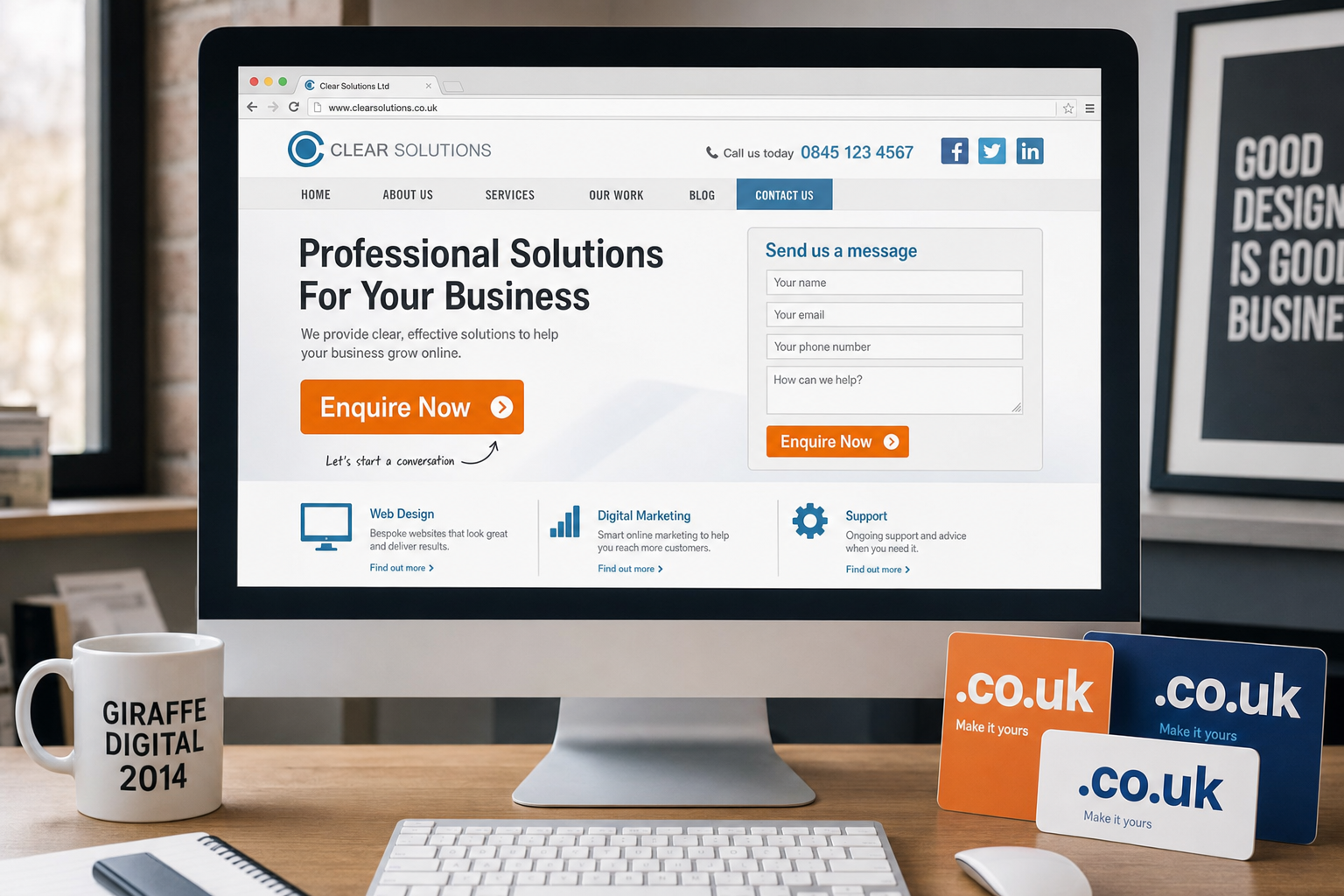
Practical design choices include giving important buttons enough white space, using consistent colours for action elements, keeping form fields to a sensible number, and ensuring phone numbers are easy to see. On longer pages, it may be helpful to repeat the call to action at natural points, particularly after a key benefit, testimonial-style statement or list of services. Repetition is useful when it helps the reader; it becomes clutter when it interrupts them.
Write calls to action in plain, useful language
The wording of a call to action matters. Generic phrases such as click here or submit do not explain what the visitor receives. Stronger wording gives a clear expectation. Examples include Request a brochure, Book a consultation, Ask for a quote, Download the guide and Call to discuss your project.
Business owners should also consider the level of commitment being requested. A visitor who has only just discovered the company may not be ready to buy immediately. Offering a softer action, such as downloading a guide or making an initial enquiry, can help turn early interest into a lead. For visitors who are ready to act, a more direct call to action such as Arrange a call or Request a quote may be more appropriate.
The surrounding copy should explain the value of acting. Instead of simply placing a button at the end of a page, support it with a short benefit. For instance, Tell us about your project and we will recommend the most suitable next step is more reassuring than a bare contact button. The visitor knows why they are being asked to respond.
Match calls to action to different types of page
Not every page on a website should have the same call to action. A home page often needs to direct visitors into the most important areas of the site, such as services, products, case studies or contact details. A service page should usually encourage an enquiry related to that service. A blog article may invite readers to subscribe, read a related guide or contact the business for advice.
Landing pages created for campaigns should be especially focused. If a page is designed for a specific offer, event or service, avoid giving visitors too many competing choices. Keep the message consistent with the advert, email or social media post that brought the visitor there. A campaign promoting a free consultation should lead to a page where booking or requesting that consultation is the main action.
Contact pages also deserve careful thought. They should not be an afterthought. Include clear contact details, opening hours where relevant, a simple enquiry form and any practical information the visitor may need before getting in touch. If the business serves particular towns, regions or sectors, make that clear. A visitor should not have to guess whether the company can help them.
Make enquiries easy on mobiles and tablets
By 2014, many customers are browsing on smartphones and tablets as well as desktop computers. A call to action that works well on a large screen may become awkward on a smaller one if it is too small to tap, placed too close to other links or hidden below a long block of text. Responsive design, or a well-planned mobile version of a site, should make key actions simple across common devices.
Telephone calls remain important for many service businesses. On mobile pages, the phone number should be easy to find and presented in a way that is convenient for the user. Forms should be kept as short as possible, with clear labels and a sensible field order. If a visitor is completing a form on a small screen, unnecessary questions can quickly become a reason to abandon the enquiry.
Testing is essential. Business owners and marketing teams should view important pages on different screen sizes, browsers and devices. Check whether the main action is visible, whether buttons are easy to tap, whether forms behave properly and whether the page loads in a reasonable time. A slow or awkward page can weaken even the best-written call to action.
Support calls to action with trust signals
Visitors are more likely to take action when they feel confident. Design can help by presenting trust signals close to important decisions. These may include professional accreditations, clear company information, a real address where appropriate, recognisable sector experience, guarantees, delivery information, privacy reassurance or concise customer comments used with permission.
Trust signals should be genuine and relevant. Overloading a page with badges, claims and long blocks of reassurance can appear less credible, not more. The aim is to answer sensible concerns at the right moment. If someone is about to submit an enquiry form, a short note explaining how their details will be used may increase confidence. If someone is about to request a quote, it may help to mention what information they will receive next.
Professional branding also plays a role. A consistent logo, colour palette, tone of voice and page layout help a business look organised and reliable. Visitors often make quick judgements online. If the website feels dated, confusing or inconsistent, the call to action may be ignored because the visitor does not feel ready to trust the company.
Consider SEO before and after the click
Search engine optimisation can bring more relevant visitors to a website, but SEO alone does not create enquiries. A page that ranks well must still persuade visitors to take action. This is why website calls to action should be considered as part of the wider search marketing strategy, not added at the end of a design project.
Page titles, headings, meta descriptions and body copy should reflect what the page is genuinely about. If a visitor searches for a particular service and lands on a relevant page, the call to action should continue that same message. For example, a page optimised for office refurbishment should not lead with a generic company contact prompt. It should invite the visitor to discuss an office refurbishment project or request a site assessment.
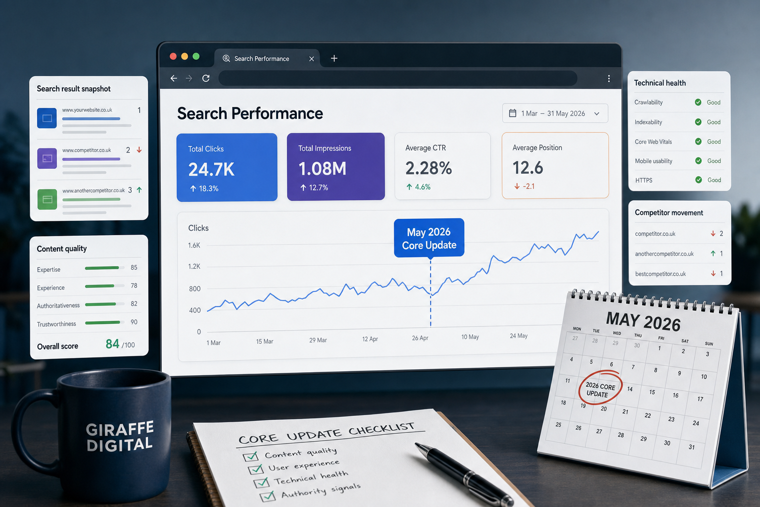
Analytics data can help identify where visitors arrive, which pages they leave from and which paths lead to enquiries. Businesses should review this information regularly rather than treating the website as a one-off brochure. If a page receives traffic but produces few enquiries, the issue may be unclear copy, weak design, a poor call to action or a mismatch between the search phrase and the page content.
Use social media to lead people towards a useful next step
Social media activity should also support clear calls to action. A Facebook update, LinkedIn post or Twitter message may introduce an article, offer, event or service, but the destination page must continue the conversation. If the social post promises advice, the page should provide that advice and then suggest a relevant next step.
For example, a company sharing a blog article about choosing a new website could end the article by inviting readers to request a design review. A business posting photos from a completed project could link to a page explaining that service and encouraging enquiries. The important point is continuity. The user should not feel that they have been sent to a page that has little to do with the post they clicked.
Social media is often a lighter touch than search because people may not be actively looking to buy at that moment. Calls to action from social content may therefore need to be softer. Encouraging visitors to read more, sign up for updates, download a guide or ask a question can be more effective than pushing immediately for a sale.
Choose domains and page addresses with clarity in mind
Domain registration is often discussed in relation to branding and search visibility, but it also affects how confidently people respond to a business online. A clear, memorable domain supports professional credibility and makes it easier for customers to return, recommend the site or recognise links in emails and printed marketing.
When choosing a domain, businesses should aim for something easy to spell, easy to say and closely connected to the organisation or trading name. Hyphens, unusual spellings and overly long names can cause confusion. Where relevant, a UK-focused domain extension may help signal location and market. It is sensible to register important variations where they protect the brand, but the main address should remain simple.
Page addresses should also be tidy and meaningful. A service page with a clear address is easier to share and more reassuring than a long string of numbers or unclear characters. This is useful for visitors, search engines and anyone using the link in a social media post, email newsletter or printed brochure.
Measure, refine and keep improving
Calls to action should not be treated as guesswork. Small changes can make a significant difference, but they should be made thoughtfully. Businesses can review enquiry levels, form submissions, phone calls, email responses and page behaviour to see whether visitors are taking the desired steps.
Useful questions include: Is the main call to action visible without searching? Does the wording explain the benefit? Is the form too long? Are there too many competing buttons? Does the page answer the objections a customer is likely to have? Does the same message continue from search result, advert, email or social media post through to the landing page?
Testing different wording, button positions or page layouts can help, provided the results are judged over a sensible period. It is also important not to change too many elements at once, otherwise it becomes difficult to know what has made the difference. Even simple observation can be valuable: ask someone unfamiliar with the site what they think the next step is on a key page. If they hesitate, the design may need to work harder.
Clear direction creates better business value
A website is often the first place a potential customer goes before contacting a business. It may support recommendations, search visibility, social media activity, email campaigns and printed marketing. If the design does not make the next step clear, much of that effort can be wasted.
Effective website calls to action combine strategy, writing, design and technical planning. They help visitors understand what to do, reassure them at the point of decision and make it simple to respond on the device they are using. For UK businesses investing in website design or digital marketing, this is not a minor detail. It is one of the most practical ways to turn online attention into real enquiries.
The best approach is to design every important page with a purpose. Decide what the visitor needs, what the business wants them to do next, and how the page can bring those two aims together. When calls to action are clear, relevant and well designed, the website becomes more than an online presence. It becomes a useful business tool.