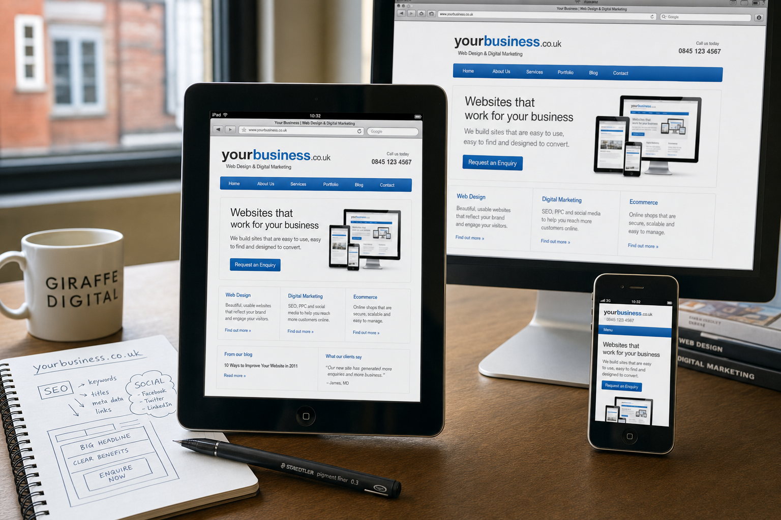
Tablet computers are quickly changing the way people browse the web. Since the arrival of the iPad and the growing number of Android tablets and other devices entering the market, many UK businesses are finding that their websites are no longer viewed only on desktop computers or small mobile phones. Customers may now be reading your services page from the sofa, checking your opening hours in a café, browsing your product range on a train journey, or comparing suppliers during a meeting. A tablet-friendly website is therefore becoming an important part of good wwebsite design not a luxury extra.
For business owners, the rise of tablets presents both a challenge and an opportunity. A site that looks dated, cramped, or difficult to use on a touchscreen can discourage enquiries. A site that is clear, fast, easy to navigate and comfortable to read on a tablet can help your organisation stand out. The key is to think carefully about how real people use these devices and to make practical improvements that support browsing, search visibility, branding and conversion.
Why tablets matter for business websites
Tablet use is growing because the devices fit naturally between desktop computers and mobile phones. They offer a larger screen than most phones, but they are more portable and easier to use than a laptop. This means visitors may spend longer reading, browsing images and researching services. For businesses that rely on considered decisions, such as professional services, home improvement, hospitality, education, retail or business-to-business suppliers, this can be especially valuable.
Unlike the traditional desktop experience, tablet browsing is often touch-led and more informal. Visitors tap, swipe and scroll rather than use a mouse. They may rotate the screen between portrait and landscape. They may be using a home wireless connection, public Wi-Fi or a mobile data connection. These details affect how a website should be planned. If the navigation is too small, if forms are awkward to complete, or if important content is hidden behind features that do not work well on the device, the visitor may move on.
A tablet-friendly website does not mean building a completely separate business strategy for every new device. It means making sensible design and technical decisions so that your website remains usable and persuasive across a wider range of screen sizes. In many cases, the same improvements that help tablet users also improve the experience for desktop and mobile visitors.
What makes a website tablet friendly
A tablet-friendly website should be easy to view, easy to touch and easy to understand. The design should not depend on a single fixed screen size, nor should it assume that every visitor has a mouse, keyboard or identical browser. Good tablet design starts with content and user behaviour rather than decoration.
Readable layouts and flexible design
Many older websites are built around narrow or rigid layouts. They may work adequately on a desktop monitor, but on a tablet they can feel cramped in portrait view or poorly spaced in landscape view. A more flexible layout helps content adapt to different widths. This might involve using wider content areas, avoiding tiny columns, allowing images to scale sensibly, and testing how pages look when the tablet is rotated.
CSS media queries are also becoming a useful approach for applying different layout rules based on screen size. Used carefully, they can help adjust navigation, column widths and spacing for tablet and mobile users without the need to create a completely separate website. However, the aim should not be to chase every device individually. The aim should be to create a robust, adaptable design that supports the main ways people browse.
Touch-friendly navigation
Tablet users tap with a finger, not a mouse pointer. Small text links placed too closely together can be frustrating. Menus, buttons and calls to action should be large enough to select comfortably. This is particularly important for navigation bars, product categories, enquiry buttons, telephone links and form controls.
Drop-down menus also deserve attention. Menus that rely heavily on mouse hover may not behave well on a touchscreen. If important pages are hidden within hover-only navigation, tablet visitors may not be able to reach them easily. A simpler menu structure, clear category pages and prominent internal links can make the website easier for everyone to use.
Fast loading pages
Tablets encourage relaxed browsing, but visitors still expect pages to load promptly. Large images, unnecessary scripts and overcomplicated page elements can slow a site down, particularly on mobile data connections. Compressing images, keeping page templates tidy, and avoiding needless effects can help maintain acceptable performance.
Speed also matters for search marketing. Search engines want to provide useful results, and a slow, awkward website is less likely to satisfy visitors. While content and relevance remain central to SEO, technical quality and user experience should not be ignored.
Content and conversion on tablet screens
Tablet browsing often lends itself to research. A visitor may not be ready to buy or enquire immediately, but they may be forming an opinion about your business. Your content needs to communicate trust quickly and clearly.
Strong headings, concise introductions and well-structured pages are important. A services page should explain what you do, who you help and what the next step is. A product page should show clear images, useful details and an obvious route to purchase or enquiry. A contact page should be simple, with key information easy to find.
Forms should also be reviewed. Long forms can feel especially awkward on a tablet. Ask only for the information you genuinely need at the first stage. Labels should be clear, fields should be easy to select, and error messages should be helpful. If your business relies on telephone enquiries, make sure the number is prominent. Some tablet users may not call directly from the device, but they still need the information quickly.
Calls to action should be visible without being overbearing. Examples include Request a brochure, Book a consultation, Check availability, View our portfolio or Send an enquiry. The right wording depends on the business, but the principle is the same: make the next step obvious.
Technology choices to consider in 2011
Tablet compatibility should be discussed early in any website design or redesign project. It is much easier to plan for different devices from the outset than to repair a site after launch.
One important consideration is the use of technologies that are not supported consistently across tablets. For example, some popular tablet devices do not support Flash as desktop computers do, and relying on Flash for core navigation, important content, or product demonstrations may exclude a portion of your audience. If a feature is important to the sales process, it should be available in a more broadly accessible form.
HTML, CSS and well-planned JavaScript can provide many of the effects and interactions businesses need, provided they are used carefully. Progressive enhancement is a sensible principle: build the essential content and functionality first, then add richer features where devices and browsers can support them. This helps maintain the site's usability across tablets, phones and desktops.
Testing is also vital. It is not enough to check a website only on a large office monitor. At minimum, key pages should be reviewed on common tablet screen sizes and orientations. The home page, main service pages, product pages, blog, enquiry forms and Checkout process, where relevant, should all be tested. It is also worth checking how the site behaves when images load slowly or when the connection is less reliable.
Search marketing and tablet visitors
A tablet-friendly website can support SEO by improving the quality of visits. Search marketing in 2011 is not simply about placing keywords on a page. It is about providing relevant content, clear structure and a website that people can actually use.
The primary keyword for a page should appear naturally in headings and body copy where appropriate, but it should not be forced. Search engines are becoming better at recognising quality, and visitors are quick to spot pages written solely for rankings. Useful pages, thoughtful internal linking and regularly updated content can all help strengthen visibility.
Local search is also important for many UK businesses. If you serve a local area, make sure your address, telephone number and service locations are easy to find. Consistency matters across your website and other online listings. A tablet user searching for a nearby supplier may be ready to take action, so location information should not be buried.
Analytics should be reviewed regularly. Website statistics can show which devices and browsers people are using, which pages attract tablet visitors, and where users leave the site. This evidence is helpful when deciding whether to improve a form, simplify a page or adjust the layout. Rather than guessing, businesses can make measured improvements based on behaviour.
Social media and tablet browsing
Tablets are well suited to social media use. People browse Facebook, Twitter, LinkedIn and YouTube from tablets while relaxing, travelling or attending events. If your social media marketing brings visitors back to your website, the landing pages must be suitable for tablet users.
For example, if you share a blog article on Twitter, the page should load quickly, display clearly and make it easy for the visitor to continue reading related content. If you promote a video, it should be embedded in a way that works on common tablet devices. If you post an offer or event announcement on Facebook, the linked page should make the next step obvious.
Social sharing buttons should be used sensibly. They can help content travel further, but they should not clutter the page or slow it down. The content itself remains the most important factor. A helpful guide, a useful announcement, a strong image gallery, or a clear product explanation is more likely to be shared than a thin page with little value.
Branding, trust and the tablet experience
A website is often the first substantial impression a potential customer has of a business. On a tablet, design details can feel especially prominent because the visitor is holding the screen close and interacting directly with the page. Poor spacing, low-quality images and inconsistent branding can reduce confidence.
Strong branding does not require excessive decoration. It requires consistency and clarity. Your logo, colours, typography, photography and tone of voice should all support the same message. If your business is professional and established, the website should feel reliable. If your business is creative and energetic, the design should express that without making the site difficult to use.
Trust signals are also important. Case studies, testimonials, trade memberships, clear contact details, privacy information and well-written about pages can all help reassure visitors. These should be easy to find on a tablet, not hidden in small footer links or awkward PDF downloads.
Domain names and planning for future growth
Tablet usage is another reminder that your website is a long-term business asset. Domain registration should be handled carefully as part of your wider digital strategy. Choose a domain name that is easy to spell, easy to say aloud and closely connected to your business name or core service. For UK businesses, it is often sensible to consider appropriate UK domain options and to protect closely related variations where practical.
Avoid choosing a domain that is too long, overly clever or dependent on a passing trend. A strong domain should support brand recognition across print, email, search results, social media profiles and word of mouth. Before registering a domain, check that it does not create confusion with an existing organisation and that it will still make sense if your services expand.
It is also worth keeping domain ownership records organised. Make sure the domain is registered in the correct name, renewal dates are monitored, and access details are stored securely. Losing control of a domain can disrupt email, search visibility and customer confidence.
Practical steps for UK business owners
If you are unsure whether your current website is ready for tablet visitors, start with a simple review. Open the site on a tablet and try to complete common tasks. Can you read the text comfortably? Can you use the menu? Can you find the contact details? Can you submit an enquiry? Can you view images and videos? Does the site still work when the screen is rotated?
Next, look at your analytics. If tablet traffic is already appearing, examine how those visitors behave compared with desktop users. If they leave quickly or fail to complete enquiries, there may be a usability issue. If tablet traffic is still small, that does not mean it can be ignored. The direction of travel is clear, and improving the site now can place your business in a stronger position.
For a new website project, include tablet-friendliness in the brief from the outset. Discuss layout, navigation, content hierarchy, forms, media, SEO and analytics. Ask how the design will adapt to different screen sizes and how it will be tested. A good website should serve the business, the customer, and the search engines.
A tablet friendly website is not simply about fitting a page onto a smaller screen. It is about creating a clearer, more flexible and more useful online experience for people who are ready to browse, compare and enquire in new ways.
Preparing your website for the next stage of browsing
The growth of tablets is part of a broader change in online behaviour. People expect websites to be available wherever they are and on whichever device they choose. Businesses that respond with practical, user-focused improvements will be better placed to earn attention, trust and enquiries.
For many organisations, the best approach is not a complete rebuild overnight, but a planned programme of improvement. Start with the pages that matter most: your home page, key service pages, product information, contact page and enquiry forms. Make them clearer, faster and easier to use. Then build content and campaigns that bring the right people to those pages.
A tablet-friendly website can support your brand, improve the customer experience, strengthen your digital marketing, and help turn more visitors into genuine enquiries. As tablet browsing becomes more common, designing with these users in mind is good business practice.