Mobile-first design is no longer a specialist consideration reserved for large retailers or technology-led organisations. For many UK businesses, the first meaningful contact a customer has with a brand now happens on a phone: a search result tapped during a commute, a Facebook post opened at lunchtime, a map listing checked outside a shop, or an email link followed between meetings. If a website project begins with the desktop version and treats the mobile experience as a later adjustment, it risks solving the wrong problem first.
A mobile-first approach asks a simple but important question at the start of a website design project: what does a customer need to see, do and understand on the smallest practical screen? Once that has been answered clearly, the experience can be enhanced for tablets, laptops and larger desktop displays. This is not about making a website smaller; it is about making it sharper, faster and easier to use.
What mobile-first design means in practice
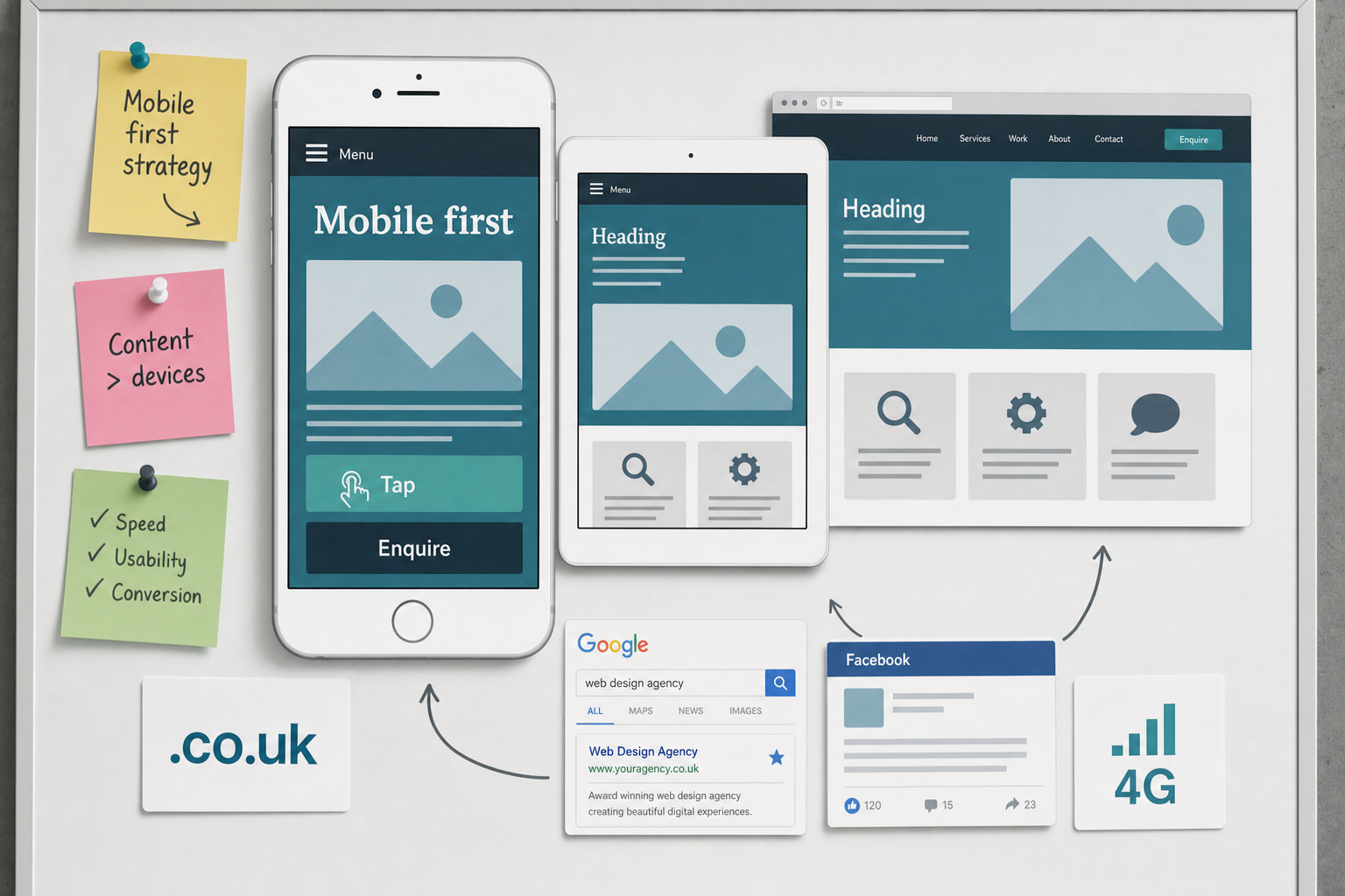
Mobile-first design is a planning and design method that begins with the constraints of mobile devices. Smaller screens, touch navigation, variable connection speeds and shorter browsing sessions all influence how a site should be structured. By designing for these conditions first, businesses are encouraged to prioritise the most valuable content, the clearest calls to action and the simplest journeys.
This differs from the older habit of creating a full desktop layout and then reducing it until it fits on a phone. That approach often leads to crowded pages, oversized images, hidden features and forms that are difficult to complete. A mobile-first process starts lean, then adds detail where larger screens can support it.
For example, a local service business may decide that a mobile visitor should immediately see what the business does, where it operates, how to enquire and whether it is credible. On a phone, that could mean a concise opening statement, a prominent telephone or enquiry button, brief trust signals and clear navigation to core services. On a desktop, the same page may include supporting case studies, longer explanatory copy and additional imagery, but the essential journey remains focused.
Mobile-first design also works closely with responsive website design. Responsive design allows the layout to adapt across screen sizes, while mobile-first design sets the priorities that guide those adaptations. In combination, they create websites that feel intentional on phones rather than merely compressed.
Why mobile behaviour matters to UK businesses
Customer behaviour has changed quickly. People use mobile devices to research purchases, compare services, read reviews, check opening hours, complete forms and contact businesses directly. Even where a final purchase or enquiry happens later on a desktop computer, the first impression may already have been formed on a phone.
This matters because mobile browsing is often impatient. A visitor may be using a weaker connection, holding the device with one hand or looking for a quick answer. If the site loads slowly, hides important information or forces awkward pinching and zooming, that visitor has little reason to persevere. A competitor with a clearer experience is only one search result or social post away.
For business owners, the value of mobile-first design is practical. It can support more enquiries, stronger engagement and better use of marketing spend. Paid search, organic search, email campaigns and social media activity all direct people towards the website. If the destination page is not suited to mobile users, the campaign may be weakened before the sales conversation begins.
A mobile-first website also helps brand perception. A well-structured mobile experience suggests that the business is organised, modern and considerate of its customers’ time. A difficult mobile experience can make even a reputable organisation appear behind the curve.
Search marketing and mobile visibility
Search engines have been placing greater emphasis on mobile usability. Google’s mobile-friendly labels and testing tools have helped businesses understand whether their pages are suitable for smaller screens, and Google has also begun experimenting with mobile-first indexing. This means that the mobile version of a website is becoming increasingly important to how search engines understand and assess a page.
For website owners planning a new build or redesign in March 2017, the sensible response is not to panic, but to plan properly. The mobile version of the site should contain the important content, page titles, headings, internal links and structured information required for both users and search engines. It should not be a stripped-down afterthought with only a fraction of the useful information found on desktop.
Good search performance still depends on fundamentals: relevant content, clear page structure, crawlable links, sensible use of headings, descriptive page titles and trustworthy information. Mobile-first design strengthens these fundamentals by forcing clarity. If a page cannot explain its value clearly on a phone, it may also be too vague or cluttered on larger screens.
Page speed is another important consideration. Mobile users may not always be connected to strong Wi-Fi. Large image files, excessive scripts and poorly planned layouts can slow the site down. Practical improvements include compressing images, avoiding unnecessary visual effects, limiting heavy third-party additions and testing important pages on real devices as well as in desktop browsers.
Businesses should also remember local search behaviour. Many mobile searches have local intent, such as finding a nearby shop, professional service, restaurant or tradesperson. Clear contact details, accurate location information, opening hours and service area content can all help customers act with confidence. A mobile-first design should make this information easy to find without forcing users through several layers of navigation.
Designing content for smaller screens
Mobile-first design is not only a technical process. It is also an editorial discipline. Long, unfocused pages can be difficult to use on a phone, especially when the main point is buried beneath decorative banners or vague introductory copy. The best mobile experiences use concise wording, meaningful headings and a logical order of information.
A useful approach is to ask what the visitor is likely to need at each stage. A new visitor may need reassurance that they have found the right type of business. A returning visitor may want to contact the team quickly. A comparison-stage visitor may need proof, frequently asked questions or details of the process. These needs should shape the page hierarchy.
Calls to action should be obvious but not aggressive. Buttons should be large enough to tap comfortably, with wording that describes the action: enquire now, request a call, view services, download the guide or find our location. Telephone links can be useful for businesses that rely on calls, while short forms may suit customers who prefer to send details in their own time.
Forms deserve particular attention. On mobile, every unnecessary field increases friction. A business may want a great deal of information, but the first enquiry form should usually ask only for what is needed to respond properly. Labels should be clear, error messages should be helpful and fields should be easy to select with a thumb.
Social media traffic is often mobile traffic
Social media marketing and mobile-first design are closely connected. Many users access Facebook, Twitter, Instagram and LinkedIn through mobile apps. When a business shares a blog post, landing page, campaign or product update, a large proportion of visitors may arrive on a small screen.
This has several implications. The page being shared should load quickly, display a strong headline and provide a clear continuation from the social post. If a user taps through from a short update and lands on a confusing page, the opportunity can be lost. Consistency between the social message and the page content is essential.
Images also need care. A graphic that looks impressive on a large monitor may be unreadable when reduced in a social feed or on a mobile landing page. Text within images should be minimal and legible. Where possible, important information should be placed in HTML text on the page rather than locked inside an image, helping both accessibility and search understanding.
For campaigns, it is worth testing the full journey on a phone before publishing. Tap the social post, open the page, read the content, complete the form and check the confirmation message. This simple exercise often reveals small issues that would otherwise frustrate real customers.
Technical foundations to consider in 2017
A mobile-first website project should be supported by sensible technical decisions. The site should use a responsive layout, readable typography, compressed imagery and navigation designed for touch. Menus should be simple, but not so hidden that users cannot find important sections. Common patterns such as a compact menu icon can work well when supported by clear labelling and logical structure.
Browser testing remains important. A site should be checked across widely used mobile browsers and devices, including different screen sizes and operating systems. Emulators are helpful, but they should not replace testing on real devices. Issues such as tap accuracy, form behaviour and loading performance are easier to judge on the devices customers actually use.
Security should also be part of the discussion, particularly for websites that collect enquiries, account details or payment information. Using HTTPS is increasingly expected by users and browsers, and it helps reassure visitors that information is being handled responsibly. Security is not simply a technical badge; it contributes to trust.
Content management should be practical for the business. If staff need to update news, services or campaign pages, the system should make that possible without breaking the mobile layout. A website that looks good at launch but becomes untidy after routine updates will not serve the business well for long.
Domain names, branding and mobile recall
Domain registration is sometimes treated as a quick administrative task, but it has a direct relationship with branding and marketing. A good domain name should be easy to say, spell, remember and type on a mobile keyboard. If a customer hears the name in conversation, sees it on a van or notices it in a printed advert, they should be able to reach the website without confusion.
For UK businesses, a relevant UK domain can support familiarity and trust, while a broader domain may be useful for organisations with international ambitions. The right choice depends on the business name, audience, market and long-term plans. It is often sensible to secure closely related versions where appropriate, provided they can be managed clearly and redirected properly.
Avoid unnecessary hyphens, awkward abbreviations and spellings that need repeated explanation. Shorter is often better, but clarity is more important than cleverness. The domain should work well in email addresses, on signage, in social media profiles and in spoken recommendations.
Before registering a domain, businesses should also consider brand consistency. The website address, trading name and social media handles should feel connected where possible. This makes it easier for customers to recognise the organisation across search results, social platforms and offline marketing materials.
How to plan a mobile-first website project
A successful project begins with objectives rather than decoration. Before discussing colours, layouts or photography, the business should identify what the website needs to achieve. Is the priority to generate enquiries, sell products, explain services, support recruitment, build authority or assist existing customers? The answer will influence the structure and content.
It is helpful to map the main user journeys. A visitor may arrive from search looking for a specific service, from social media after seeing a campaign, or directly after receiving a recommendation. Each route should lead to relevant information and a clear next step. Mobile-first design keeps these journeys focused because there is limited room for distraction.
Analytics from an existing website can provide useful evidence. Device usage, popular pages, enquiry paths and exit points can all inform the redesign. However, data should be interpreted carefully. If mobile conversion is low, it may not mean mobile visitors are less valuable; it may mean the current mobile experience is poor.
Wireframes are particularly useful in a mobile-first process. Starting with a simple mobile wireframe helps everyone agree on hierarchy before visual design begins. Once the small-screen structure is right, the layout can be expanded for tablets and desktops. This reduces the risk of designing attractive pages that do not support real user tasks.
Common mistakes to avoid
One common mistake is hiding too much content on mobile. Simplification is useful, but removing important service information, testimonials, location details or guidance can weaken both user confidence and search relevance. The goal is to prioritise content, not to deprive mobile visitors of substance.
Another mistake is relying on large homepage banners to do the work of communication. On a phone, oversized banners can push useful content too far down the page, slow loading and offer little value. Strong copy, clear navigation and relevant supporting imagery are usually more effective.
Businesses should also avoid designing only for the newest or largest phones. Customers use a wide range of devices, including older handsets with smaller screens. A robust design should work gracefully across common conditions, not only in a perfect presentation environment.
Finally, a mobile-first website should not be viewed as a one-off task. Search behaviour, social media habits and business priorities continue to change. Reviewing performance, updating content and improving key journeys should be part of the ongoing digital marketing programme.
A better starting point for digital growth
Mobile-first design gives businesses a stronger foundation for website design, SEO, social media marketing and wider digital strategy. It encourages clearer priorities, faster pages, better content and smoother customer journeys. Most importantly, it reflects how people actually discover and assess businesses online.
For UK business owners planning a new website or considering a redesign, the question should not be whether the site can be made to work on mobile after everything else has been decided. The better question is what the mobile visitor needs first, and how the wider website can grow from that answer.
When mobile-first design guides the project from the beginning, the result is not just a smaller version of a desktop site. It is a more focused digital presence: easier to use, easier to market and better prepared for the way customers search, browse and make decisions.