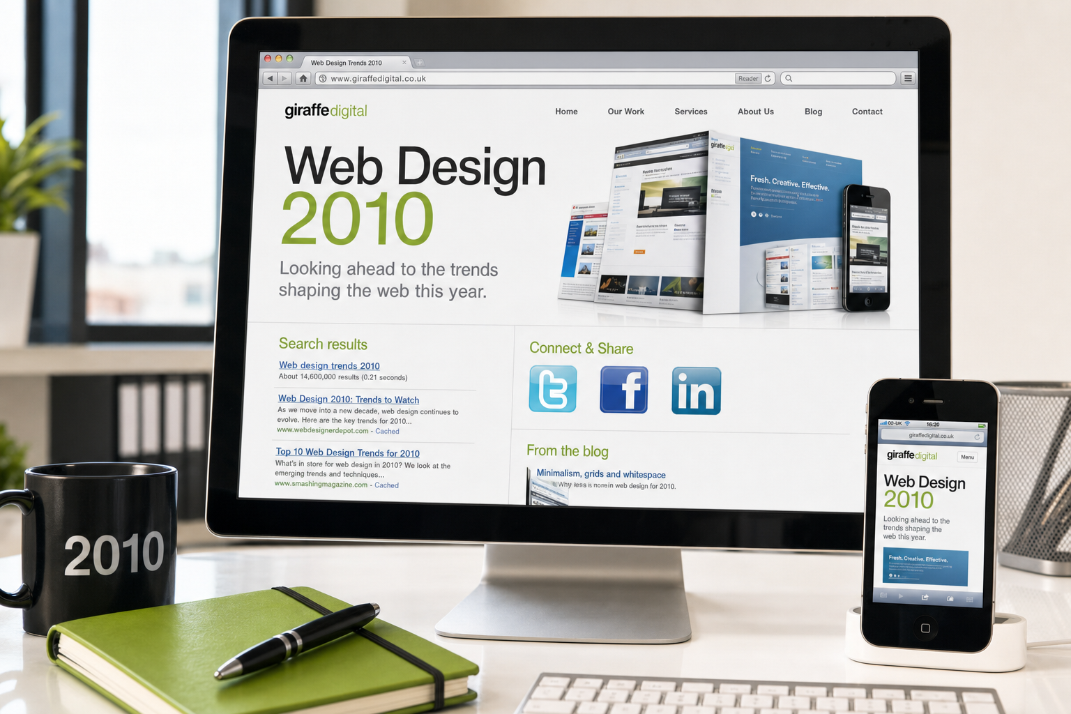
As 2010 begins, a business website is no longer simply an online brochure. For many UK organisations, it is the first place a customer checks before making an enquiry, arranging a visit, requesting a quotation or choosing between suppliers. The most useful web design trends 2010 are not about novelty for its own sake. They are about making websites clearer, faster, easier to update and better connected to the way people now search, compare and share information online.
For business owners, the key question is not whether a design looks fashionable, but whether it helps a real visitor take the next sensible step. A strong website should explain what you do, build trust quickly, work reliably in common browsers, support search visibility and give people convenient ways to get in touch. With that in mind, the trends below are worth considering when planning a new website, refreshing an existing one or reviewing your wider digital marketing for the year ahead.
Clearer, cleaner design with stronger messages
One of the most noticeable shifts in website design is the move away from cluttered pages packed with competing boxes, badges and animated features. More businesses are choosing cleaner layouts with a clearer visual hierarchy. This means more purposeful use of space, stronger headings, better photography and fewer distractions around the main message.
For a business website, this approach has practical value. Visitors often arrive with a specific question: can this company help me, is it credible, where is it based, and how do I make contact? A clean design helps answer those questions without forcing the visitor to work too hard. The home page should quickly introduce the organisation, show the main services or products, and guide users to the next step, whether that is an enquiry form, a telephone number, a product category, or downloadable information.
Large headings, short introductory statements and well-placed calls to action are likely to remain important through 2010. The best examples will not simply use bigger type; they will use stronger content. A heading such as Commercial electrical services for Hampshire businesses is far more useful than a vague welcome message. It tells both visitors and search engines what the page is about.
Designing for trust and credibility
Trust is a design issue as much as a marketing issue. In a competitive market, a dated or confusing website can raise doubts even when the business itself is professional and reliable. During 2010, more organisations are likely to pay closer attention to credibility signals throughout their websites.
Useful trust elements include clear contact details, an address where appropriate, staff or premises photography, trade memberships, testimonials, guarantees, case studies and carefully written service pages. These elements should be presented with restraint. A page overloaded with badges and claims can feel less convincing than one that clearly explains the company and backs up its statements with relevant details.
For service businesses, a good example would be a page that explains the problem the customer faces, outlines the process, shows the areas covered and includes a straightforward enquiry route. For retailers, clear delivery information, returns guidance and secure Checkout reassurance are essential. Good design supports these messages by making them easy to find rather than hiding them in small print.
Mobile access becomes harder to ignore
Although most visitors still use desktop and laptop computers, mobile web access is growing quickly. More people are checking websites on smartphones, thanks to improved mobile browsers. A website that is awkward to read or impossible to navigate on a smaller screen may already be losing enquiries, especially from people looking for directions, opening hours, telephone numbers or quick product information.
In 2010, many businesses will not need a separate mobile website, but they should at least consider how their existing site behaves on smaller screens. Important contact details should be available as normal text, not trapped inside an image or an animation. Navigation should be simple, pages should not be unnecessarily heavy, and key information should appear near the top of the page.
It is also worth being cautious with technology that excludes mobile users. Heavy Flash introductions and navigation systems can cause problems for some visitors and may offer little search marketing benefit. Flash can still be used creatively in the right circumstances, but it should not contain the only version of important text, links or calls to action. A practical business website should work even when a visitor cannot view every enhancement.
Better typography, imagery and brand consistency
Web typography is becoming more sophisticated, but it still needs to be handled carefully. Most business websites should prioritise readability. Strong contrast, sensible line lengths and consistent heading styles make a website feel more professional and help users scan pages.
Designers are also making better use of photography and illustration. Rather than relying only on generic stock images, more businesses are beginning to show their real people, places, products and processes. This can be especially effective for local companies, professional services, venues, manufacturers and organisations where personal confidence matters.
Brand consistency will also be important in 2010. A website should not feel separate from the rest of the organisation. Colours, logo use, tone of voice, printed materials, email newsletters and social media profiles should all feel connected. This does not mean every channel must look identical, but it should be clear that they belong to the same business.
Search-friendly structure from the start
Search engine optimisation is most effective when it is considered during the planning and design stage, not added as an afterthought. A visually attractive website can still underperform if search engines cannot understand its structure or if important services are buried too deeply.
For 2010, businesses should pay particular attention to page titles, headings, readable text, internal links and logical page organisation. Each main service or product category should usually have its own focused page rather than being squeezed into a single general page. This gives visitors clearer information and gives search engines a better understanding of what each page offers.
Good web design should also avoid unnecessary barriers to indexing. Important content should be available in HTML text wherever possible. Navigation should be clear and crawlable. Images should use helpful alternative text where relevant. Page addresses should be tidy, descriptive and stable, so that links and bookmarks continue to work over time.
Local visibility is another important consideration for UK businesses. If your company serves a particular town, county or region, that information should be reflected naturally in the website content. A page that explains accountancy services in Bristol or hotel accommodation near York city centre can be more useful than a generic service description without geographical context. Businesses should also ensure that their contact details are consistent across their website and appropriate online listings.
Content that earns attention
One of the strongest web design trends 2010 will be the closer relationship between design and content. A website needs more than an attractive frame; it needs useful information that helps customers make decisions. Well-structured content can reduce repetitive enquiries, improve search visibility and support the sales process.
Useful content might include buying guides, frequently asked questions, maintenance advice, project examples, industry updates, downloadable brochures or simple explanations of technical subjects. A solicitor might publish guidance on what to prepare before an initial consultation. A building firm might explain the stages of a renovation project. A retailer might compare product options and help customers choose the right model.
Blogs and news sections can be valuable if they are maintained properly. They give businesses a place to publish timely information, answer common questions and demonstrate expertise. However, an abandoned blog can do more harm than good. If a company cannot commit to regular updates, it may be better to maintain a smaller advice section with evergreen content that remains useful for longer.
Social media becomes part of the marketing mix
Social media is no longer just a novelty for consumer brands. Many businesses are experimenting with Facebook, Twitter, LinkedIn and online forums to build relationships, answer questions and distribute content. In 2010, the most successful use of social media will be practical and purposeful rather than rushed or fashionable.
A business should first decide what it wants social media to achieve. Possible aims include sharing company news, promoting useful articles, handling customer questions, networking with other professionals, supporting events or encouraging repeat visits to the website. The website should act as the central hub, with social profiles pointing visitors back to useful pages, contact forms, offers or resources.
It is wise to keep social media links visible but not overpowering. A website does not need to be covered in icons. A simple invitation to follow the company for updates, combined with genuinely useful posts, is more effective than a row of unused profiles. Businesses should also remember that public conversations require care. Tone, response times and accuracy all contribute to reputation.
More attention to speed and usability
Broadband access is common, but not every visitor has a fast connection or a modern computer. Page speed and usability remain important. Large image files, excessive scripts, unnecessary animation and complicated navigation can frustrate users before they ever reach the enquiry stage.
Good usability is often simple. Menus should use familiar labels. Contact details should not be hidden. Forms should ask only for information that is genuinely needed. Error messages should be clear. If a visitor clicks on a service, product or article, the next step should feel obvious.
Browser compatibility also remains a real consideration. Many workplaces still use older browsers, while others are adopting newer versions of Internet Explorer, Firefox, Safari and Chrome. A business website should be tested across the browsers its audience is likely to use. It does not have to look absolutely identical in every browser, but it should remain usable, readable and professional.
Careful use of new web technologies
Designers are beginning to explore newer techniques, including richer JavaScript effects, improved CSS and early uses of HTML5. These developments are exciting, but business owners should take a balanced view. The best use of technology is the one that improves the visitor experience without excluding a significant part of the audience.
Subtle interactive features can help users browse galleries, reveal extra information, compare options or complete forms more easily. However, effects should not be added simply because they are available. If an animation slows down the page, hides important content or confuses the visitor, it is working against the business.
Progressive enhancement is a sensible principle. A website should provide the essential information and functions first, then add richer presentation for browsers that support it. This approach helps protect search visibility, accessibility and long-term maintainability.
Domain names and online identity
A good domain name remains an important business asset. When choosing a domain in 2010, UK businesses should look for names that are memorable, easy to spell and closely connected to the company or activity. A suitable .co.uk address is often a strong choice for a UK-focused business, while a .com may also be useful for organisations with wider ambitions.
Avoid domain names that are unnecessarily long, difficult to say over the telephone or easy to confuse with another organisation. Hyphens can sometimes make a name clearer, but too many can look awkward and may be forgotten by customers. It is also sensible to register obvious variations where they protect the brand, including common misspellings if they are likely to matter.
Domain registration should be treated as part of business administration, not as a one-off technical detail. Keep ownership records accurate, use a reliable contact email address and make sure renewal responsibilities are clear. Losing control of a domain can cause serious disruption to email, search visibility and customer confidence.
Measurement and continual improvement
A website should not be judged only on how it looks on launch day. Businesses increasingly need to understand how visitors find the site, which pages they use, where enquiries come from and which content performs best. Basic analytics can provide valuable information, but it should be interpreted sensibly.
Useful questions include: which search phrases bring visitors to the site, which pages receive enquiries, where visitors leave, and whether important calls to action are being noticed? This evidence can guide practical improvements. A poorly performing page may need a clearer heading, stronger content, better internal links or a simpler enquiry route.
Search marketing, social media and website design should work together. If a blog article attracts visitors, it should guide them towards a related service. If an email campaign promotes an offer, the landing page should match the message. If a directory listing sends visitors to the home page, that page should make the relevant service easy to find.
What UK businesses should prioritise in 2010
Not every trend will suit every organisation. A small professional firm may benefit most from clearer service pages, local search visibility and a stronger enquiry process. A retailer may need better product photography, simpler Checkout and clearer delivery information. A venue may need event listings, maps, galleries and social media updates. The right approach depends on the audience, the offer and the business objectives.
As a practical starting point, business owners should review their current website against five questions:
- Can a new visitor understand what the business does within a few seconds?
- Is the website easy to navigate on common browsers and smaller screens?
- Does each key service or product have useful, search-friendly content?
- Are contact details, enquiry forms and calls to action clear?
- Is the website connected to wider marketing activity, including search and social media?
If the answer to any of these questions is no, the opportunity may not be to follow a design fashion, but to remove friction from the customer journey. That is where the real value of web design lies.
Looking ahead with purpose
The most important web design trends 2010 point towards clarity, usefulness and integration. Websites are becoming cleaner, content is becoming more important, mobile access is growing, and social media is becoming part of normal marketing activity. At the same time, the basics still matter: good structure, readable text, fast pages, reliable hosting, sensible domain choices and clear contact routes.
For UK business owners, the best investment is a website that reflects the organisation properly and helps customers act with confidence. A successful site in 2010 should not simply impress visitors for a moment. It should answer their questions, earn their trust and support the business every day.