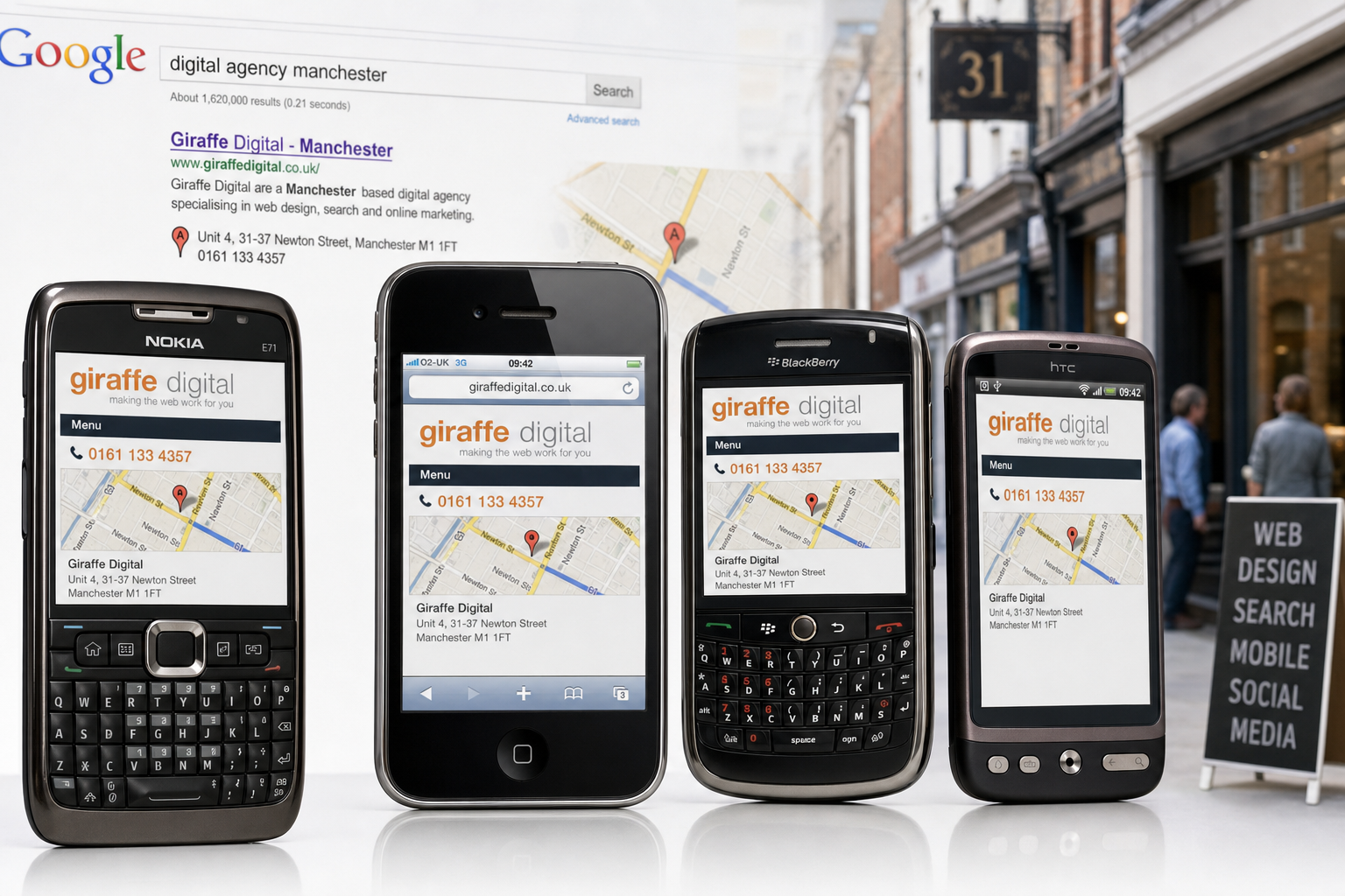
More of your customers are now viewing websites from a phone rather than waiting until they are at a desk. For many UK businesses, this is no longer a novelty reserved for technology enthusiasts. Better handsets, improved mobile browsers and wider use of 3G have made it increasingly common for people to look up opening hours, compare services, read reviews, follow links from social networks and make enquiries while they are away from their computer. A well-planned mobile website can make those visits useful rather than frustrating.
The important point is not whether mobile browsing will replace desktop browsing. It will not do so for every task, and many people will still prefer a full screen when researching in depth. The opportunity is more practical: when someone needs quick information, your website should be easy to read, easy to navigate and easy to act upon from a smaller screen. If it is not, that visitor may simply return to the search results and choose a competitor whose site is easier to use.
Why mobile browsing matters for business owners
Mobile browsing has moved beyond basic WAP pages and simple text menus. Many modern phones can display richer websites, use maps, open email links and submit forms. Visitors may arrive through a search engine, a link in an email newsletter, a post on Twitter or Facebook, or a recommendation from a friend. The context is often urgent: they may be trying to find your address, call your office, check whether you provide a particular service, or confirm that you are a credible business before getting in touch.
For local and service-led businesses, this behaviour is especially important. A potential customer might search for a restaurant, solicitor, plumber, photographer, consultant or retailer while travelling, sitting in a café or walking along the high street. If your site takes too long to load, requires awkward zooming, or hides the telephone number in an image that cannot be selected, the visitor has little reason to persevere.
A mobile website should therefore support the moments that matter most. It should not be a smaller copy of every page on your main site. It should help visitors complete the most likely tasks quickly. Those tasks might include calling you, finding your premises, reading a brief summary of your services, checking your opening hours, sending an enquiry or signing up to receive updates.
Start with visitor needs, not the handset
It is tempting to begin by asking which devices you should design for. There are certainly differences between an iPhone, a BlackBerry, a Nokia handset, a Windows Mobile device and newer Android phones. Some have touch screens, some have small keyboards, some rely on a trackball or directional pad, and some use browsers such as Opera Mini to compress pages. However, the most useful starting point is the visitor’s need.
Ask what a person is likely to want when they are not sitting at a desk. A business-to-business firm might find that mobile visitors mainly want contact details, directions, staff profiles or a quick overview before a meeting. A retailer might need to show store locations, product categories and current promotions. A hotel or restaurant might focus on reservations, menus, photographs, maps and telephone links. A professional services firm may need to present trust signals, clear specialisms and a simple enquiry route.
Once these priorities are clear, the design decisions become easier. You can decide which content belongs on the mobile version, which information can be shortened, and which pages should remain available but not placed at the front of the mobile journey. The aim is not to remove substance; it is to remove unnecessary effort.
Designing a mobile website that people can actually use
A good mobile website is clear, fast and forgiving. It should recognise that the visitor may be using a slower connection, a small screen, bright daylight, one hand, or a device with limited support for desktop-style features. Elegant design still matters, but it must serve usability.
Keep pages light and focused
Large images, complicated scripts and heavy page layouts can make mobile browsing slow and unreliable. Use images carefully, reduce file sizes and avoid placing essential information inside large graphics. A mobile visitor should not have to wait for decorative elements before seeing your telephone number, address or main service message.
Keep copy concise on key pages. A short introduction, a clear list of services and a prominent next step will usually work better than several dense paragraphs. Longer articles and detailed resources can still be made available, but the main mobile path should be simple.
Make navigation obvious
Desktop websites often rely on wide menus, sidebars and large promotional panels. These rarely translate well to a phone. A mobile website should use a small number of clear navigation options, such as Services, About, Contact, Location and Latest News. If you have many services, group them sensibly rather than forcing visitors to scroll through a long list.
Links should be easy to select. Tiny text links placed close together are frustrating on touch screens and difficult on phones with a directional pad. Use enough spacing, write link text that explains the destination, and make the most important actions visible near the top of the page.
Put contact details within easy reach
For many businesses, the telephone number is one of the most valuable elements of a mobile website. Display it as text rather than an image, and consider making it a clickable telephone link where supported. Include your address in plain text, and provide a link to a map where appropriate. If your opening hours matter, put them near the contact information rather than hiding them on a separate page.
Forms should be short. Asking for a name, telephone number, email address and brief message is often enough for an initial enquiry. Long forms with many required fields are difficult to complete on a phone and can reduce response rates.
Technical choices for a mobile website
There is no single correct technical approach for every business. Some organisations will create a separate mobile version of their website, often using an address such as a mobile subdomain. Others will adapt existing templates so that pages are simpler and narrower for smaller screens. The right choice depends on your current website, content management arrangements, budget, audience and long-term digital plans.
If you use a separate mobile version, make sure visitors are directed sensibly. A handset can be detected and offered the mobile site, but users should still be able to access the full site if they prefer. Automatic redirection can be useful, but it should not trap a visitor on a limited page when they need fuller information.
Consistency also matters. Your mobile website should still feel like your business. Use the same brand name, tone of voice and core messages. Simplifying a site for mobile use should not mean making it look unprofessional or disconnected from your main identity.
Where possible, use straightforward HTML and CSS, and avoid relying on features that may not be supported across common mobile browsers. Not all devices handle complex scripting, pop-up windows, embedded media or plug-ins consistently. If an important message, form or navigation item depends on a feature that fails on a popular phone, the visitor may be unable to continue.
Search marketing and mobile visitors
Search remains one of the most important routes into a business website, and mobile visitors often search with a different intent from desktop users. They may use shorter phrases, include a town or area, or search for a specific type of service near where they are. This makes clear page titles, relevant headings, concise service descriptions and accurate local information especially valuable.
Your mobile website should not be invisible to search engines. Make sure pages can be reached by normal links and are not hidden entirely behind scripts. Use descriptive text rather than relying solely on images. If you provide services in particular towns or regions, mention them naturally where relevant. Avoid creating thin, duplicated pages for every location simply to attract traffic; useful content and clear relevance are safer and more credible.
For local businesses, check that your business name, address and telephone number are consistent across your website and other reputable online listings. Inconsistent details can confuse customers and weaken trust. If you have moved premises, changed telephone numbers or updated trading hours, make sure those details are corrected across your online presence.
Analytics can help you decide how urgent your mobile project is. Look at your website statistics and server logs to see which devices and browsers are already visiting. Even if mobile traffic appears modest, pay attention to the pages those visitors view and where they leave. A small but growing number of mobile visits may represent valuable enquiries that are currently being lost.
How social media is increasing mobile traffic
Social media is one of the reasons mobile browsing is becoming harder to ignore. Many people check Twitter, Facebook and other networks from their phones, following links as they appear throughout the day. If your business shares news, offers, blog posts, videos or event details, a portion of that audience may arrive on a small screen.
This has a direct effect on marketing. A carefully written social media update can generate interest, but if the landing page is slow or difficult to read on a phone, the opportunity is weakened. Before promoting a page through social channels, open it on several handsets and check whether the main message is visible, the page loads within a reasonable time and the next step is clear.
The same applies to email marketing. Many subscribers now read email on mobile devices, particularly business users with smartphones. If your newsletter includes a link to a campaign page, event registration page or article, that destination should be usable from a phone. Otherwise, the reader may intend to return later but forget.
Domain names and brand protection
Domain name decisions should support clarity and trust. Most UK businesses should ensure that their primary domain is easy to remember, easy to spell and aligned with their trading name or brand. If your organisation serves a UK audience, a suitable UK domain can help users recognise you as relevant and familiar. Many businesses also choose to secure closely related extensions or common spelling variations to protect their brand and reduce confusion.
For a mobile website, you do not always need a completely separate domain. A mobile subdomain can be effective because it keeps the mobile experience connected to your existing brand. It is short, recognisable and relatively easy to promote in print, email and advertising. Some businesses may consider a mobile-specific domain extension, but this should be assessed carefully. The most important factor is whether customers will understand and trust the address.
Keep mobile addresses short if they may be typed manually. Avoid unnecessary hyphens, awkward abbreviations and words that are easily misspelt. If you are launching a new brand, check domain availability early in the naming process rather than after print materials, signage and stationery have been produced.
Practical steps before commissioning a mobile website
Before you begin a mobile website project, gather evidence and set priorities. This will help you make better decisions and avoid paying for features that do not support your business goals.
- Review your current analytics: Identify mobile devices, popular landing pages, bounce rates and enquiry paths.
- List the top mobile tasks: Decide what visitors are most likely to need quickly, such as calling, finding directions or checking services.
- Audit your content: Mark which pages need shortening, rewriting or restructuring for mobile use.
- Check your competitors: Visit competitor sites from a phone and note what works well or poorly.
- Test real devices: Do not rely only on a desktop browser resized to a narrow width. Try common phones used by your customers.
- Plan measurement: Decide how you will track calls, enquiries, form submissions and visits from social media or search.
It is also worth thinking about maintenance. A mobile website that is accurate at launch but neglected afterwards can quickly become a liability. If your opening hours, staff, services, offers or locations change, the mobile version must be updated at the same time as the main site. Ideally, your content management arrangements should make this straightforward.
A mobile website is a service improvement
The strongest argument for a mobile website is not that every business must chase every new technology. It is that your website should serve customers in the situations where they actually use it. If a growing number of visitors are arriving from mobile devices, then usability on those devices becomes part of customer service, sales support and brand perception.
A frustrating mobile experience can make a good business look out of touch. A clear, quick and helpful mobile experience can make it easier for people to choose you, contact you and recommend you. For UK business owners investing in website design, search marketing, social media or broader digital strategy, mobile browsing deserves a place in the planning conversation.
The businesses that benefit most will be those that approach mobile sensibly: focus on user needs, keep pages fast, make contact easy, maintain brand consistency and measure the results. Mobile browsing may still be developing, but the commercial value of being accessible on a phone is already becoming difficult to ignore.