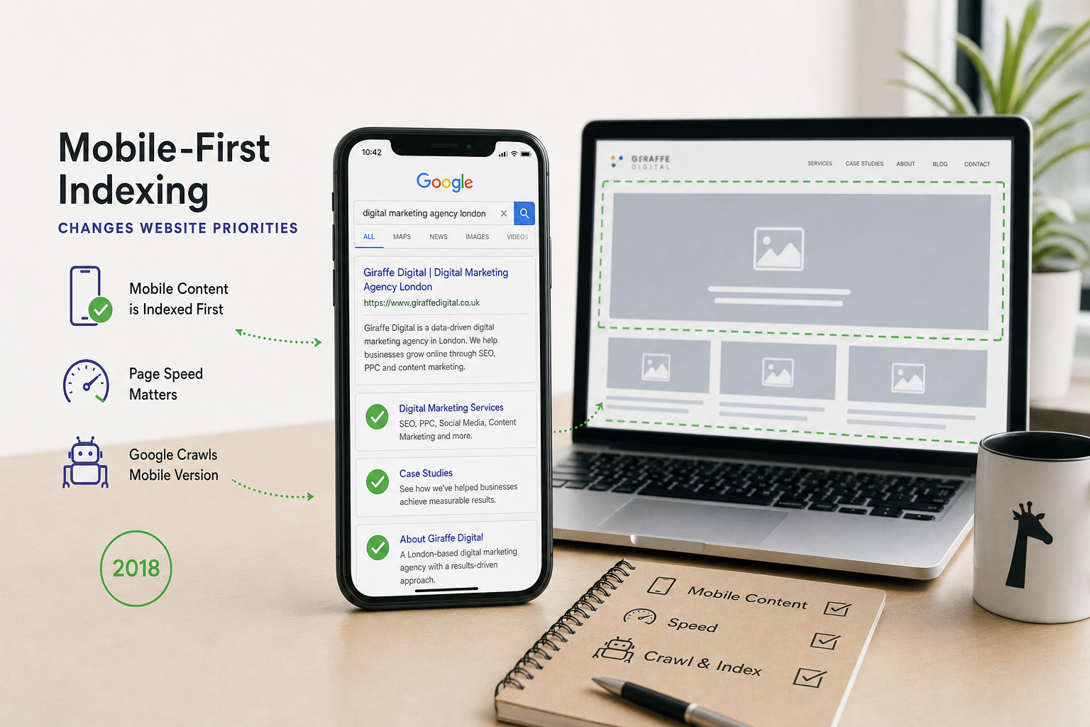
Google is changing the way it evaluates websites, and the shift is an important one for UK businesses. With mobile-first indexing now rolling out more widely, Google will increasingly use the mobile version of a website as the primary version for indexing and ranking. This does not mean desktop websites are disappearing, nor does it mean every business needs a separate mobile site. It does mean the mobile experience can no longer be treated as a reduced, secondary version of the main website.
For business owners, the practical message is straightforward: if your customers find you through search, visit your website from social media, check your details on the move or compare you with competitors on a phone, your mobile website must work properly. It should contain the right content, load efficiently, make contact easy and present your brand with the same care as your desktop website. Mobile-first indexing is not simply a technical SEO change; it is a reminder that website design, content, branding and digital marketing need to be planned around real user behaviour.
What mobile-first indexing means
Historically, Google has mainly looked at the desktop version of a website when deciding what to include in its index and how to rank pages. That made sense when desktop browsing dominated. However, more people now search, browse and interact with businesses from mobile devices, so Google has been moving towards a mobile-first approach.
Under mobile-first indexing, Google primarily uses the mobile version of your content for indexing and ranking. If your desktop site has detailed service pages, helpful copy, structured data and internal links, but your mobile version hides or removes much of that information, you may be at a disadvantage. Google wants to understand what a mobile visitor can actually access.
It is worth noting that mobile-first indexing is about how Google indexes your site. It is not the same as having a mobile-only index. Desktop users will still search Google, desktop websites can still appear in search results, and many ranking signals still matter. The key issue is that the mobile version of your website is becoming the version Google relies on first.
Why this matters for business value
For many businesses, the website is both a sales tool and a trust signal. A potential customer may find you after seeing a recommendation on Facebook, searching on Google, clicking through from LinkedIn, or noticing your business name on printed material. In each case, there is a strong chance the first visit happens on a mobile phone.
If that visitor lands on a slow, awkward or incomplete mobile page, the opportunity can be lost quickly. A restaurant with a hard-to-read menu, a solicitor with hidden service information, a tradesperson with a tiny phone number, or an online retailer with a frustrating checkout all face the same problem: the website is creating friction at the exact moment a customer is ready to act.
Mobile-first indexing therefore supports a wider business priority. Your mobile site should help people understand what you offer, why they should trust you and what they should do next. That might be calling your office, completing an enquiry form, booking an appointment, visiting your premises or reading more about a service. The easier those actions are on mobile, the stronger your website becomes as a commercial asset.
Responsive design is usually the best foundation
For most modern business websites, responsive design is the most practical approach. A responsive website uses the same core HTML content and URL, while the layout adapts to fit different screen sizes. This helps maintain consistency between desktop and mobile, makes content management simpler and reduces the risk of presenting different information to users and search engines.
Some older websites still use a separate mobile version, often on an m-dot subdomain, while others rely on dynamic serving to deliver different HTML depending on the device. These approaches can still work, but they require careful maintenance. You need to make sure equivalent content, metadata, canonical tags, hreflang tags where relevant, structured data and internal links are correctly handled across versions.
If you are planning a redesign in 2018, it is sensible to start with mobile layouts early in the process rather than treating them as a final adjustment. Designers and developers should think about navigation, page hierarchy, tap targets, forms, imagery and calls to action for smaller screens from the beginning. A desktop design that is simply squeezed into a mobile layout rarely produces the best result.
Content must be complete on mobile
One of the most common mistakes is stripping mobile pages back too far. Shorter, clearer presentation can be helpful, but important content should not disappear. If a service page explains your expertise, answers common questions and includes useful detail on desktop, the mobile version should provide the same essential information.
Tabs, accordions and expandable sections can be appropriate on mobile when they are used to organise content for usability. The important point is that the content should still be accessible to users and search engines. Do not remove important copy simply because it appears long. Instead, structure it better with headings, concise paragraphs, bullet points and clear links.
Think carefully about the pages that support buying decisions. For a local service business, that might include service pages, location information, testimonials, accreditations, frequently asked questions and contact details. For an e-commerce business, it may include product descriptions, delivery information, returns guidance, product imagery and reviews. For a professional organisation, it may include team profiles, case studies, sector expertise and enquiry routes.
Technical checks for mobile-first indexing
Mobile-first indexing does not mean technical SEO is only about mobile design, but it does place more importance on mobile accessibility. A visually attractive page is not enough if Google cannot crawl, render or understand it properly.
Start by making sure important resources are not blocked. CSS, JavaScript and images should generally be available to Googlebot so that pages can be rendered accurately. Check that mobile pages return the correct status codes, avoid unnecessary redirects and do not send users to irrelevant pages based on device type.
Your metadata should also be consistent. Page titles and meta descriptions should be present on mobile as well as desktop. Structured data should appear on both versions where it is used. If you run separate mobile URLs, make sure canonical and alternate annotations are correctly configured so Google understands the relationship between the pages.
Internal linking deserves particular attention. Desktop navigation can often include more links because there is more screen space, but the mobile site still needs a clear path to important pages. If key services are buried or absent from mobile navigation, users and search engines may struggle to discover them.
Speed and performance are part of the mobile experience
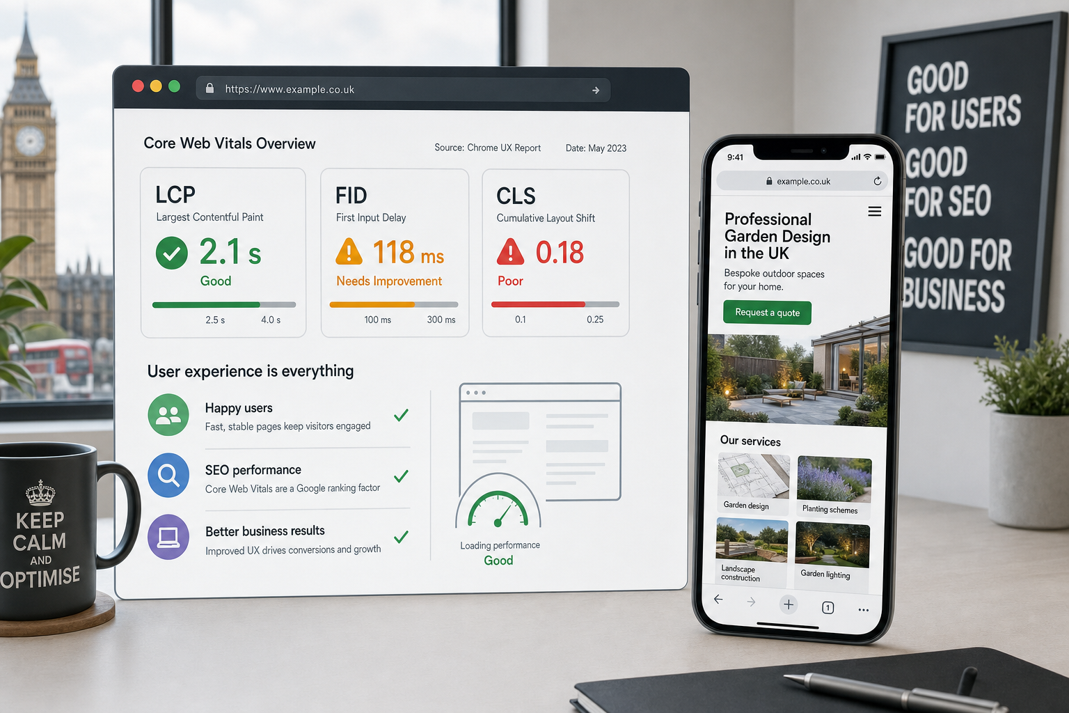
Mobile users are often browsing on variable connections, smaller devices and limited time. A slow site can damage conversions before a visitor has even seen your message. Google has also announced that mobile page speed will become a ranking factor for mobile searches from July 2018, so performance should be treated as both a user experience issue and a search consideration.
There are several practical improvements that can help. Compress images before uploading them, use appropriate file dimensions, avoid unnecessary scripts, reduce bloated themes or plugins, and make sure hosting is suitable for the website’s traffic and functionality. Caching and minification can also help when implemented correctly.
Business owners do not need to understand every technical detail, but they should ask the right questions. How quickly do important pages load on a typical mobile connection? Are large hero images slowing the first view? Are third-party scripts from advertising, tracking or social widgets causing delays? Is the mobile user asked to wait for elements that do not directly support the enquiry or sale?
Make mobile enquiries simple
A mobile-first website should make it easy for visitors to take action. That sounds obvious, but many websites still use long forms, small links or hidden contact details. If a customer wants to speak to you, request a quote or ask a question, the journey should be clear.
Consider the most valuable actions for your business. A local business may need prominent phone links and opening hours. A consultancy may need a short enquiry form and a strong explanation of its services. A retailer may need a smooth product page, a clear basket process and reassuring delivery information. A venue may need directions, availability information and a straightforward booking route.
Forms should be designed for mobile input. Use only the fields you genuinely need at the first stage. Label fields clearly, avoid tiny checkboxes, and make error messages easy to understand. If the enquiry is complex, consider asking for basic contact details first and gathering more information later.
Social media traffic is mobile traffic
Social media marketing is closely connected to mobile-first indexing because much of the traffic from platforms such as Facebook, Instagram, Twitter and LinkedIn arrives from mobile devices. A campaign can generate interest, but the website still has to convert that attention into action.
Before investing time in social content, make sure the landing pages are fit for mobile visitors. If you promote a particular service, event, offer or article, send users to a relevant page rather than expecting them to search through your homepage. The message in the social post should match the page they land on, and the next step should be obvious.
Brand consistency also matters. The visual style, tone of voice and promise made on social media should be supported by the mobile website. If your social presence feels polished but your mobile site feels dated or awkward, trust can suffer. A strong digital strategy connects search, social, content and website design rather than treating them as separate pieces.
Domain names and brand trust
Mobile-first indexing does not change the fundamentals of choosing a good domain name, but it does make clarity even more important. Mobile users often see less of a URL in the browser, and they may be typing or sharing links on smaller screens. A domain should be easy to spell, easy to say and closely aligned with your brand.
For UK businesses, it is sensible to consider whether the domain reflects your market and customer expectations. A concise, memorable domain can support offline marketing, local recognition and word-of-mouth referrals. Avoid unnecessary hyphens, confusing spellings or names that are too close to another organisation’s brand.
When registering domains, keep ownership details properly managed within the business and make sure renewal responsibilities are clear. It is also wise to register sensible variations where they protect the brand, but avoid collecting domains without a clear reason. Your domain name is part of your digital identity, so it should be chosen with the same care as your logo, website and marketing materials.
A mobile-first checklist
If you are unsure where to begin, use the following checklist to review your website from a mobile-first perspective:
- Review key pages on a real phone: Check your homepage, main service pages, contact page, product pages and popular blog posts.
- Compare mobile and desktop content: Make sure important headings, copy, images, links and calls to action are present on mobile.
- Test navigation: Users should be able to find important services, locations, products and contact information quickly.
- Check page speed: Look for oversized images, unnecessary scripts and slow-loading page elements.
- Improve tap targets: Buttons, menu items and form fields should be easy to use without zooming.
- Keep metadata consistent: Titles, descriptions and structured data should not be missing from mobile pages.
- Check forms: Reduce unnecessary fields and make mobile input as simple as possible.
- Review analytics: Compare mobile traffic, bounce rates, enquiries and conversions against desktop behaviour.
- Connect campaigns to relevant pages: Search and social visitors should land on pages that match their intent.
Planning your next website around mobile users
If your current website is several years old, mobile-first indexing may be the right prompt to review whether it still supports your business properly. A redesign should not only be about making the site look newer. It should improve how customers find information, understand your offer and take action.
Start by identifying your priority audiences and the tasks they need to complete. A homeowner looking for emergency help has different needs from a procurement manager researching suppliers. A returning customer may want quick contact details, while a new visitor may need reassurance, examples of work and clear service information. Good mobile design considers these journeys and removes unnecessary obstacles.
Content planning should sit alongside design. Decide which pages are needed, what each page should achieve and how they will link together. SEO research can help identify the language customers use when searching, while brand strategy can ensure the site feels distinctive and credible. The result should be a website that is useful for visitors and understandable for search engines.
Mobile-first indexing is a business opportunity
It is easy to view mobile-first indexing as another technical requirement, but it is more useful to see it as an opportunity to improve the quality of your digital presence. A strong mobile website can support better search visibility, more effective social media campaigns, higher enquiry rates and a more professional brand impression.
The businesses that benefit most will be those that treat mobile as central to the customer journey. That means complete content, clear design, fast performance, reliable technical foundations and joined-up marketing. Whether you are considering a new website, reviewing your SEO or planning a broader digital strategy, mobile-first indexing should be part of the conversation from the start.
For UK business owners, the priority is not to chase every technical trend. It is to make sure your website reflects how people actually search and browse in 2018. If your mobile experience is clear, helpful and commercially focused, you will be in a stronger position as Google continues its move towards mobile-first indexing.