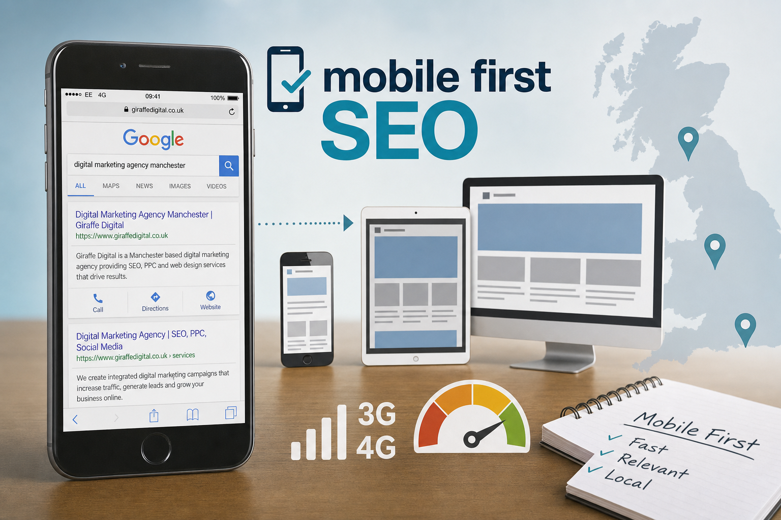
Mobile use is no longer a side issue for business websites. For many UK customers, the first visit to a company will not happen on a desktop computer, but on a phone during a commute, lunch break, shopping trip or quick local search. That shift has important implications for search visibility, website design, content, social media and the way a brand presents itself online. Mobile-first SEO is about planning for that first small-screen experience, rather than treating mobile as a reduced version of a desktop site.
For business owners, the value is practical. A mobile-friendly website can help more visitors find key information, call or enquire quickly, and feel confident that the organisation is modern and trustworthy. Search engines are also placing clear emphasis on mobile usability. Google’s mobile-friendly update in 2015 made mobile compatibility a raranking factoror searches on mobile devices, and further strengthening of that signal is expected during 2016. The message is straightforward: if your customers use mobile, your search strategy must take mobile seriously.
What mobile-first SEO means in 2016
Mobile-first SEO does not mean ignoring desktop users. It means making decisions from the perspective of the mobile visitor first, then ensuring the experience also works well on tablets, laptops and desktop computers. A customer searching on a phone is often task-focused. They may want a telephone number, directions, opening hours, a concise service explanation, product availability, or reassurance that they have found the right business.
Search engines want to send those users to pages that load reliably, display clearly and answer the query without unnecessary friction. A mobile page that requires pinching and zooming, hides essential content, uses tiny links, or takes too long to load is unlikely to satisfy visitors. Even if it ranks, it may not convert.
In practical terms, a mobile-first SEO approach includes responsive website design, clear content hierarchy, fast page loading, strong local signals where relevant, sensible technical set-up, and calls to action that suit mobile behaviour. It also requires joined-up thinking between website design, branding, social media and search marketing, because users will often move between these touchpoints before making an enquiry.
Start with the questions mobile visitors are asking
Before considering layouts, plugins or code, think about customer intent. A good mobile search strategy begins with the questions people are likely to type or speak into a search box. These might include service-led queries such as emergency plumber in Bristol, comparison-led queries such as best accountant for small business, or reassurance-led queries such as family solicitor reviews.
For each important service or product, identify the information a mobile visitor needs in order to make progress. A page should answer the obvious questions without forcing the user through several layers of navigation. If you offer appointments, say how to book. If you serve a local area, make that area clear. If you have different departments, help the user choose the right one quickly.
This is particularly important for small and medium-sized businesses. Large brands may benefit from recognition, but smaller organisations must earn confidence quickly. Clear headings, useful copy, visible contact details and credible supporting information can make the difference between an enquiry and a missed opportunity.
Design for smaller screens without weakening the brand
Responsive design is now the sensible default for most business websites. A responsive site uses the same core content and web address, while the layout adapts to different screen sizes. This is usually preferable to maintaining a separate mobile website, because it helps avoid duplicated content, inconsistent updates and confusing user journeys.
Good mobile design is not simply about fitting everything into a narrow column. It requires choices. Menus should be easy to open and close. Buttons should be large enough to tap accurately. Text should be readable without zooming. Forms should ask only for the information genuinely needed at that stage. Images should support the message without slowing the page unnecessarily.
Branding also matters. Some mobile websites become so stripped back that they lose personality and trust. The aim is not to remove the brand, but to express it efficiently. Colours, typography, photography and tone of voice should remain recognisable, while the layout keeps the user’s task at the centre.
Useful mobile design checks
- Can a visitor understand what the business does within a few seconds?
- Is the primary call to action visible without excessive scrolling?
- Are telephone numbers tappable on a smartphone?
- Are forms short, clear and easy to complete?
- Does the navigation work comfortably with a thumb?
- Do images resize properly on common phone and tablet screens?
- Is important text presented as real text rather than embedded within an image?
Make speed a commercial priority
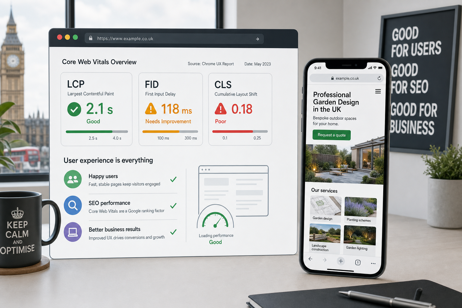
Page speed is not only a technical concern; it is a business concern. Mobile users are often on 3G, 4G or public Wi-Fi connections that may be inconsistent. A beautiful website that loads slowly can lose visitors before they have seen the offer. Search engines also use speed and usability signals to understand whether a page is likely to provide a good experience.
Common causes of slow mobile pages include oversized images, excessive scripts, poorly configured hosting, unnecessary sliders and bloated templates. A practical review should look at the total page weight, the number of files being requested, image compression, caching and whether the most important content appears quickly.
Not every business needs an elaborate technical set-up, but every business should take performance seriously. If your website is being redesigned, speed should be discussed at the planning stage, not treated as a final polish. Decisions about photography, layout, tracking scripts and content management systems all affect the eventual mobile experience.
Write content that works on mobile and supports search
Mobile-first SEO does not mean writing less. It means writing with better structure. Search engines still need useful, relevant content to understand what a page is about, and customers still need enough detail to make a decision. The challenge is to present that information in a way that feels manageable on a small screen.
Use clear headings, concise introductions and logical sections. Place the most important information near the top of the page. Break long passages into readable paragraphs. Use bullet lists where they genuinely help, but avoid turning every page into a shallow checklist. If a topic requires depth, provide it; just organise it properly.
For example, a local building firm might have a page for home extensions. A mobile-friendly page could open with a brief explanation of the service, followed by key benefits, areas covered, examples of typical projects, planning considerations and a simple enquiry route. This gives both users and search engines a clear understanding of relevance.
Strengthen local search signals
Mobile search and local intent often go together. People search for nearby restaurants, trades, professional services, shops and venues from their phones. If your business depends on local customers, your mobile-first SEO plan should include accurate and consistent local information.
Make sure your business name, address and telephone number are correct across your website and reputable online directories. Add opening hours where relevant. Include a clear contact page with a map or directions, but do not rely on the map alone; write useful location information in text as well. If you serve a wider area rather than welcoming customers to your premises, explain the areas covered in a natural and helpful way.
Customer reviews can also influence mobile behaviour, particularly when users are comparing options quickly. Encourage genuine reviews through appropriate channels, but avoid anything artificial or manipulative. Trust is built gradually, and poor review practices can damage a brand.
Connect social media with mobile search behaviour
Social media is heavily mobile. Many users encounter brands first through Facebook, Twitter, LinkedIn, Instagram or Pinterest before visiting a website or searching for the business name. A mobile-first approach should therefore consider how social profiles, shared links and landing pages work together.
When posting on social media, check how the linked page appears on a phone. Is the headline clear? Does the image crop well? Does the landing page load quickly? Is there an obvious next step? A strong social post can be wasted if the visitor arrives on a page that is difficult to read or navigate.
For business-to-business organisations, LinkedIn activity may support credibility and introduce people to expertise before they search for the company. For retailers, hospitality businesses and lifestyle brands, visual platforms can influence discovery and brand preference. In each case, the website should be ready for the mobile visitor who decides to take a closer look.
Choose domains with long-term clarity
Domain registration is a strategic branding decision as well as a technical one. A good domain should be memorable, easy to spell and appropriate for the market you serve. For many UK organisations, a UK-focused domain can support recognition and trust, while a wider commercial domain may be suitable for businesses with broader ambitions.
Avoid choosing a domain purely because it contains keywords. Exact-match domains can still be useful when they are genuinely brandable, but they are not a substitute for a strong website, useful content and a trustworthy business. Long, awkward or hyphen-heavy domains can be difficult to say aloud, type on a phone or remember after seeing an advert.
It is also sensible to protect important variations of your brand where appropriate, including common spelling differences or relevant UK extensions. Keep registration details organised, use a secure account, and ensure renewal reminders are not missed. Losing control of a key domain can cause avoidable disruption to search visibility, email and marketing activity.
Check the technical foundations
Technical SEO underpins the mobile experience. Search engines need to crawl and understand your pages, and users need consistent access to them. A responsive site should avoid blocking important CSS, JavaScript or image files from search engines, because these resources help them assess how the page works on mobile devices.
Each important page should have a clear title, relevant meta description and logical heading structure. Redirects should be handled carefully, especially when replacing an older site. Broken links, duplicate pages and inconsistent canonical tags can all create confusion. XML sitemaps and clean internal linking help search engines discover the right pages.
Security is also increasingly important. Serving a site over HTTPS can support user confidence, particularly where forms, accounts or transactions are involved. Even for simpler brochure websites, trust signals matter. A secure, well-maintained site reflects positively on the organisation behind it.
Measure what matters
Mobile-first SEO should be measured against business outcomes, not just rankings. Rankings are useful indicators, but they do not tell the whole story. Review mobile traffic, enquiry forms, click-to-call activity, bounce rates, popular landing pages and the paths users take before converting. Compare mobile and desktop behaviour to identify where the mobile experience may be falling short.
If many mobile visitors reach a service page but few enquire, the issue may be the page layout, form length, call to action or loading speed. If mobile visitors leave from the home page, the proposition may not be clear enough. If users search for the brand after seeing social posts, branded search visibility and reputation become important parts of the journey.
Regular review is essential. Search behaviour, devices and customer expectations continue to evolve, so a website should not be treated as a one-off project. Small improvements to speed, content, navigation and calls to action can produce meaningful gains over time.
Preparing your business for mobile-first search thinking
The businesses best placed to benefit from mobile search are those that treat mobile as central to the customer journey. That does not require chasing every new idea or rebuilding a website for the sake of it. It requires clear priorities: understand your audience, design for real mobile behaviour, publish useful content, keep technical foundations tidy, and connect search with wider digital marketing.
If your website is difficult to use on a phone, now is the right time to review it. If you are planning a redesign, make mobile requirements part of the brief from the beginning. If you are investing in SEO, ensure the strategy considers speed, responsive design, local search, social discovery and conversion, not just keyword positions.
Mobile-first SEO is ultimately about respect for the customer’s time. When a visitor can find you, understand you and contact you easily from the device in their hand, your digital presence is doing its job. For UK businesses competing for attention online, that is a practical advantage worth building properly.