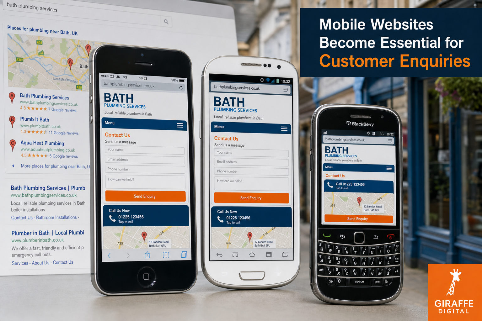
More customers are using mobile phones to find suppliers, compare services and make enquiries while they are away from a desk. For many UK businesses, a website is no longer viewed only on a large office screen. It is opened on an iPhone, an Android handset, a BlackBerry, a Windows Phone or a compact tablet, often on a 3G connection and often by someone who wants a quick answer. If your site is slow, awkward to read or difficult to contact from a mobile, those enquiries can be lost before a visitor has understood what you offer.
Mobile websites are therefore becoming an essential part of online marketing rather than an optional extra. A well-planned mobile experience can help a visitor call you, request a quote, find your premises, read your key services and trust your brand without pinching, zooming and waiting for oversized pages to load. The goal is not simply to make a website smaller; it is to make it more useful for the way people behave on a phone.
Why mobile browsing matters for enquiries
Mobile use has grown quickly because smartphones put search, email, maps and social media into a customer's pocket. A potential customer may see your name on a printed advert, hear about you from a colleague, receive a recommendation on Twitter or search locally while travelling. In each case, the website is often the next step. If the website does not work well on a phone, the business has placed a barrier between interest and enquiry.
Mobile visitors tend to be more task-focused than many desktop visitors. They may want to know whether you serve their area, what type of work you do, whether you appear credible and how to get in touch. They are unlikely to read every page in detail before making initial contact. This makes clear signposting particularly important. A prominent telephone number, a short enquiry form, opening hours, address details and a simple services summary can make the difference between a visitor contacting you and returning to the search results.
Local intent is also significant. Someone searching for a solicitor, accountant, restaurant, tradesperson, consultant or retailer from a phone may be looking for a nearby option. If your website connects well with local search listings, map results and clear contact information, it can support enquiries from people who are ready to act. This is especially important for businesses that depend on calls, appointments, bookings, quotations or footfall.
What makes a good mobile website in 2012
A good mobile website should be fast, readable and easy to use with a finger rather than a mouse. It should prioritise the information customers need most, while still feeling like part of the same brand as the main website. It should not feel like a stripped-out afterthought with missing content, broken navigation or unreadable text.
Clear layout and readable content
Mobile screens have limited space, so content must be organised carefully. Long introductions, crowded sidebars and small text can make a page frustrating. Use concise headings, short paragraphs and a logical order. The most important content should appear near the top of the page, particularly on service pages and contact pages. Visitors should not have to search for your phone number or guess where to make an enquiry.
Designers should consider how buttons, links and forms behave on a touch screen. Small links placed close together can lead to mistakes. Buttons should be large enough to tap comfortably, and forms should ask only for the information genuinely required at the first stage. A lengthy form that may be tolerable on a desktop can feel excessive on a mobile phone.
Fast loading over mobile connections
Speed is one of the strongest practical reasons to build for mobile properly. Many visitors will be using 3G or public Wi-Fi rather than a reliable office broadband connection. Oversized images, unnecessary scripts, large background graphics and complex layouts can create a slow experience. A visitor who is trying to make a quick enquiry may not wait.
Images should be prepared sensibly, pages should avoid unnecessary weight, and content should be structured so that important information loads quickly. This is also useful for search visibility, because search engines want to send users to pages that provide a good experience. Even when rankings are not the immediate concern, speed helps conversions.
Contact details designed for action
For many businesses, the key purpose of a mobile visit is enquiry generation. Make contact options visible and simple. A telephone number should be easy to tap from a mobile device. An email address or short enquiry form should be close to the relevant service information. If visitors need to find you, include a clear address and a map link that works reliably on mobile devices.
It is also worth considering different types of enquiries. A professional services firm may want quote requests, consultation bookings or brochure requests. A local retailer may want calls about stock or directions to the shop. A hospitality business may want bookings. A trades business may want urgent phone calls. The mobile website should reflect these priorities rather than copying the desktop layout without thought.
Responsive design or a separate mobile site
Businesses planning mobile websites often face a choice between a responsive design and a separate mobile version of the website. A responsive website uses flexible layouts and styling so that the same site adapts to different screen sizes. A separate mobile site usually provides a distinct version, often with simplified navigation and mobile-focused pages.
Responsive design is an attractive option because it can keep content, links and branding in one place. It can also reduce duplication and make future updates easier when it is planned well. However, it still requires proper design thinking. A page that merely squashes a large desktop layout onto a small screen is not a good mobile experience. Responsive design should be approached with content priorities, page weight and touch interaction in mind.
A separate mobile site can work well when a business has very specific mobile needs or an existing website that cannot be rebuilt immediately. It may allow faster improvement for mobile visitors while a broader redesign is planned. The disadvantage is that content management, search considerations and consistency can become more complicated. Care must be taken to direct mobile users correctly and to avoid creating confusing duplicate content.
There is no single answer for every organisation. A small business commissioning a new website may benefit from planning responsive design from the start. A larger organisation with a complex existing website may take a phased approach. The important point is to make a deliberate decision based on customer behaviour, marketing goals and practical maintenance, rather than ignoring mobile altogether.
Search marketing and mobile visibility
Mobile websites should be planned alongside search engine optimisation. Customers often reach a business by searching from a phone, especially for local services. Your mobile experience should therefore support the same core search goals as your main website: relevant content, clear page titles, useful headings, crawlable pages and accurate contact details.
Local search is particularly important. Businesses should ensure their name, address and telephone number are consistent across their website and local listings. Google+ Local, map listings and reputable directory profiles can all help customers find the correct details. Inconsistency can confuse both users and search engines, especially when old addresses or phone numbers remain online.
Keyword planning should also reflect real customer language. People searching from a mobile may use shorter phrases, local terms or urgent wording. A page about emergency plumbing, same-day appointments, local delivery or nearby professional advice should explain the service clearly rather than relying on vague marketing language. This does not mean stuffing pages with repeated terms. It means writing useful, specific content that matches what customers are trying to find.
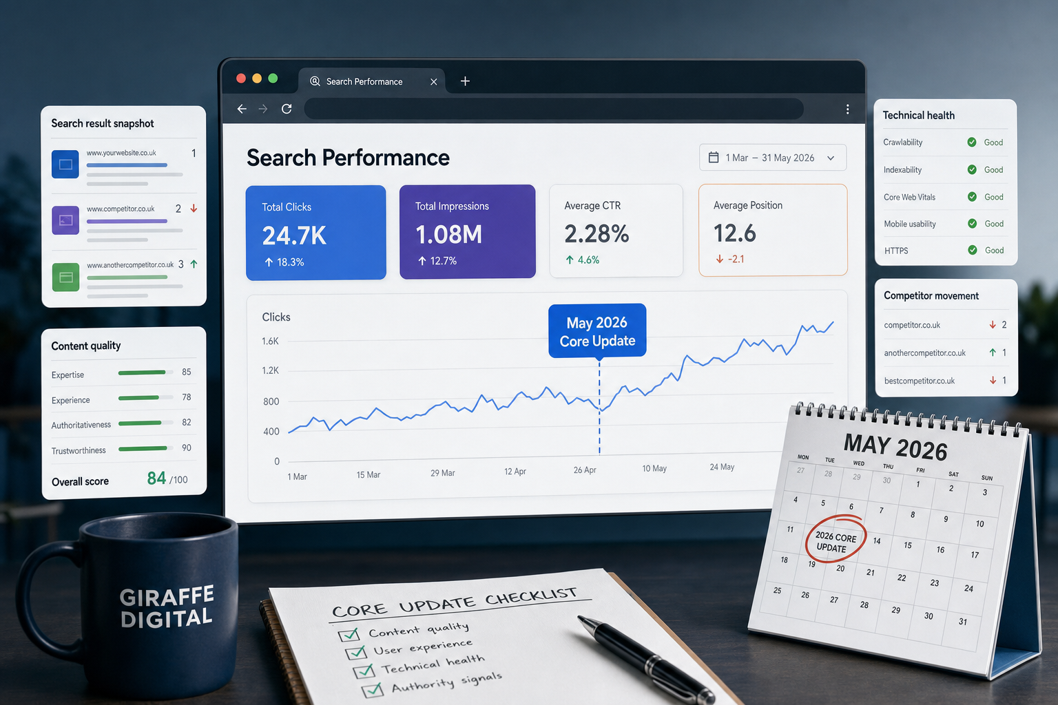
Analytics can help businesses understand the opportunity. Website statistics can show how many visitors are arriving from mobile devices, which pages they view, how long they stay and whether they complete enquiry forms. If mobile visitors are leaving quickly from important pages, it may indicate a design, speed or content problem. Reviewing this data before and after improvements can help guide sensible decisions.
Social media makes mobile experience even more important
Social media is closely connected to mobile browsing. Many people check Facebook, Twitter, LinkedIn, Google+ and YouTube on phones, then click through to websites from posts, profiles, adverts or shared links. If those links lead to a poor mobile page, the effort spent on social media marketing is weakened.
For example, a business may share a blog article on Twitter, promote a seasonal offer on Facebook or post a video that links to a service page. The visitor is already interested enough to tap the link, but that interest can disappear if the page is slow or difficult to read. A mobile-friendly landing page supports the social media activity by giving the visitor a clear next step.
Social campaigns should therefore be checked on mobile devices before they are promoted. Look at the page as a customer would. Is the message clear? Does the image load properly? Is the enquiry route obvious? Does the page match the promise made in the post? This simple checking process can prevent wasted traffic and improve response rates.
Branding and trust on a smaller screen
A mobile website still needs to communicate trust. Some businesses treat mobile pages as purely functional, but customers are still making judgements about credibility. Logo use, colour, typography, photography and tone of voice should be consistent with the wider brand. A customer should feel that they have reached the same professional organisation, not a detached or neglected version of the website.
Trust signals should be adapted for mobile rather than hidden. Testimonials, accreditations, professional memberships, guarantees, case study summaries and clear company information can all support enquiries. The key is to present them in a concise and readable way. A short quote from a customer, a simple list of sectors served or a link to a fuller case study can reassure visitors without overwhelming the screen.
Good copywriting is also part of trust. Mobile visitors need plain explanations of what you do and why they should contact you. Avoid vague claims that could apply to any competitor. Be specific about services, locations, experience and process where appropriate. A clear message often performs better than a crowded page full of slogans.
Domain names and mobile planning
Domain registration remains an important part of digital strategy. A good domain name should be memorable, easy to spell and suitable for use across printed material, email, search results and mobile screens. Shorter names can be easier to type on a phone, but clarity should not be sacrificed. If a domain is difficult to say over the telephone or easy to mistype, it may create unnecessary friction.
UK businesses should consider the role of relevant UK domain extensions alongside any international ambitions. Where possible, it is sensible to secure the main domain variations that protect the brand and reduce confusion. Businesses should also keep clear records of renewal dates and ownership details, as a lost or poorly managed domain can affect email, search visibility and customer trust.
It is also worth thinking about how a domain will appear in social media profiles, email signatures and mobile search results. A long, complicated address may look untidy and be harder for customers to remember. If campaigns use short landing page addresses, they should still point to well-designed mobile pages that feel consistent with the main site.
Practical steps for UK business owners
Improving mobile websites does not need to start with guesswork. Begin by looking at your current website on several devices. Try a smartphone with a smaller screen, a larger smartphone and a tablet if possible. Use a mobile connection as well as office Wi-Fi. Look at the pages most likely to lead to enquiries, such as the home page, main service pages, contact page and any campaign landing pages.
- Check readability: Can you read the text without zooming, and are headings clear?
- Check navigation: Can a visitor find key services, contact details and location information quickly?
- Check speed: Do important pages load promptly over a mobile connection?
- Check forms: Are enquiry forms short, clear and easy to complete on a touch screen?
- Check calls: Is the telephone number visible and easy for a mobile user to activate?
- Check consistency: Does the mobile experience reflect your brand and current marketing messages?
- Check tracking: Can you measure mobile visits, enquiries and popular pages through your analytics?
Once the issues are clear, prioritise improvements that affect enquiries. A beautiful mobile design is helpful, but the first priority should be removing barriers. If contact details are hidden, forms are too long or pages load slowly, fix those problems before adding extra features. Mobile users reward simplicity and relevance.
Businesses planning a new website should include mobile requirements at the brief stage. Ask how the design will work across common screen sizes, how navigation will be handled, how images will be optimised and how content will be managed. Mobile should not be left until the end of the project, because it affects structure, design, copywriting and development.
Mobile websites are now part of the enquiry process
The growth of mobile browsing has changed the way customers move from interest to enquiry. A website may still be discovered through search engines, recommendations, adverts, email campaigns or social media, but the first visit is increasingly likely to happen on a mobile device. Businesses that make that visit easy, fast and persuasive are better placed to turn attention into contact.
For UK business owners, the message is straightforward: mobile websites should be treated as a core part of website design and digital marketing. They support search visibility, strengthen social media campaigns, improve local enquiries and help customers take action at the moment they are interested. Whether through a responsive redesign, a carefully planned mobile version or targeted improvements to key pages, investing in the mobile experience is an investment in customer enquiries.