Mobile traffic is no longer a small technical detail to be considered after a website has been designed. For many UK businesses, visits from smartphones and tablets are becoming a regular part of the enquiry process, especially when people are comparing suppliers, looking for opening times, checking directions or responding to a recommendation on social media. A website that works well on a desktop computer but becomes awkward on a smaller screen can lose valuable enquiries before a visitor has even reached the contact page.
In March 2013, good website planning needs to take this change seriously. Mobile use is not only about younger audiences or consumer brands. Professional services, local trades, hospitality businesses, retailers, charities and business-to-business organisations are all seeing customers use phones and tablets as part of their research. The question is not simply whether a website can be viewed on a mobile device. The more useful question is whether a visitor can understand, trust and contact the business quickly when using one.
Mobile traffic is changing how people browse
Desktop browsing still matters, particularly for detailed research, longer forms and office-based buying decisions. However, the journey to an enquiry is becoming more varied. A potential customer may first see a tweet on a phone, visit a website briefly during a commute, return later on a tablet at home, and then make a call the next morning from a desktop search result. If the mobile experience is poor at the first stage, that later enquiry may never happen.
Smartphones encourage quicker decisions. Visitors are often looking for a telephone number, map, address, product detail, appointment information, opening hours or a short answer to a specific question. Tablet visitors, by contrast, may spend longer browsing and may be more comfortable reading articles, looking through galleries or comparing services. Treating all mobile traffic as one behaviour can therefore hide useful differences.
For business owners, the practical value is clear. A mobile-friendly website can help more people complete simple actions: call the office, submit an enquiry, find a location, download a document, sign up to a newsletter or share a page with a colleague. It can also reduce wasted marketing spend. There is little sense in paying for search advertising or social media activity if the landing page is difficult to use on the device your audience is holding.
Website planning now starts with the visitor’s device
A successful website project should begin with questions about audience behaviour. Who is visiting? What are they trying to do? Are they likely to be at home, at work, on the move or in a shop comparing options? Which pages are most important on a smaller screen? These questions influence structure, design, copywriting and technical decisions.
It is tempting to think of mobile design as simply shrinking a desktop site. That approach often creates crowded navigation, tiny links, large images that load slowly and forms that are frustrating to complete. Instead, the design should prioritise the tasks that matter most. A visitor on a smartphone should not have to pinch and zoom repeatedly just to find a telephone number or read a service description.
Responsive design, mobile sites and practical choices
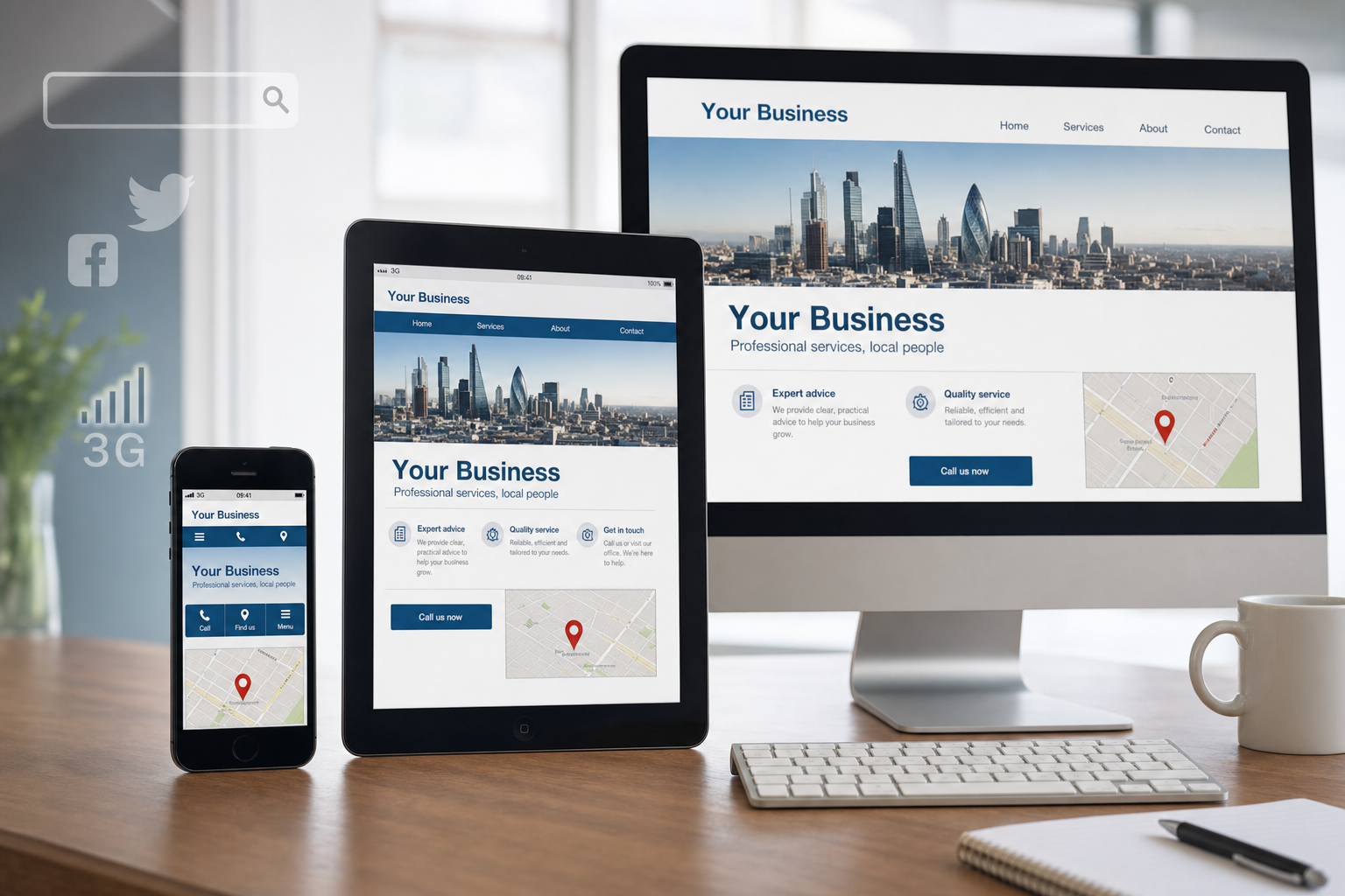
Responsive web design is becoming an increasingly popular approach because it allows a website layout to adapt to different screen sizes using flexible grids, images and style rules. For many businesses, this can provide a more manageable long-term solution than maintaining a completely separate mobile website. It also helps keep content consistent, as the same page can serve desktop, tablet and smartphone users in an appropriate layout.
Separate mobile websites can still be suitable in some situations, particularly where mobile visitors need a very different set of functions or where an existing site cannot be redeveloped immediately. However, separate versions require careful planning. Redirects must work properly, search engines need clear signals about equivalent pages, and content must not become out of date on one version while remaining current on another.
The best choice depends on the business, the budget, the existing technology and the type of visitor. The important point is that the decision should be made deliberately at the planning stage, rather than treated as a patch after launch.
Design details that matter on mobile screens
Mobile usability is often won or lost in small details. A clean layout, readable text and clear calls to action can make a significant difference. Pages should have enough contrast, sensible line lengths and buttons that are large enough to tap without accidentally selecting the wrong link. Navigation should be simple and predictable, with the most important sections easy to reach.
Forms deserve particular attention. A contact form that feels acceptable on a desktop may be too long on a phone. Where possible, ask only for the information needed to respond properly. Use clear labels, avoid unnecessary fields and make error messages easy to understand. For many businesses, a prominent telephone link may be just as important as a form, especially for urgent enquiries.
Images should support the message rather than slow the page unnecessarily. Large, uncompressed photography can make a mobile page feel sluggish, particularly over a 3G connection. Good image preparation, sensible file sizes and careful use of scripts can help keep the experience smooth. Visitors are more patient with a site that looks professional and loads promptly.
It is also wise to avoid relying on technology that many mobile devices do not support well. For example, Flash-based introductions, menus or galleries can cause serious problems for smartphone and tablet users. Modern HTML, CSS and JavaScript techniques can usually provide a more accessible and maintainable solution, provided they are used carefully and tested properly.
Mobile traffic and search marketing
Search remains one of the most important sources of website enquiries, and mobile traffic is changing the way people search. Mobile searches are often more immediate and local. Someone searching for a restaurant, accountant, repair service or retailer on a phone may be close to making contact. This makes accurate, useful and easily accessible information essential.
For organic search, businesses should focus on the same fundamentals that make a website useful: clear page titles, descriptive headings, relevant copy, logical internal links and content that answers real customer questions. A mobile-friendly layout supports these efforts by helping visitors stay on the site and complete their task. If users arrive from search and quickly leave because the page is unreadable, the business has missed an opportunity.
Local search is particularly important for mobile users. Business name, address and telephone details should be consistent across the website and other reputable listings. Opening times, service areas and directions should be easy to find. A map can be helpful, but it should not replace written address details that can be read, copied and indexed.
Paid search campaigns should also take device behaviour into account. Mobile visitors may respond better to concise adverts, direct calls to action and landing pages that make it easy to call or enquire. Campaign performance should be reviewed by device where possible, rather than assuming that desktop and mobile visitors behave in the same way. A keyword that performs modestly on desktop may be more valuable on mobile if it leads to calls from people ready to act.
Social media is feeding mobile visits
Social media activity is a major reason to take mobile traffic seriously. Many people check Facebook, Twitter, LinkedIn and other networks from a phone or tablet throughout the day. When a business shares a blog post, offer, event update or useful guide, a large proportion of clicks may come from mobile devices. If the destination page is difficult to read, the social media effort loses impact.
This should influence both content and design. Social posts often create short bursts of attention, so landing pages need to communicate value quickly. A blog article should have a clear introduction, readable paragraphs and helpful headings. A promotion should explain the offer and next step without forcing visitors to search through several pages. An event page should make the date, time, location and booking details obvious.
Businesses should also consider how website content appears when shared. Page titles and descriptions should be clear because they often form the preview text on social platforms. Strong, relevant images can improve engagement, but they must be supported by a page that works after the click. Social media should not be treated as separate from the website; it is one of the routes by which mobile visitors arrive.
Domain names, branding and mobile recall
Mobile behaviour also affects how businesses think about domain names and branding. A good domain should be easy to say, type and remember. This matters even more on a phone, where typing can be slower and mistakes are more common. Shorter, clearer domains are often easier for customers to enter from printed material, radio mentions, vehicle signage or a verbal recommendation.
For UK businesses, a relevant .co.uk domain remains a strong choice, particularly where the audience is primarily domestic. A .com domain can also be useful, especially for organisations with broader ambitions or where brand protection is important. The right decision depends on the trading name, audience and availability. Businesses should also consider registering sensible variations where there is a clear risk of confusion, but they should avoid building a portfolio of unnecessary domains with no practical use.
Hyphens, unusual spellings and long strings of keywords can create problems. They may appear to describe a service, but they are harder to remember and easier to mistype on a mobile keyboard. A domain should support credibility as well as search visibility. It should look professional in email addresses, printed material and social media profiles.
It is also important to keep registration details, renewal dates and ownership records under control. A domain is a core business asset. Losing access to it, or having it registered in the wrong name, can create serious disruption for email, the website and marketing activity.
Technology decisions should support long-term marketing
Mobile traffic should be considered when choosing a content management system, hosting arrangement and development approach. A business website is rarely finished at launch. New pages, blog posts, case studies, event updates and service changes all need to be added over time. If the system makes mobile-friendly content difficult to manage, the site may quickly fall behind.
Editors should be able to add content without breaking layouts on smaller screens. This means having clear templates, sensible image handling and guidance on headings, links and formatting. A well-built site should allow marketing activity to continue without requiring technical intervention for every minor update.
Testing is equally important. A site should be checked on a range of common smartphones, tablets and desktop browsers. It is not enough to resize a browser window and assume the job is complete. Real devices reveal practical issues such as tap targets, form behaviour, orientation changes, image loading and the way telephone links work.
Analytics should be installed and reviewed from the start. Business owners should look at mobile traffic levels, popular pages, enquiry paths, bounce rates and conversions by device. This information can shape future improvements. For example, if many mobile visitors land on a service page but few enquire, the page may need a clearer call to action, shorter copy near the top or a more prominent phone number.
Content should answer mobile visitors quickly
Mobile-friendly design is not only a technical matter. The writing itself has to work on smaller screens. Long, dense paragraphs can be hard to scan. Clear headings, concise introductions and useful summaries help visitors decide whether they are in the right place. This does not mean every page must be short; it means the structure should make information easy to find.
Service pages should explain what the business does, who it helps, where it operates and what the visitor should do next. Product pages should include essential specifications, availability information where appropriate and clear enquiry or purchase routes. Blog posts should provide genuine value rather than exist only for search engines. Useful content earns trust, supports search visibility and gives social media activity something worthwhile to share.
For many businesses, frequently asked questions can be especially useful for mobile visitors. Short answers to common concerns about appointments, delivery, guarantees, locations, parking or consultation processes can remove barriers to enquiry. The easier it is for a visitor to feel informed, the more likely they are to take the next step.
Planning for mobile is planning for customers
The rise of mobile traffic does not mean every business needs an elaborate mobile application or a complex technical project. In many cases, the greatest gains come from sound planning: a responsive or well-structured mobile experience, fast-loading pages, clear contact details, useful content and marketing campaigns that recognise how people actually browse.
Business owners should treat mobile as part of the wider digital strategy, not as an isolated design preference. Search, social media, domain choice, branding, content and technology all connect. A potential customer may encounter the business in several places before making contact, and any weak point can reduce confidence.
The businesses that benefit most will be those that make the web easier for their customers. If a visitor can find the right information, read it comfortably, trust the brand and make contact without frustration, the website is doing its job. As mobile traffic continues to grow, that practical focus will become central to successful website planning.