The way people use business websites is changing quickly. A potential customer may first see your brand on a desktop computer at work, then return later on an iPhone, Android handset, BlackBerry or iPad. If your website only works well on a large screen, you risk making that second visit awkward, slow or unconvincing. Responsive design is becoming a serious business priority because it allows one website to adapt its layout to suit different screen sizes, helping visitors read, browse and enquire with less effort.
For UK business owners, this is not simply a design fashion. It affects enquiries, search visibility, social media activity, customer confidence and the long-term value of your website investment. A site that is difficult to use on a phone can undermine otherwise strong marketing, particularly when more people are arriving from email newsletters, Twitter, Facebook, LinkedIn and search results while they are away from a desk.
What responsive design means in practical terms
Responsive design is an approach to website design that uses flexible page layouts, scalable images and CSS media queries to adjust the way a page appears on different devices. Rather than creating one fixed-width design for desktop visitors and a separate mobile website for phone users, a responsive site can reshape itself according to the space available.
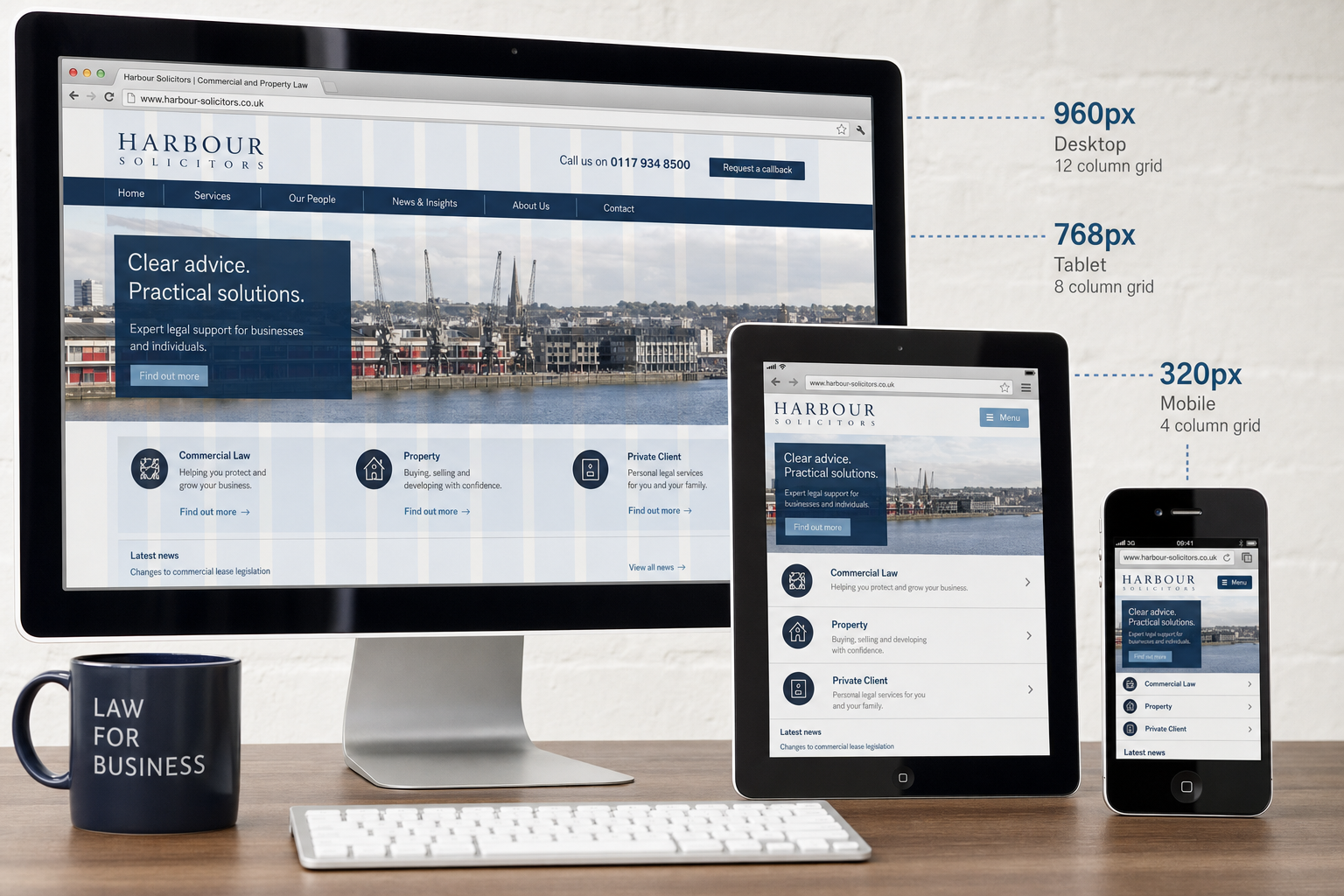
On a wide desktop monitor, a business website might show a large header, a multi-column layout, a full navigation menu and supporting images beside the main content. On a tablet, the columns may become narrower or stack in a clearer order. On a smartphone, the same content may appear in a single column with larger, touch-friendly links, simpler navigation and images that fit the screen.
The important point is that the website still feels like the same brand. The logo, tone of voice, colours, content and calls to action remain consistent. The layout changes so that the visitor is not forced to pinch, zoom and scroll sideways just to read a paragraph or find a telephone number.
Why mobile behaviour should influence business website planning
Mobile web use is no longer limited to a small group of technology enthusiasts. Many customers now use smartphones to look up local services, compare suppliers, check opening hours, read reviews, follow social links and respond to recommendations. Tablet use is also growing, particularly for browsing at home in the evening.
This behaviour matters because business websites are rarely viewed in one neat, predictable setting. A visitor may search for an accountant, solicitor, restaurant, tradesperson, consultancy or retailer while travelling, during a lunch break or after seeing a recommendation on social media. If the website is slow, cramped or hard to navigate, that visitor may simply return to the search results and choose a competitor.
Responsive design helps reduce that friction. It does not guarantee more enquiries by itself, but it gives your existing marketing a better chance of working. If you are investing in search engine optimisation, social media marketing, email campaigns, brochure design or offline advertising, your website must be ready for the variety of devices those activities can send to it.
The business value of a single adaptable website
One of the strongest arguments for responsive design is that it can simplify how a business manages its online presence. A separate mobile website may seem attractive at first, but it often introduces extra decisions: which pages should appear on the mobile version, how content should be synchronised, what happens when a visitor shares a mobile link, and how search engines should interpret the relationship between the desktop and mobile pages.
A single responsive website can be easier to maintain because the same core content is available to all visitors. Product descriptions, service pages, case studies, contact details and news articles can be managed in one place. This is particularly useful for small and medium-sized businesses without large in-house digital teams.
It also supports a more consistent brand experience. When someone clicks a link from Twitter on a phone, then shares it with a colleague using a desktop computer, the destination should still make sense. The page should not look like an afterthought simply because it was opened on a different screen.
For many businesses, responsive design is also a sensible long-term planning decision. New devices will continue to appear, and screen sizes will continue to vary. A flexible approach is more future-conscious than designing only for one fashionable handset or one fixed desktop width.
How responsive design supports search marketing
Search engines aim to send users to pages that are useful, relevant and accessible. While content quality and links remain central to search marketing, usability is increasingly difficult to ignore. If visitors arrive from a search result and quickly leave because the page is unreadable on their device, the business has lost an opportunity even if the ranking itself was strong.
Responsive design can support search marketing in several practical ways. First, it keeps each piece of content at one main address, which can make it easier for people to link to, share and bookmark. Secondly, it reduces the risk of having thin or incomplete mobile pages that do not represent the full value of the business. Thirdly, it encourages a more disciplined approach to content hierarchy, because the most important information must work clearly on small screens as well as large ones.
That does not mean every responsive website will automatically rank well. Search engine optimisation still requires relevant page titles, useful headings, well-written copy, sensible internal linking, fast-loading pages and an understanding of the phrases customers actually use. However, a responsive website can provide a stronger foundation for those efforts because it helps content perform across more browsing situations.
Businesses should also remember that search results are not the only source of mobile traffic. Social media posts, email links and directory listings can all be opened on phones. A joined-up digital marketing strategy should consider the experience after the click, not only the campaign that generated it.
Design decisions that matter on smaller screens
Responsive design is not just a technical exercise. It requires careful thought about what visitors need most. On a small screen, clutter becomes more damaging. Long menus, oversized banners, unnecessary introductory text and decorative images can push important information too far down the page.
For a service business, the most important actions may be calling, sending an enquiry, viewing key services and checking location details. For an e-commerce business, product images, descriptions, stock information, delivery details and the buying process need particular care. For a professional organisation, credibility signals such as qualifications, testimonials, team information and useful articles must remain easy to find without overwhelming the visitor.
Good responsive design usually involves prioritising content rather than merely squeezing a desktop page into a narrow column. Navigation may need to be simplified. Buttons and links should be large enough to tap accurately. Forms should ask only for information that is genuinely required. Images should be prepared so they do not slow down the page unnecessarily on mobile connections.
Typography is another important consideration. Text that looks elegant on a large monitor may be tiring to read on a phone if it is too small or lacks spacing. Clear type, concise paragraphs and strong headings make a real difference to the visitor’s experience.
Technology considerations in February 2012
Responsive design commonly relies on HTML, CSS and media queries. Support across modern browsers is improving, but businesses should still be realistic about browser differences. Many office users continue to browse with older versions of Internet Explorer, while others use Firefox, Chrome, Safari or Opera. Mobile visitors may be using iOS, Android, BlackBerry, Windows Phone or other mobile browsers.
This means testing is essential. A responsive website should be checked on a sensible range of devices and browsers, not simply resized in one desktop browser and declared complete. The aim is not to make the site look absolutely identical everywhere. The aim is to make it usable, attractive and dependable for the people most likely to visit.
Performance also deserves attention. Mobile connections can be slower or less reliable than office broadband, so large image files, excessive scripts and heavy pages can cause frustration. A cleaner design, well-compressed images and careful development can help the site load more efficiently.
It is also wise to consider the content management system behind the website. Business owners need to update news, services, staff pages and product information without breaking the layout. When planning a responsive site, make sure the editing process is straightforward and that uploaded images and page content will behave properly within the responsive framework.
Social media and responsive landing pages
Social media marketing makes responsive design even more important. People checking Facebook, Twitter, LinkedIn, YouTube or Google+ are often doing so on mobile devices. If your business shares a news article, offer, guide, video or event page, many of the first visitors may arrive on a small screen.
A weak mobile experience can reduce the value of social activity. A post may be well written and timely, but if the linked page is awkward to use, visitors may not read further, share it or make an enquiry. Responsive landing pages help keep the journey smooth from social update to website action.
For example, a local restaurant sharing a seasonal menu should ensure the menu can be read without zooming and that booking details are visible. A training provider promoting a course should make dates, location, benefits and enquiry options clear on a phone. A business-to-business supplier sharing a white paper or article should avoid forms that are unnecessarily long for mobile users.
Social media also rewards consistency. If your profile imagery, website design and landing pages feel connected, the business appears more professional. Responsive design helps preserve that consistency across the different screens where social content is consumed.
Domain names, branding and responsive websites
A responsive website should sit within a clear wider branding strategy, and the domain name remains an important part of that. When registering a domain name, choose something memorable, easy to spell and closely aligned with your business name or core brand. Avoid awkward punctuation, confusing abbreviations and spellings that are difficult to say over the telephone.
For many UK businesses, it is sensible to consider both a UK-focused domain and a broader commercial option if they are available and appropriate. This can help protect the brand and reduce confusion. If your business has plans to expand into different regions or service areas, think ahead before committing to a name that may feel too narrow later.
It is also worth registering obvious variations where there is a clear brand protection reason to do so. However, domain registration should not be treated as a substitute for a proper search and content strategy. Owning many domain names will not, by itself, make a business more visible. A strong website, useful content, credible links and a consistent brand are far more important.
When launching a redesigned responsive website, take care with existing addresses. If old pages have earned links or search visibility, they should be handled properly so visitors and search engines can find the new equivalents. A redesign should improve the website without wasting the value built up by previous marketing.
When should a business move to responsive design
Not every business needs to rebuild its website immediately, but every business should review how its current site performs on mobile and tablet devices. Start by opening your key pages on several devices and asking practical questions: can a visitor read the text comfortably, find the main services, understand the offer, use the navigation, complete a form and contact the business without frustration?
Look at your website analytics as well. If mobile traffic is growing, if visitors on mobile devices are leaving quickly, or if enquiries from mobile users are weak, the case for responsive design becomes stronger. Even if mobile traffic is still modest, a forthcoming redesign is an ideal opportunity to plan responsively rather than investing in another fixed-width site.
Responsive design is particularly important for businesses that depend on local search, social media referrals, regular publishing, e-commerce, event promotion, hospitality bookings or time-sensitive enquiries. In these situations, customers are often acting quickly and may not wait until they are at a desktop computer.
A website should not ask the customer to work around the design. The design should adapt so the customer can act with confidence.
Planning a responsive redesign
A successful responsive website begins with strategy, not decoration. Before discussing colours and layouts, clarify the business goals of the site. Do you want more enquiries, stronger credibility, online sales, newsletter sign-ups, event bookings, recruitment interest or better support for existing customers? The responsive design should then be shaped around those objectives.
Content planning is equally important. Decide which pages matter most, what questions customers ask before making contact, and what proof they need to trust the business. Responsive design often exposes weak content because there is less room to hide behind visual clutter. Clear messaging, helpful service explanations and strong calls to action become essential.
Wireframes or simple layout plans can be useful before full visual design begins. They help show how content will rearrange from desktop to tablet to phone. This stage can prevent costly misunderstandings and ensures that important elements are not lost on smaller screens.
Finally, build testing and refinement into the project. Responsive design involves judgement. Some decisions only become obvious when real pages are viewed on real devices. Allow time to adjust navigation, image sizes, form layouts and content order before launch.
A practical priority, not a passing trend
Responsive design has moved from an interesting design idea to a practical business consideration. Customers are using a wider mix of devices, and they expect websites to work without fuss. Search marketing, social media and brand reputation are all affected by the quality of that experience.
For UK business owners planning a new website or reviewing an existing one, the question is no longer whether mobile and tablet users matter. The question is whether your website gives those users the same confidence and clarity as it gives someone sitting at a desktop computer.
A well-planned responsive website can make your digital marketing more efficient, your brand more consistent and your content easier to access. It is not a shortcut to success, but it is becoming an important foundation for businesses that want their websites to perform properly wherever customers choose to browse.