More customers are now arriving at business websites from a wider range of devices than ever before. A visitor might find you from a desktop computer at work, check your details again on a smartphone on the train, or browse your services on a tablet from the sofa. This change is encouraging many website owners to think more carefully about responsive web design: an approach that allows a website layout to adapt to the screen it is viewed on, rather than forcing every visitor into a single fixed page width.
For UK businesses planning a new website or reviewing an existing one, this is not simply a design fashion. It is a practical response to changing online behaviour. A site that is awkward to read on a phone, slow to load, or difficult to navigate with a finger can lose enquiries before a visitor has even understood what the business offers. Responsive web design aims to make the same website more usable across different devices, while keeping branding, content and search marketing more manageable.
What responsive web design means
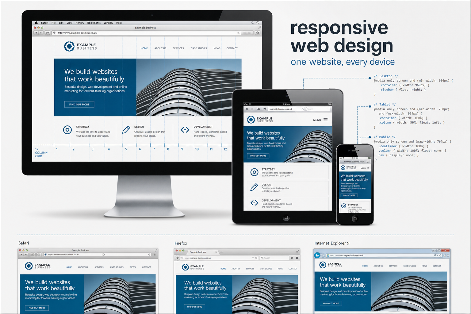
Responsive web design combines several front-end design techniques to create pages that adjust to different screen sizes. Rather than producing one rigid layout for desktop users and a completely separate mobile site, the designer creates a flexible structure. Columns can narrow, images can scale, and navigation can be simplified as available space changes.
The main ingredients are fluid grids, flexible images and CSS media queries. A fluid grid uses proportions rather than fixed pixel widths, allowing page elements to resize in relation to the browser window. Flexible images are set so that they do not spill out of their containers on smaller screens. Media queries, introduced in CSS3, allow different style rules to be applied based on factors such as screen width.
In practical terms, a business website might show three columns of service information on a large desktop monitor, two columns on a tablet, and a single column on a smartphone. The content remains the same, but its presentation changes to suit the context. This helps visitors read, navigate and take action without constant zooming and horizontal scrolling.
It is important to note that responsive web design is still a developing approach. Browser support varies, and older browsers may not understand every newer CSS feature. A sensible design process therefore uses progressive enhancement: starting with clear content and a solid structure, then improving the presentation for browsers and devices that support more advanced styling. This is a more robust approach than relying on a single ideal viewing environment.
Why business owners should be paying attention
Mobile internet use is no longer confined to a small group of enthusiasts. Smartphones such as iPhones, Android handsets and BlackBerry devices are now common among business customers and consumers alike. The arrival of tablet browsing has also changed expectations. People increasingly expect websites to be readable and useful wherever they are, not only at a desk.
For a local service provider, this can affect the quality of enquiries. A visitor searching for a telephone number, address, opening hours, and a quick description of services may be using a small screen. If the website makes these details difficult to find, the visitor may return to the search results and choose a competitor. For a professional services firm, a poor mobile experience can also weaken the impression of competence and attention to detail.
Responsive web design can support business goals in several ways:
- Better accessibility for different visitors: content can be easier to read on desktops, laptops, tablets, and smartphones.
- More consistent branding: the same visual identity, tone of voice and key messages can be carried across devices.
- Simpler content management: one set of pages is usually easier to maintain than separate desktop and mobile versions.
- Improved enquiry paths: important calls to action, telephone numbers and contact forms can be planned for smaller screens from the outset.
- More future-ready design: flexible layouts are better suited to the growing variety of screen sizes now appearing.
This does not mean every existing website must be rebuilt immediately. However, any business commissioning a new website in 2011 should at least discuss how the design will behave on smaller screens. Ignoring the subject may result in a site that begins to feel dated sooner than expected.
Responsive design and search marketing
Search engine optimisation is often discussed in terms of rankings, keywords and links, but the experience visitors have after clicking a result is also crucial to commercial success. If a website attracts traffic but fails to convert that traffic into enquiries, bookings, calls or sales, the campaign is not doing its full job.
Responsive web design can help search marketing by keeping important content in one place. A separate mobile site can sometimes create extra work: duplicated pages, different URLs, inconsistent content and additional technical considerations. A responsive approach often allows one page to serve different devices, which can make content planning and link building more straightforward.
For example, if a company publishes a useful guide to choosing a service, it is helpful for all links, shares, and references to point to a single main version of that guide. Visitors on desktop and mobile devices can then receive an appropriate layout without the business having to promote separate addresses. This can help preserve clarity in a search marketing campaign.
That said, responsive design is not a substitute for sound SEO. Page titles, headings, descriptive copy, internal linking, crawlable navigation and relevant content remain important. Businesses should still research the phrases their customers use, write pages that answer real questions, and ensure that search engines can access the content. A responsive layout supports these efforts by making the resulting pages more usable across devices.
Loading speed also deserves attention. Mobile visitors may be using slower connections, so large images and heavy scripts can create frustration. A responsive website should not simply shrink a large desktop page onto a small screen. It should be planned with efficient code, carefully prepared images, and a clear content hierarchy.
Planning a responsive business website
A successful responsive project begins with priorities, not decoration. Before sketching layouts, it is worth asking what different visitors are trying to achieve. A restaurant may need menus, location details and booking information to be prominent. A solicitor may need clear service pages, credentials and a simple enquiry route. A manufacturer may need product information, specifications and a way to request a quote.
Once these priorities are clear, the design can be planned around content. This is especially important on smaller screens, where space is limited. Long lists of navigation links, large banners and unnecessary introductory text can push useful information too far down the page. Responsive design encourages businesses to be disciplined about what matters most.
Navigation should be simple
Desktop websites often use wide navigation bars, drop-down menus and multiple sidebars. These can become awkward on small screens. A responsive design should provide a clear route to key areas of the site without making the visitor tap tiny links. Menus may need to be shortened, grouped or presented differently as the screen narrows.
Calls to action should remain visible
If the purpose of a page is to generate an enquiry, the enquiry route should not disappear on a mobile device. Telephone numbers, email links, contact forms and directions can be particularly important for mobile visitors. A good responsive design considers these actions early, rather than treating them as an afterthought.
Images should support the message
Photography and graphics can help explain a business, but large images can be a burden on smaller devices. Images should be chosen and prepared carefully. Flexible image rules can prevent broken layouts, while sensible cropping and file preparation can improve the experience for visitors on slower connections.
Branding, credibility and first impressions
A website is often the first substantial interaction a potential customer has with a business. If the design appears broken on a phone or requires constant zooming, it can make the organisation seem less attentive. This is particularly important for businesses that sell expertise, reliability or service quality.
Responsive web design helps protect the brand experience by ensuring that the website remains coherent across contexts. Colours, typography, imagery and tone should feel consistent whether the visitor is on a large monitor or a compact screen. The layout may change, but the brand should still be recognisable.
There is also a trust element. Visitors are more likely to complete forms, call a company or share details when a website feels professional and easy to use. Cluttered pages, overlapping text and awkward navigation can create unnecessary doubt. For many businesses, improving usability is not just a technical matter; it is part of building confidence.
Social media and the mobile visitor
Social media marketing is another reason to take smaller screens seriously. Many people check Facebook, Twitter, LinkedIn and other social platforms from mobile devices. If a business shares a link to its latest article, promotion, or announcement, a significant number of visitors may open it on a phone.
This makes a simple but important point: social activity should lead to pages that work well for the audience they serve. A carefully written post can be wasted if the landing page is difficult to read or slow to load. Responsive web design helps ensure that shared links remain useful beyond the desktop environment.
Businesses should also consider how social sharing buttons, embedded video and image galleries behave on smaller screens. These features can add value, but they should not dominate the page or make it harder to reach the main content. As with all digital marketing, the aim is to support the visitor's journey, not distract from it.
Domain names and responsive website planning
Responsive web design also raises a useful question about domain strategy. Some businesses have considered using a separate mobile address for mobile visitors. While this can be appropriate in certain circumstances, many small and medium-sized businesses will prefer the simplicity of one main domain with a flexible website.
When registering a domain name, choose something clear, memorable and closely connected to the business name or main service. Keep it easy to spell over the phone, avoid unnecessary punctuation, and consider whether the name will still make sense as the business grows. For UK organisations, it is also sensible to consider relevant UK domain extensions alongside any broader options, so that customers can find the business easily and the brand is protected where appropriate.
Do not register domains purely for search engines. A keyword-rich domain may appear attractive, but it should still be credible, brandable and suitable for long-term marketing. The strongest approach is usually to combine a sensible domain name with useful content, good technical structure and consistent promotion.
What to ask your web designer
If you are commissioning a new website, responsive design should be part of the early conversation. It is much easier to plan flexible layouts from the beginning than to bolt them on after every visual decision has been made. Business owners do not need to understand every technical detail, but they should ask practical questions.
- How will the website layout change on smaller screens?
- Which devices and browsers will be considered during design and testing?
- Will important content and calls to action remain easy to find on a smartphone?
- How will images be prepared to keep pages efficient?
- Will the site use one main set of URLs for desktop and mobile visitors?
- How will the design support search engine optimisation and social media campaigns?
- Can the content management process remain straightforward as the site develops?
The answers should be clear and business-focused. A good design partner will be able to explain not only how the layout works, but why particular decisions support the visitor and the organisation's aims.
A sensible step for the next generation of websites
Responsive web design is gaining attention because it responds to a real change in how people use the web. It is not about chasing every new device or adding complexity for its own sake. It is about recognising that customers now access websites on many different screens and that a business website should be ready to serve them effectively.
For UK business owners, the opportunity is to plan websites that are clearer, more flexible and easier to maintain. By combining responsive layouts with strong content, sensible SEO, consistent branding and well-planned social media activity, a website can become a more reliable part of the wider marketing programme.
The businesses that benefit most will be those that treat responsive design as part of strategy rather than decoration. Start with the customer, decide what the website must achieve, and then design an experience that works across the devices people are already using. That is a practical way to build a website that feels more useful now and better prepared for what comes next.