The arrival of high-resolution screens on popular mobile devices is changing what customers expect from business websites. Images, icons and interface details that once looked perfectly acceptable can appear soft, fuzzy or poorly finished on a Retina display. For UK businesses investing in a new website, or improving an existing one, Retina display web design is no longer a technical curiosity. It is becoming an important part of presenting a credible brand online.
This does not mean every organisation needs to rebuild its website immediately, nor does it mean every image should simply be made twice as large. It does mean website owners should understand how these displays affect visual quality, download speed, search performance and the customer’s first impression. A thoughtful approach can make a website look sharper without creating unnecessary delays or maintenance problems.
Why Retina displays matter for business websites
A Retina display contains a much higher density of pixels than many traditional screens. To the viewer, this can make text, photographs and graphics appear more detailed and more natural. The effect is especially noticeable on smartphones and tablets, where customers often hold the device close to their face. The iPhone 4 has already familiarised many users with this level of sharpness, and the new iPad is likely to make high-resolution browsing feel more normal for a wider audience.
For a business website, the practical issue is simple: a graphic created for an older screen can look blurred when the device has more pixels available. Logos, navigation icons, buttons, image banners, maps and product details are often the first elements to show the problem. A strong brand mark can lose its crisp edge. A call-to-action button can appear less professional. A product photograph can look less convincing than it should.
Visitors rarely describe this as a pixel density problem. They simply feel that one site looks more polished than another. In competitive markets, that impression matters. If a potential customer is comparing two solicitors, restaurants, hotels, retailers, consultants or trades, a sharper and better-organised website can help build confidence before they have made contact.
Understanding the difference between photographs and interface graphics
Not all website images need to be treated in the same way. A sensible Retina display web design plan begins by separating decorative interface graphics from photography and content images.
Interface graphics include logos, icons, menu arrows, buttons, social media symbols, background patterns and small illustrations. These elements often contain hard edges and fine lines, so they can look particularly poor when stretched across a high-resolution screen. They are usually the best candidates for sharper replacement files or vector artwork.
Photography is more nuanced. A carefully prepared larger photograph can look excellent on a Retina display, but it can also increase file size dramatically. Large photographic banners may already be one of the heaviest parts of a website. Doubling every image without judgement can slow the site down, particularly on mobile connections. Product photographs, portfolio examples and important promotional images should be reviewed, but the aim should be better quality rather than bigger files for their own sake.
Text is also worth mentioning. Body copy rendered as normal HTML text generally benefits from the device’s screen resolution automatically. However, text placed inside an image, such as a promotional banner or graphic advert, can become blurry unless it has been prepared carefully. Wherever possible, important words should remain as real text on the page, not locked inside an image. This helps accessibility, search engines and display quality.
Practical design approaches available in March 2012
There are several practical ways to improve images for high-resolution screens while keeping a website manageable. The right combination depends on the type of site, its audience and the way it has been built.
Use larger source images where they genuinely add value
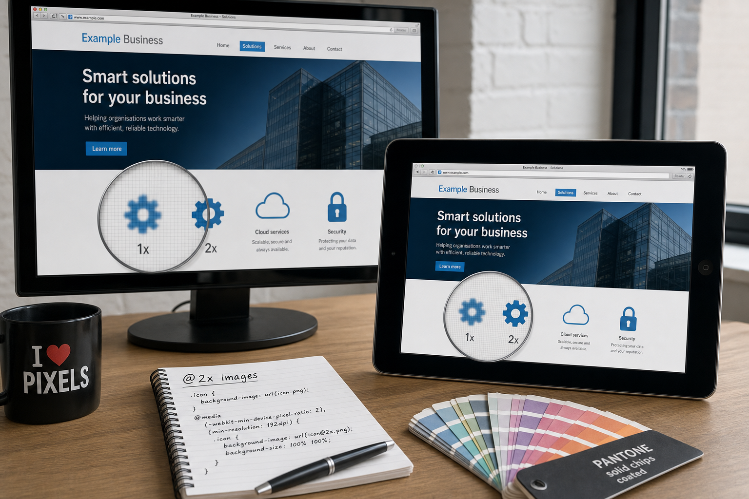
One common technique is to create a larger version of an image, often twice the width and height, and display it at the intended smaller size. For example, an icon that appears as 32 by 32 pixels on the page may be supplied as a 64 by 64 pixel file. On a Retina display, the extra detail can be used to render a crisp result.
This approach works well for small icons and selected interface details. It is less suitable when applied blindly to every large photograph. A twice-width and twice-height photograph contains four times as many pixels, which can mean a significantly heavier file. Website owners should ask which images are important enough to justify that additional weight.
Prefer vectors for logos and simple graphics where suitable
Vector graphics are resolution independent, which makes them useful for logos, symbols and simple illustrations. They can scale cleanly on different screens without the same loss of sharpness as a bitmap image. In practice, many 2012 websites still need careful browser support planning, so vector use should be tested rather than assumed.
For some projects, a combination of approaches is sensible: keep a vector master file for the brand, export crisp PNG versions for the website, and provide higher-resolution alternatives for devices that can use them. The important point is to protect the quality of the original artwork. A logo copied from an old email signature or low-quality leaflet file is unlikely to provide the finish required for a modern website.
Use CSS background techniques with care
For icons and decorative backgrounds, CSS can help deliver sharper assets to high-resolution devices. Many designers are using media queries, including WebKit device pixel ratio queries, to serve alternative background images to devices with denser screens. This can be effective for the current generation of iPhone and iPad devices, provided it is tested properly.
When using a larger background image, the background size should be controlled so that it displays at the intended visual dimensions. Otherwise, the browser may simply show the asset at the wrong size. This is a small technical detail, but it is exactly the sort of detail that separates a polished implementation from a frustrating one.
Keep image sprites and icon sets organised
Many websites use image sprites, where several small graphics are combined into one file to reduce server requests. Retina-ready sprites can work well, but they need accurate positioning and clear documentation. If a website is likely to be updated by several designers or developers, file naming and source files should be kept tidy. A confusing folder full of duplicate icons can quickly become a maintenance problem.
Balancing sharp visuals with website speed
A sharper website should not become a slower website. Page speed is important for users and should be considered as part of search marketing. Visitors on mobile networks are less patient, and search engines have made it clear that speed is one of many signals worth taking seriously. A visually attractive page that takes too long to load may lose enquiries before the visitor has seen the content.
Good image preparation remains essential. JPEG files should be compressed sensibly for photographs. PNG files should be used carefully for graphics that need transparency or crisp edges. GIF may still be suitable for very simple graphics, although it is not the right choice for detailed photography. Designers should avoid uploading oversized images directly from a camera or design package without preparing them for the web.
It is also worth reviewing the number of separate graphics on a page. A home page with several banners, icons, social media badges, partner logos and background textures may look attractive in a design comp, but it can become heavy in practice. Prioritise the visuals that support the message and remove decoration that does not help the user decide what to do next.
For business owners, the best question is not simply, “Can this image be Retina quality?” A better question is, “Will making this image sharper improve trust, understanding or conversion enough to justify the extra file weight?” That commercial view keeps design decisions focused.
Search marketing considerations for high-resolution images
Retina display web design should support search marketing rather than work against it. Search engines cannot judge the elegance of a high-resolution icon in the same way a customer can, but they can understand the structure, relevance and performance of a page.
Use descriptive file names where appropriate. A file called handcrafted-oak-dining-table.jpg is more useful than image123.jpg, provided the name is accurate and not artificially stuffed with keywords. Alternative text should describe meaningful images for users who cannot see them and for search engines trying to understand the page. A decorative flourish or background pattern usually does not need keyword-heavy alternative text.
Where a graphic contains important words, consider rebuilding it as HTML text styled with CSS. This can improve clarity on Retina displays, make the message easier for search engines to understand, and allow the text to adapt more readily across different screen sizes. A banner reading “Book a free consultation” should ideally be accessible as text rather than existing only as pixels within an image.
Businesses should also remember that image quality supports engagement. A visitor who trusts the page is more likely to stay, read, share and enquire. Search marketing is not only about ranking for a phrase. It is about earning the click and then satisfying the visitor’s expectation when they arrive.
Retina displays, mobile browsing and social media marketing
High-resolution screens are closely linked to the growth of mobile and tablet browsing. Many customers now move between a desktop computer, a smartphone and a tablet during the same buying process. They may first notice a business through Twitter, Facebook, LinkedIn, Google+ or an image shared on a blog, then visit the website on a mobile device before making contact later from a desktop machine.
This means brand consistency matters. A blurred logo on the website, a poorly cropped Facebook page image and an unclear Twitter profile graphic all weaken recognition. Social media marketing works best when the visual identity feels coherent across platforms. The artwork does not need to be identical in every location, but it should be prepared from good source files and sized carefully for each use.
Pinterest is also attracting attention as a visual discovery platform, particularly for sectors such as interiors, food, fashion, weddings, crafts and retail. For these businesses, stronger imagery can influence whether people share, pin or ignore a product. While a website should not be overloaded with enormous images, the quality of key photographs can support both social sharing and customer confidence.
When planning campaigns, consider where images will appear beyond the website. Blog thumbnails, email newsletters, Facebook updates and product previews may all use cropped or resized versions of the same original image. Keeping a well-organised image library, with high-quality originals and properly prepared web versions, can save time and protect the brand.
What UK business owners should review on an existing website
If your website was designed before high-resolution mobile screens became common, it is worth carrying out a practical visual audit. This does not need to be overcomplicated. Load the site on a recent smartphone or tablet and look at it with a customer’s eye.
- Logo quality: check whether the brand mark appears sharp or whether the edges look fuzzy.
- Navigation and buttons: review icons, arrows and call-to-action graphics, especially those with text.
- Product and service images: look at important photographs that influence buying decisions.
- Social media graphics: compare website branding with profile and cover images used on social platforms.
- Page speed: consider whether pages feel slow on mobile connections, particularly image-heavy pages.
- Search basics: check image file names, alternative text and whether important messages are real text rather than embedded in graphics.
This review often reveals a handful of high-impact improvements. Replacing a low-quality logo file, refreshing icons, improving key photography and compressing large images can make a site feel more professional without requiring a full redesign.
Domain names, branding and a sharper online presence
Retina-ready imagery is only one part of building a credible online presence. The domain name, brand identity, website structure and marketing activity all need to work together. When registering a domain, choose a name that is easy to spell, easy to say aloud and closely connected to the organisation’s trading name or proposition. For UK-focused businesses, a suitable UK domain can help customers recognise that the business is relevant to them, while a broader domain may be useful if the organisation trades internationally.
Avoid registering a domain that depends on hyphens, unusual spellings or a phrase customers are unlikely to remember. If a domain is being chosen for a new venture, consider how it will look on printed materials, email addresses, social media profiles and search results. A strong domain will not compensate for weak design or poor content, but it does provide a stable foundation for digital marketing.
It is also wise to keep ownership details, renewal dates and access credentials organised. A website project can be delayed unnecessarily when a business cannot confirm who controls the domain. Clear administration supports good marketing, particularly when redesigning a site, moving hosting or launching a new campaign.
Planning for change without chasing every device
Technology will continue to move, and more screens are likely to offer higher pixel density over time. The answer is not to chase every individual device with a separate design. Instead, businesses should invest in flexible methods, strong source artwork, sensible content management and considered image preparation.
A well-planned website design project in 2012 should ask how the site will look on desktop monitors, smartphones and tablets. It should consider whether the design relies too heavily on fixed-size graphics, whether key images are prepared from quality originals, and whether the site can be maintained without specialist intervention for every small update.
For many businesses, the most valuable step is to treat visual quality as part of the overall customer experience. Retina displays simply make weaknesses more visible. If the brand is inconsistent, if photographs are poor, if buttons are unclear or if pages are slow, a high-resolution screen will not hide the problem. It will often make it more noticeable.
A sensible next step
Retina display web design is about more than making images look attractive on the latest devices. It is about protecting the professionalism of your brand, supporting customer confidence and ensuring that design choices do not undermine speed or search visibility.
If you are planning a new website, ask your designer how logos, icons, buttons and key photographs will be prepared for high-resolution screens. If you already have a website, start with a focused audit of the most visible assets. In many cases, a small number of careful improvements can make the whole site feel sharper and more current.
Customers are becoming used to clearer screens and better digital presentation. Businesses that respond thoughtfully will be better placed to make a strong first impression, encourage enquiries and support their wider digital marketing activity.