Website accessibility is often discussed as a technical requirement, but it is much more than a box to tick during a website design project. For UK businesses, it is a practical way to make sure more people can find, understand and use your website. A site that is easier to navigate, clearer to read and more reliable across devices is not only better for disabled users; it is better for customers, search engines and your brand as a whole.
Many business owners think of accessibility only in relation to screen readers or specialist software. These are important considerations, but accessibility also covers everyday experiences: a customer trying to read pale grey text on a sunny train platform, a user with a temporary wrist injury who cannot use a mouse, an older visitor who needs larger text, or someone completing an enquiry form on a small mobile screen. When accessibility is built into a website from the beginning, the result is usually a cleaner, faster and more commercially useful online presence.
What website accessibility really means
Website accessibility means designing and developing your website so that people with a wide range of abilities can use it effectively. This includes visitors with visual, hearing, motor and cognitive impairments, as well as people using different devices, browsers and assistive technologies.
The Web Content Accessibility Guidelines, commonly known as WCAG 2.0, provide a useful framework. They are based around four principles: content should be perceivable, operable, understandable and robust. In plain English, that means users should be able to see or hear the information, move around the site, understand what is being asked of them and rely on the website working in a sensible way.
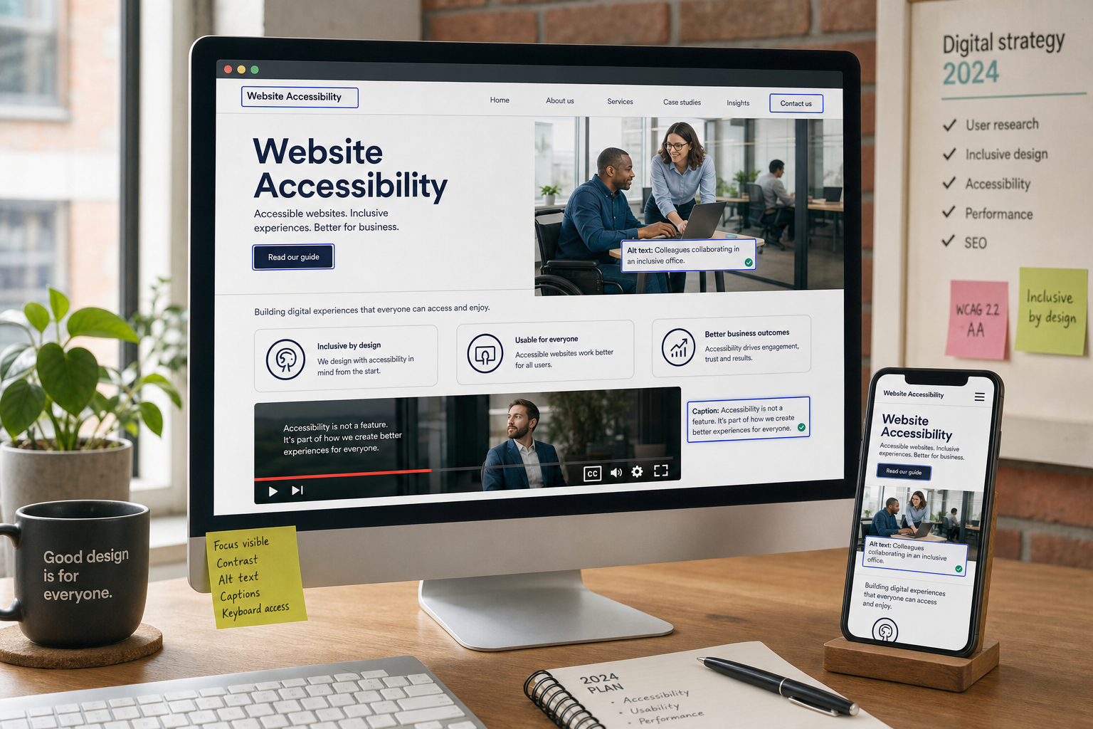
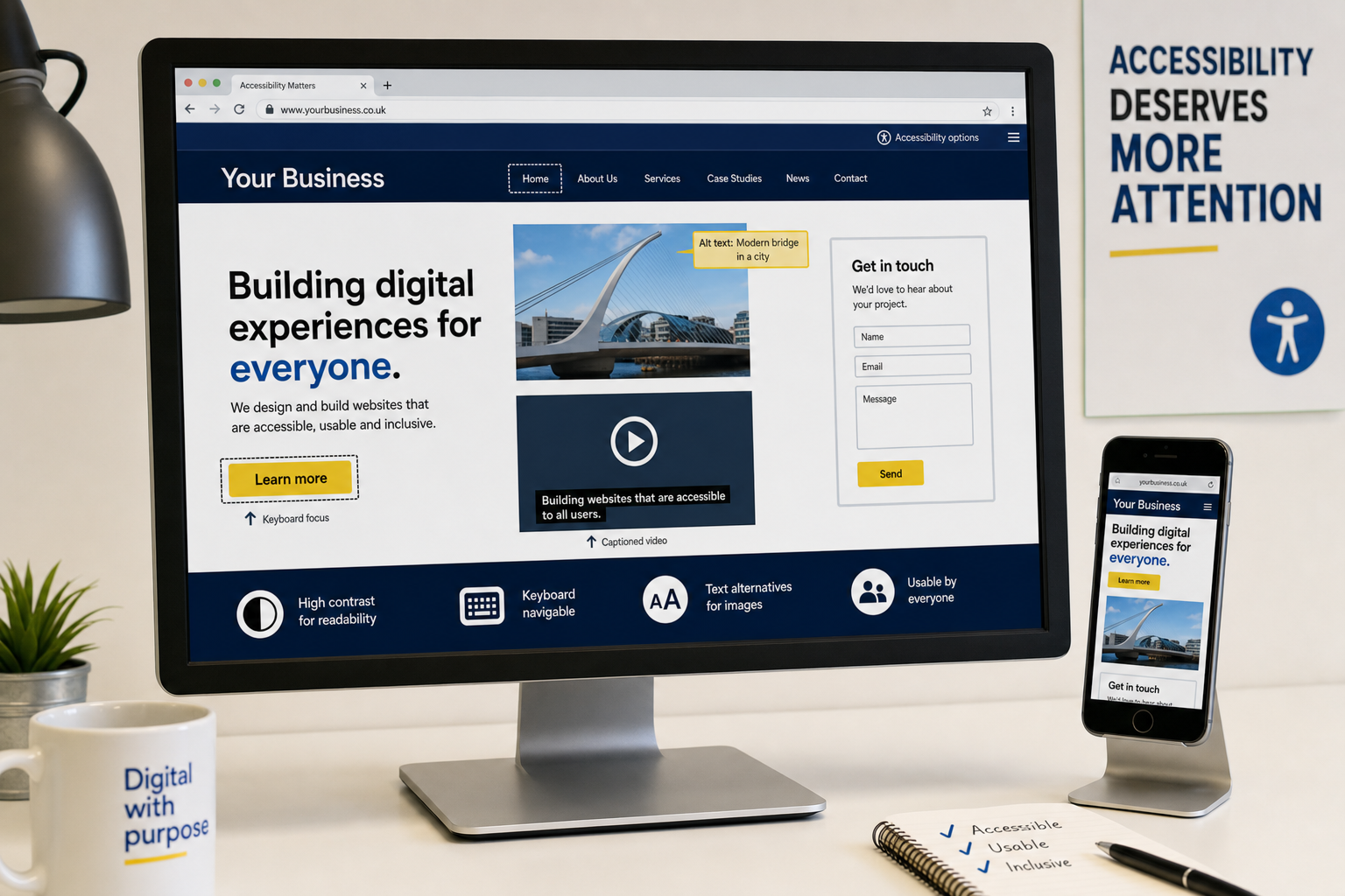
For a business website, accessibility may include writing descriptive page titles, using proper headings, ensuring good colour contrast, providing text alternatives for images, making forms clear, allowing keyboard navigation and avoiding content that only works for users with a particular device or ability. None of these points require a website to look dull. Good accessibility supports good design.
Why accessibility matters for UK businesses
The business case for website accessibility is straightforward: if people cannot use your website, they are less likely to enquire, buy, book, subscribe or recommend you. A website may look impressive, but if it creates unnecessary barriers, it is quietly turning potential customers away.
There is also a legal and reputational aspect. UK organisations need to be aware of their responsibilities under the Equality Act 2010. While the details of compliance can vary depending on the organisation and service, the underlying principle is that disabled people should not be unfairly disadvantaged when accessing goods, services or information. A more accessible website demonstrates that your business takes inclusion and customer service seriously.
Accessibility can also strengthen trust. If your website is calm, readable and easy to use, visitors are more likely to feel confident in your organisation. For local service businesses, professional firms, retailers, charities and membership organisations, that confidence can be a deciding factor. A visitor may compare several providers before making contact; a frustrating website experience can be enough to lose the enquiry.
Accessibility and search marketing work well together
Website accessibility and search engine optimisation often support the same goals. Search engines need to understand your pages, and users need to understand them too. Clear structure, relevant headings, descriptive links and meaningful alternative text all help make content easier to interpret.
For example, an image of a product, venue or service should not have a vague file name and empty description if the image carries useful information. A concise alt attribute can help users with screen readers and provide additional context to search engines. It should describe the image accurately rather than being stuffed with keywords. A useful example would be: alt='Oak dining table with six upholstered chairs in a bright showroom'. A poor example would be: alt='best furniture cheap furniture furniture shop'.
Headings are another important overlap. A page with one clear topic, logical subheadings and well-written paragraphs is easier for customers to scan and easier for search engines to assess. This is especially important for service pages, location pages, product categories and advice articles. If a visitor lands on your website from a search result, they should quickly understand where they are and what to do next.
Mobile usability is also central to search marketing in 2016. With more users browsing on smartphones and tablets, a responsive website that adapts properly to different screen sizes is increasingly important. Accessible design principles such as readable text, large enough touch targets, clear navigation and fast-loading pages all contribute to a better mobile experience.
Common accessibility barriers on business websites
Many accessibility issues are not caused by advanced technical problems. They are often the result of rushed content, poor design decisions or a lack of testing. The good news is that many improvements are achievable during a redesign, content review or ongoing optimisation programme.
Low contrast and difficult typography
Light grey text on a white background may look elegant in a design mock-up, but it can be hard to read on older monitors, mobile screens or in bright conditions. Text should have sufficient contrast against its background. Font sizes should be comfortable, line spacing should allow easy reading and important information should not be hidden in tiny footnotes or image-only banners.
Navigation that relies only on a mouse
Some users navigate websites with a keyboard rather than a mouse. This may be due to a disability, an injury or a preference. Menus, forms and calls to action should be reachable and usable with the keyboard. It should also be clear where the user is on the page when tabbing through links and form fields.
Images without useful alternatives
Images can be powerful, but they should not be the only way essential information is communicated. If a banner image contains opening hours, an event date or a special instruction, that information should also appear as real text on the page. Decorative images may not need detailed descriptions, but informative images do.
Unclear forms and error messages
Contact forms, booking forms and checkout steps are frequent sources of frustration. Labels should be clear, required fields should be obvious and error messages should explain what has gone wrong. A message such as There was a problem is far less helpful than Please enter your email address in the format name@example.co.uk.
Video and audio without alternatives
Video is becoming more common in business marketing, especially on websites and social media. Where practical, provide captions, transcripts or written summaries. This helps deaf and hard-of-hearing users, but it also helps people who cannot play sound at work, on public transport or in a busy environment.
How accessibility improves website design
Accessible websites are usually more focused websites. They avoid clutter, make important actions clear and guide users through content in a logical order. This is good design. A visitor should not have to work hard to find your phone number, understand your services or complete an enquiry.
Strong visual hierarchy is particularly important. Headings, paragraphs, buttons and forms should each have a clear role. Calls to action should be easy to identify without relying only on colour. For instance, a button that says Request a consultation is clearer than a vague Click here link, especially when a screen reader user is moving through a list of links.
Consistency also matters. If the main navigation changes from page to page, or if buttons behave differently across the site, users may become confused. Consistent layouts, familiar patterns and straightforward language help all visitors, including those with cognitive impairments or lower confidence online.
Social media marketing and accessible content
Accessibility should not stop at your website. Social media platforms such as Facebook, Twitter, LinkedIn and Instagram are important parts of digital marketing in 2016, and the content you publish there should be as easy to understand as possible.
When sharing images, make sure the accompanying text explains the key message. If you are promoting an event, do not put all the information only inside a graphic. Include the date, location and booking instruction in the post text as well. Keep hashtags readable by using capital letters at the start of each word where appropriate, such as #SmallBusinessAdvice. This makes the phrase easier to read and clearer for assistive technology.
For video clips, consider captions or a short written summary. Many users watch social video without sound, so accessible content can also improve engagement. The clearer your message is, the more likely people are to respond, share or visit your website.
Domain names, branding and accessibility
Even domain registration can influence accessibility and usability. A domain name should be easy to read, say, spell and remember. Avoid unnecessarily complex spellings, long strings of words or confusing hyphenation where possible. If customers hear your web address over the phone, at a networking event or on local radio, they should be able to type it correctly without needing a long explanation.
For UK businesses, it is sensible to choose a domain that supports trust and brand recognition. Consider how the address looks in print, email signatures, social media profiles and search results. If your business name is often misspelt, you may need to think carefully about how customers will find you. The aim is not only to secure a web address, but to choose one that helps people reach your website without friction.
Consistency across your domain, email address and social media handles also supports accessibility. When your brand is presented in a clear and predictable way, customers are less likely to become confused by similar names or unofficial-looking profiles.
Practical steps to make your website more accessible
Improving website accessibility does not have to mean starting again, although it is easiest to address during a new website design project. Existing websites can often be improved through a structured review. Start with the pages that matter most: your home page, main service pages, contact page, high-performing blog posts and any pages that directly support enquiries or sales.
- Check your headings: Use headings in a logical order so visitors can scan the page and understand its structure.
- Review colour contrast: Make sure text, buttons and important messages are easy to read against their backgrounds.
- Write descriptive links: Replace vague link text such as read more with wording that explains the destination where possible.
- Add useful alt text: Describe informative images clearly and avoid keyword stuffing.
- Test with a keyboard: Navigate your site without a mouse and check whether menus, links and forms can be used.
- Simplify forms: Use clear labels, helpful error messages and only ask for information you genuinely need.
- Make content readable: Use plain English, short paragraphs and clear calls to action.
- Check mobile layouts: Ensure text, menus and buttons work well on smartphones and tablets.
- Provide alternatives: Offer transcripts, captions or written summaries where audio or video contains important information.
- Test in real situations: Ask people outside the project team to complete common tasks and note where they struggle.
Accessibility should be part of your digital strategy
Website accessibility is not a one-off task to complete and forget. New blog posts, images, landing pages, campaigns and social media content can all introduce new barriers if your team does not follow consistent standards. For that reason, accessibility should be part of your wider digital strategy.
A simple internal checklist can help. Before publishing a new page, ask whether the title is clear, the headings make sense, the images have appropriate alternatives, the call to action is obvious and the content works on mobile. If several people add content to your site, provide guidance so that accessibility is not dependent on one person remembering the details.
When planning a website redesign, accessibility should be discussed from the first stage, not added at the end. Designers, developers, copywriters and search specialists all have a role to play. A visually attractive site still needs robust code. A technically sound site still needs clear language. A well-optimised page still needs to be usable by real people.
Accessible design is not about limiting creativity. It is about removing unnecessary barriers so that more people can engage with your business online.
A better experience for every visitor
Website Accessibility Deserves More Attention because it sits at the centre of good digital practice. It improves usability, supports search marketing, strengthens brand trust and helps businesses serve a wider audience. For UK business owners investing in website design, SEO, branding or digital marketing, accessibility should be treated as a commercial priority as well as an ethical responsibility.
The most effective websites are not simply attractive. They are clear, inclusive and purposeful. They help visitors find information, make decisions and take action without unnecessary difficulty. By making accessibility part of your website and marketing strategy, you create a stronger foundation for long-term online performance.