Accessible web design is no longer a niche concern reserved for large organisations or public sector websites. For UK businesses, it is becoming an important part of good website design, search marketing, customer service and brand reputation. A website that is easier to read, navigate and use will serve more people, create fewer barriers and often perform better across mobile devices, search engines and social media campaigns.
Accessibility is about making sure people can use your website regardless of disability, device, connection speed, environment or level of confidence online. That includes customers who use screen readers, keyboard navigation, captions, magnification software or voice control. It also includes people browsing on a phone in bright sunlight, visitors with temporary injuries, older customers with changing eyesight and users who simply need clear information quickly.
For business owners planning a new website, refreshing an existing site or reviewing digital marketing activity, accessibility deserves a place near the top of the priority list. It is not just a technical exercise. It influences content, branding, web design, social media, domain choices, SEO and the way customers experience your organisation online.
Why accessible web design matters for business
The most immediate reason to take accessibility seriously is that it helps more people use your website. If a visitor cannot read your text, understand your navigation, complete a form or find contact details, they are unlikely to become an enquiry or customer. These lost opportunities are often invisible because many people will simply leave rather than complain.
Accessible design also supports a more professional brand experience. A clear layout, sensible colour contrast, well-written headings and straightforward calls to action make a website feel more trustworthy. When a business invests in usability, it sends a message that it values every customer and pays attention to detail.
There is also a legal and ethical dimension. In the UK, businesses need to be aware of their obligations under the Equality Act 2010, which requires reasonable adjustments to avoid discrimination. Public sector websites and apps are also affected by the Public Sector Bodies Accessibility Regulations, with important deadlines beginning in 2019. Even where a business is not directly covered by public sector requirements, the direction of travel is clear: digital services are expected to be inclusive.
Search performance can benefit too. Search engines need to crawl, interpret and understand website content. Many accessibility improvements, such as descriptive page titles, meaningful headings, text alternatives for images and logical site structure, also help search engines make sense of a page. Accessibility should not be treated as a shortcut to ranking, but it sits naturally alongside good SEO practice.
Accessibility is not just for specialist websites
A common misconception is that accessible web design is only relevant for charities, health services, councils or education providers. In reality, every business website can create barriers if it is not designed carefully. An online shop with low-contrast product descriptions, a hotel website with an inaccessible booking form, a trades business with a hard-to-use contact page or a professional services firm with PDFs that cannot be read properly can all lose potential enquiries.
Accessibility also affects routine digital marketing activity. If a pay-per-click advert sends visitors to a landing page with a confusing form, the campaign budget is being undermined. If a social media post uses text embedded in an image without a useful description, some followers will miss the message. If an email newsletter relies on tiny text or unclear links, engagement is likely to suffer.
Good accessibility is practical rather than complicated. It starts with the question: can people understand and use this page easily? That question should guide decisions about design, copywriting, photography, video, navigation and technical development.
Core principles of accessible web design
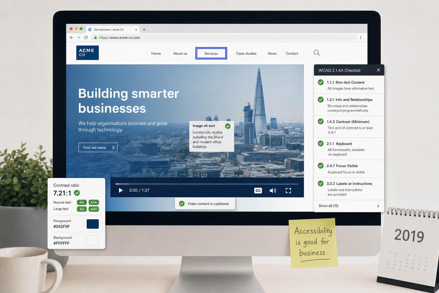
The Web Content Accessibility Guidelines, commonly known as WCAG, provide a recognised framework for improving accessibility. WCAG 2.1 is current guidance and is built around four principles: content should be perceivable, operable, understandable and robust. In plain English, people need to be able to find the information, use the controls, understand what to do and rely on the website working with different browsers and assistive technologies.
Make content easy to see and hear
Text should have sufficient contrast against its background. Pale grey text on a white background may look subtle in a design mock-up, but it can be difficult to read on many screens. The same applies to buttons, form labels and navigation items. Colour should not be the only way to communicate meaning. For example, if an error message only highlights a field in red, some users may not understand what has happened. A clear written message should explain the problem.
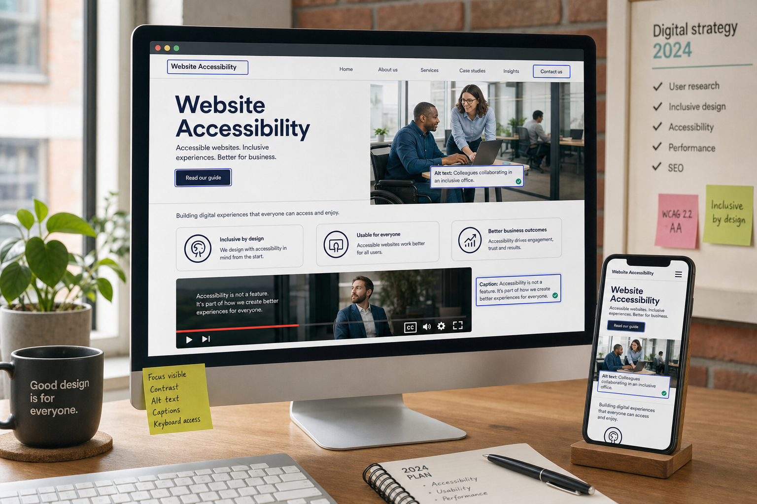
Images that carry meaning should have appropriate alternative text. If an image is purely decorative, it does not need a lengthy description. If it shows a product, a location, a chart or an important concept, the alternative text should explain what the image communicates. This helps screen reader users and can also improve the quality of image-related content for search engines.
Video content should be considered carefully. Captions help deaf and hard-of-hearing users, but they are also useful for people watching without sound on social media or in a busy environment. If a video includes important visual information that is not explained in the audio, supporting text on the page can help.
Make the website usable without a mouse
Many people navigate websites using a keyboard, switch device or other assistive technology. A website should allow users to move through menus, links, buttons and forms in a logical order. It should be clear where the focus is on the page, so users know which link or field is currently selected.
Drop-down menus, sliders, pop-ups and complex interactive features need particular care. If they cannot be opened, closed or controlled without a mouse, they may block people from using the site. This is one reason why simple, well-structured design is often more effective than overly elaborate effects.
Use clear language and helpful structure
Accessible design is not only about code. Content should be written in a way that helps people scan and understand it. Short paragraphs, descriptive headings and plain calls to action are good for all visitors. A heading such as Book a consultation is more useful than vague wording such as Get started when the visitor needs to know what will happen next.
Links should make sense out of context where possible. Instead of several links saying click here, use descriptive wording such as read our website design services or download the accessibility checklist. This helps screen reader users who may navigate by link lists, and it also improves general usability.
Practical website design improvements to consider
If you are planning a new website in 2019, accessibility should be discussed at the beginning of the project rather than added at the end. Retrofitting accessibility after launch can be more difficult, especially if the visual design, content management system or page templates create avoidable barriers.
Start with navigation. Main menu labels should be clear and predictable. Visitors should be able to find important pages such as services, contact details, opening hours, delivery information and support content without unnecessary steps. Breadcrumbs, search functions and footer links can also help users move around the site.
Forms deserve close attention because they are often where enquiries and sales happen. Each field should have a visible label, not just placeholder text inside the field. Error messages should explain what needs to be corrected. Required fields should be identified clearly. Where possible, avoid asking for unnecessary information; a shorter form is usually easier for everyone to complete.
Responsive design is also important. Mobile browsing is a normal part of customer behaviour, and search engines increasingly assess sites with mobile use in mind. Buttons need to be large enough to tap accurately, text should not require pinching and zooming, and forms should be manageable on smaller screens. Accessibility and mobile usability often overlap because both depend on clarity, flexibility and sensible layout.
Page speed should not be ignored. Large images, unnecessary scripts and heavy design effects can slow down a website, particularly on mobile connections. A faster website is usually easier to use and more efficient for search marketing. Compress images, avoid excessive animation and keep templates lean where possible.
Accessibility and SEO work well together
Accessible web design supports many of the foundations of search engine optimisation. A well-structured website gives both users and search engines a clearer understanding of content. Meaningful title tags, relevant headings and properly marked-up pages can improve the way pages are crawled and presented in search results.
Alternative text for images should be written for people first. It should describe the image accurately rather than being stuffed with keywords. For example, an accountancy firm might use alternative text such as business owner reviewing quarterly accounts with an adviser rather than a repetitive phrase designed only for search. Search engines are becoming better at recognising quality and relevance, so natural, useful descriptions are the right approach.
Local SEO can also benefit from accessible thinking. Make sure your business name, address, telephone number and opening hours are easy to find as text on the site, not hidden only inside an image. If you serve particular towns, counties or regions, explain this clearly in your content. A visitor using assistive technology should be able to understand where you operate and how to contact you without difficulty.
Content marketing should be structured with readers in mind. Blog posts, guides and service pages should use headings that reflect real questions customers ask. For example, a home improvement company might publish guidance explaining planning permission considerations, while a financial adviser might provide clear information about initial consultations. Helpful, accessible content builds confidence and gives search engines more context about your expertise.
Social media accessibility should not be overlooked
For many businesses, the first contact with a customer happens on social media rather than the website. Accessibility should therefore extend to social posts, adverts, videos and profile information. This is especially important when social media activity is used to drive traffic to landing pages or generate enquiries.
When posting images on platforms such as Twitter, Facebook, Instagram and LinkedIn, consider whether the image needs a description. Some platforms provide options for adding alternative text, and it is good practice to use them when the image carries important meaning. If text is placed inside an image, repeat the key message in the post copy so it is not lost.
Hashtags are easier to read when each word starts with a capital letter, such as #AccessibleWebDesign rather than #accessiblewebdesign. This helps screen readers interpret the words more clearly and also improves readability for everyone. Avoid overloading posts with long strings of hashtags, as they can become difficult to understand.
Video captions are increasingly important because many people watch social videos without sound. Captions can improve engagement as well as accessibility. Keep captions accurate and easy to read, and avoid placing important text where platform controls may cover it on mobile screens.
Domain names, branding and accessible customer journeys
Accessibility begins even before someone lands on your website. A clear, memorable domain name can make it easier for customers to type, share and recognise your web address. When choosing a domain, aim for wording that is simple to spell, easy to say aloud and closely connected to your business name or service.
Avoid unnecessary hyphens, confusing abbreviations and unusual spellings where possible. If people hear your domain on the phone, at an event or in a radio advert, they should be able to understand it without repeated explanation. This is particularly important for local businesses that rely on word of mouth and offline marketing as well as search.
Think carefully about email addresses connected to your domain too. A professional, readable email address supports trust and reduces errors when customers make contact. The same applies to printed materials, signage, vehicle graphics and social media profiles. Consistent naming across channels helps customers recognise your brand and reduces friction in the journey from discovery to enquiry.
Technical basics also matter. Your domain should point reliably to the correct website, use secure HTTPS and avoid confusing duplicate versions where possible. If visitors see browser security warnings or land on broken pages, confidence is quickly lost. These details may sit behind the scenes, but they affect accessibility, trust and marketing performance.
How to review your current website
A useful accessibility review combines automated checks with human judgement. Automated tools can highlight issues such as missing alternative text, contrast problems and form label errors, but they cannot tell you whether content is genuinely clear or whether a customer journey makes sense. Manual testing is essential.
Try navigating key pages using only a keyboard. Can you see where you are on the page? Can you open menus, follow links, complete forms and close pop-ups? Increase the browser zoom and check whether content remains readable and usable. View the site on a mobile phone in different lighting conditions. Read important pages aloud and ask whether the wording is clear.
It is also helpful to review real user journeys. For example, if your main goal is to generate service enquiries, test the route from a search result or social media post through to the contact form. If your website supports bookings, test the booking process from start to finish. If your site provides technical information, check whether downloads and documents are accessible and clearly labelled.
Keep a prioritised list of improvements. Some changes, such as rewriting link text or improving colour contrast, may be relatively straightforward. Others, such as rebuilding a complex form or changing a template, may need development time. The important point is to make steady progress rather than treating accessibility as a one-off tick-box exercise.
Building accessibility into your digital strategy
Accessible web design works best when it is part of a wider digital strategy. Designers, developers, copywriters, SEO specialists and social media managers all influence accessibility in different ways. A visually attractive website can still be difficult to use if the content is unclear. A technically sound site can still fail if social campaigns send people to confusing landing pages.
When commissioning a website, ask how accessibility will be considered during design, development, content creation and testing. Discuss colour contrast, navigation, forms, keyboard use, alternative text, captions and mobile usability early. If your business uses a content management system, make sure the team responsible for updates understands how to add headings, links and images properly.
Accessibility should also be part of ongoing marketing. New blog posts, campaign pages, downloadable guides and social graphics can introduce fresh barriers if they are rushed. A simple internal checklist can help maintain standards. Before publishing, ask whether the content is readable, whether images have suitable descriptions, whether links are clear and whether the next step is obvious.
A better web experience for every customer
The value of accessible web design is that it improves the experience for a wider audience while supporting business goals. It can help more people find your information, understand your services, trust your brand and complete important actions. It also encourages better discipline in design, content and digital marketing.
For UK business owners, accessibility should not be viewed as an obstacle to creativity. It is a framework for making digital communication clearer, fairer and more effective. A well-designed accessible website can still look distinctive, reflect your brand and support ambitious marketing plans. The difference is that it removes unnecessary barriers along the way.
As website design, search marketing and social media continue to shape how customers choose businesses, accessibility is moving up the priority list for good reason. The businesses that take it seriously now are likely to create stronger, more resilient digital experiences for everyone who visits them online.