For a service business, a website is rarely there simply to look attractive. It should help a potential customer understand what you do, decide whether you are credible, and take the next step with confidence. Good website usability is often the difference between a visitor who leaves after a few seconds and one who telephones, completes an enquiry form, books a consultation or asks for a quotation.
Service businesses often depend on trust before a sale can happen. A solicitor, accountant, builder, consultant, clinic, agency or local tradesperson must make it easy for visitors to find the right information quickly. If your website is confusing, slow, cluttered or difficult to use, people may assume the same about your service. Fortunately, many usability improvements are practical, measurable and achievable without reinventing the whole business.
What website usability means for a service business
Website usability is about how easily a visitor can use your website to complete a task. That task might be finding your telephone number, understanding your services, checking your location, reading your credentials, submitting a form or comparing your business with another supplier.
It is not the same as simply having a modern-looking design. A website can look polished but still fail if the navigation is unclear, the pages are slow to load, the text is hard to read or the calls to action are hidden. Equally, a simple website can perform well if it answers the right questions in the right order.
For a service business, usability should support three commercial objectives:
- Clarity: visitors should quickly understand what you offer and who you help.
- Confidence: the website should provide enough evidence to make your business feel trustworthy.
- Contact: the next step should be obvious, whether that is a call, email, form submission or visit.
When these three areas work together, your website becomes more than an online brochure. It becomes a useful business asset that supports sales, customer service and search marketing.
Make the first few seconds count
Most visitors make an initial judgement very quickly. They want to know whether they have arrived in the right place. Your home page and key landing pages should answer the basic questions without making people work too hard.
A strong opening section should usually explain what the business does, where it operates if location matters, and what action the visitor can take next. For example, a local electrician might lead with emergency and domestic electrical services in Surrey, followed by a telephone number and an enquiry link. A management consultant might lead with a clear statement about improving operational performance for medium-sized organisations, followed by a prompt to arrange an initial conversation.
Avoid opening with vague statements that could apply to any organisation. Phrases such as high-quality solutions, professional service and customer-focused approach are common, but they do not help visitors decide whether you are right for them. Be specific. Say what you do, for whom, and why it matters.
Keep navigation simple and predictable
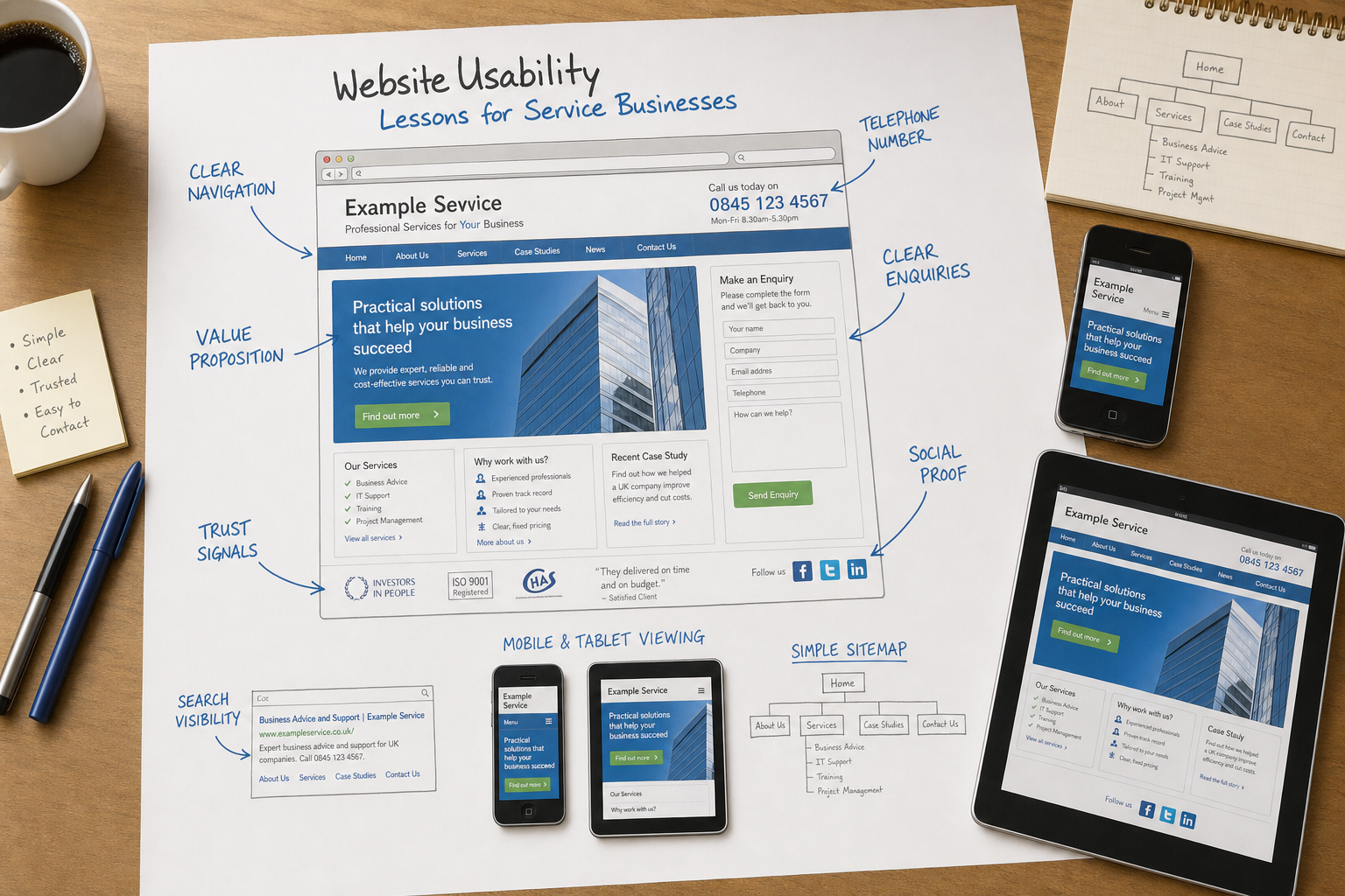
Clear navigation is one of the most important parts of website usability. Visitors should not need to learn how your website works. They should be able to move around it without thinking too much.
For most service businesses, the main navigation can be kept straightforward. Common sections include services, about, case studies or testimonials, sectors, blog or news, contact and perhaps resources. If you offer several services, group them logically and use plain English labels. A visitor should not have to guess what a menu item means.
It is also wise to avoid overloading the top-level navigation. Too many choices can slow people down. If you have a broad service range, use landing pages that introduce each area and then link to more detailed pages. This helps both visitors and search engines understand the structure of the website.
Good navigation should also include links within the page content. If someone is reading about bookkeeping, it may be helpful to link to payroll support, tax returns or a contact page. Internal links guide visitors naturally and can help search engines discover and understand related pages.
Write for customers, not for internal teams
Many service websites are written from the organisation’s point of view rather than the customer’s. They describe departments, accreditations and processes before explaining the customer benefit. While those details can be useful, they need to be presented in a way that answers the visitor’s questions.
Think about what a potential customer wants to know at each stage. They may be asking:
- Can this business solve my problem?
- Does it work with people or organisations like mine?
- Is it local, national or specialist?
- What happens if I get in touch?
- Why should I trust it?
Use headings, short paragraphs and bullet points to make information easy to scan. Long, dense blocks of text are tiring on screen. Clear headings also help visitors jump to the section they need, particularly on service pages where people may be comparing several providers.
Search marketing should be considered, but not at the expense of readability. It is sensible to include the phrases your customers use when searching, such as accountant for small businesses, commercial cleaning in Manchester or HR consultancy for employers. However, forcing the same keyword into every line makes the page awkward and may reduce trust. Useful, well-structured content is better for visitors and more sustainable for search visibility.
Design visible and reassuring calls to action
A service website should make it obvious what the visitor can do next. This does not mean every page needs aggressive sales messaging. It means each page should have a suitable next step.
For example, a page about a professional service might invite the visitor to request an initial consultation. A local service page might highlight the telephone number. A detailed article might suggest reading a related guide or contacting the team for advice. The call to action should fit the context.
Contact information should be easy to find. A telephone number in the header is useful for many service businesses, especially where enquiries are urgent or personal. A dedicated contact page should include relevant details such as telephone number, email address, address, opening hours, enquiry form and a map if visits are part of the service.
Forms should be kept as short as possible. Ask for the information you genuinely need at the first stage. If a visitor has to complete a long form before they have spoken to anyone, they may abandon it. A simple form asking for a name, contact details and a brief message is often enough to begin the conversation.
Build trust with evidence, not decoration
Trust is central to service marketing. Visitors cannot touch the service before they enquire, so they look for signals that reduce risk. Website design can help, but trust is built through evidence.
Useful trust signals include professional qualifications, trade memberships, awards, client testimonials, case studies, photographs of the team, clear company information and well-written service descriptions. If you work in a regulated or specialist field, explain your credentials clearly. If you serve a local area, show that connection through location pages, local references and practical contact details.
Testimonials are most useful when they sound specific and genuine. A statement that says excellent service is less helpful than one explaining what problem was solved and how the customer benefited. If confidentiality matters, describe the type of customer or sector rather than inventing details.
Design should support trust by being consistent. Mismatched fonts, poor spacing, broken images and outdated pages can make a business look careless. Visitors may not consciously notice every design issue, but the overall impression affects whether they feel comfortable making contact.
Consider mobile and tablet visitors
More people are using smartphones and tablets to browse, compare suppliers and look up contact details. A service business should not assume visitors are sitting at a desk with a large screen. Someone may be searching for a plumber from a mobile phone, checking a consultant’s details before a meeting, or reading a solicitor’s page on a tablet in the evening.
Mobile usability does not need to be complicated, but it does need attention. Important details such as telephone numbers, addresses and enquiry links should be easy to find. Text should be readable without constant zooming. Buttons and links should be large enough to tap accurately. Pages should not depend on technology that performs poorly or is unsupported on many mobile devices.
Responsive design is becoming an increasingly sensible approach for many new websites, allowing the layout to adapt to different screen sizes. For some businesses, a separate mobile version may also be considered. The right choice depends on the website, the audience and the budget, but the principle is the same: visitors should be able to use the website comfortably on the device they have chosen.
Pay attention to speed and technical reliability
A slow website creates frustration and can cost enquiries. Visitors are unlikely to wait patiently if a competitor’s website loads more quickly and provides the same information. Search engines also want to send users to pages that offer a good experience, so technical performance supports both usability and search marketing.
Common causes of slow pages include oversized images, unnecessary scripts, heavy visual effects and poor hosting arrangements. Images should be prepared properly for the web rather than uploaded straight from a camera. Features should be chosen because they help the visitor, not because they look impressive in a design presentation.
Reliability also matters. Broken links, missing pages, forms that do not submit and error messages all damage confidence. Regular checks should be part of website maintenance. If your website is built on a content management system, keep a sensible update and backup routine in place, and make sure responsibility for maintenance is clear.
Use domain names and email addresses professionally
Your domain name is part of your brand. It appears on business cards, vehicles, email signatures, search results and printed marketing. A professional domain helps people remember you and reinforces credibility.
When choosing a domain, keep it as clear and simple as possible. A short, memorable name is usually better than a long phrase filled with hyphens. If your business serves the UK, a UK-focused domain can be appropriate, while a broader domain may suit organisations with wider ambitions. It is often sensible to secure closely related versions where appropriate, particularly to protect a trading name, but avoid collecting unnecessary domains without a plan.
Choose a domain that is easy to say over the telephone and unlikely to be misspelt. Be careful with numbers, unusual abbreviations and words that can be spelt in more than one way. Before committing to a name, consider how it will look in an email address and whether it supports the brand you want to build.
Professional email addresses using your own domain are also important. They look more credible than relying solely on a free webmail address, particularly for businesses selling professional advice or higher-value services.
Connect usability with search marketing
Website usability and search engine optimisation should not be treated as separate disciplines. A page that is helpful, well structured and easy to use is more likely to satisfy visitors arriving from search. If visitors quickly leave because they cannot find what they need, the page is not doing its job even if it ranks well.
Search engines are placing increasing emphasis on quality. Thin pages, duplicated content and artificial link building are risky strategies. Service businesses should focus on clear service pages, useful advice articles, local relevance where appropriate and natural mentions from reputable websites.
A practical search approach might include separate pages for core services, useful articles answering common customer questions, location information for local services, and clear page titles that reflect how people search. Each page should have a purpose. Avoid creating large numbers of near-identical pages simply to target small keyword variations.
Analytics should be used to understand behaviour. Look at which pages attract visitors, which pages lead to enquiries, and where people leave. This information can reveal usability problems. For example, if many visitors reach the contact page but few submit the form, the form may be too long, unclear or technically faulty.
Make social media support the website
Social media can help service businesses stay visible, share expertise and bring people back to useful website content. Platforms such as Facebook, Twitter, LinkedIn, YouTube and Google+ can all have a role, depending on the audience. The aim should not be to be everywhere, but to use the right channels consistently and professionally.
Your website should make it easy for visitors to find your active social profiles, but social links should not distract from enquiries. If the goal of a service page is for someone to contact you, do not make the social media icons more prominent than the telephone number or enquiry form.
Publishing helpful articles on your website and sharing them through social channels is often more valuable than posting only promotional messages. For example, an accountant might publish a guide to preparing records for year end, while a building firm might share advice on planning a refurbishment. The website remains the home for the detailed content, while social media helps distribute it and encourages conversation.
Test with real people and keep improving
Usability is best judged by watching how people actually use a website. Internal teams often know too much about the business to see the problems. A menu label that makes sense to staff may mean very little to a new visitor.
Ask a few people who are not involved in the project to complete simple tasks. Can they find a specific service? Can they locate the telephone number? Can they explain what the business does after viewing the home page? Can they submit a test enquiry without confusion? Their feedback can be more valuable than lengthy debate around personal design preferences.
Improvement should be ongoing. Review enquiry quality, search traffic, form submissions, bounce rates and common customer questions. If people keep asking the same thing by telephone, the answer may need to be clearer on the website. If an important service receives little traffic, it may need better navigation, stronger content or improved search optimisation.
A usable website is a stronger business tool
Good website usability is not a luxury reserved for large organisations. It is a practical requirement for any service business that wants its website to generate trust and enquiries. Clear navigation, useful content, visible contact options, credible evidence, mobile consideration and reliable technology all contribute to better performance.
The most effective websites are designed around the needs of the visitor and the goals of the business. They make it easy for people to understand, evaluate and act. For UK service businesses investing in website design, SEO, branding or digital strategy, usability should be discussed from the beginning of the project rather than added at the end.
A website that is easy to use respects the visitor’s time. It presents the business clearly, answers sensible questions and removes unnecessary obstacles. In a competitive service market, that can be the difference between being considered and being contacted.