More UK customers are using smartphones and tablets to find local services, compare products, read reviews and contact businesses before they ever sit down at a desktop computer. For many organisations, a mobile-friendly website is no longer a technical extra; it is part of the first impression a customer receives. If your website is difficult to read, slow to load or awkward to use on a small screen, visitors may leave before they understand what you offer.
This shift affects businesses of every size. A restaurant may lose a booking because its menu is unreadable on a phone. A tradesperson may miss an enquiry because the telephone number is hidden within a large desktop layout. A professional services firm may appear less credible if its website requires pinching, zooming and sideways scrolling. At the start of 2014, website design needs to consider the way people browse across phones, tablets, laptops and office computers, often moving between several of them before making a decision.
Why mobile use is now a business issue
Mobile browsing has moved well beyond occasional convenience. Customers use their phones while travelling, during lunch breaks, in shops, at events and at home while watching television. This behaviour changes what they expect from a business website. They want fast access to essential information, clear navigation and simple ways to take the next step.
For a UK business owner, the commercial value is straightforward. A mobile-friendly website can help more visitors become enquiries, bookings, calls, subscribers or customers. It reduces friction. It also supports wider marketing activity, because people arriving from search engines, email campaigns and social media posts are increasingly likely to be using a mobile device.
Mobile visitors often have immediate intent. Someone searching for an emergency plumber, a nearby café, a solicitor’s phone number or a showroom address may be ready to act quickly. If the website works well on a phone, the business has a better chance of receiving that call or visit. If it does not, a competitor is only a search result away.
What makes a mobile-friendly website effective
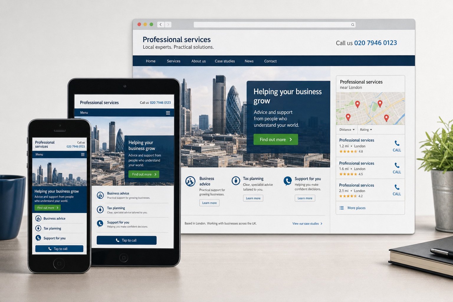
A mobile-friendly website is not simply a smaller version of a desktop site. It is a website designed so that content, navigation and calls to action work comfortably on smaller screens and touch interfaces. The aim is to help users complete common tasks without frustration.
Readable content without constant zooming
Text should be large enough to read on a smartphone, and line lengths should suit narrower screens. Long, dense blocks of copy are difficult to use on mobile, so pages should be structured with clear headings, short paragraphs and obvious signposts. This also helps desktop visitors scan information more easily.
Navigation built for fingers, not mouse pointers
Desktop menus can become awkward on a phone, particularly if they rely on small links or hover effects. Mobile navigation should use clear labels, sensible grouping and touch-friendly spacing. Visitors should not need to hunt for the information most important to them, such as services, opening times, locations, contact details or booking options.
Fast loading on mobile connections
Not every customer is browsing on a fast Wi-Fi connection. Many will use 3G, and some will have an inconsistent signal. Oversized images, unnecessary scripts and heavy visual effects can slow pages down. An effective mobile design should use optimised images, efficient coding and sensible page structure so visitors are not left waiting.
Clear calls to action
On mobile, the next step should be obvious. A telephone number should be easy to find and, where appropriate, formatted so users can tap to call. Contact forms should be simple, with only the fields genuinely needed. Addresses should be clearly displayed for businesses that rely on local footfall. For e-commerce websites, the basket and checkout process should be as straightforward as possible on smaller screens.
Responsive design, mobile sites and practical choices
One of the most common questions for business owners is whether to build a responsive website or a separate mobile version. Responsive web design uses flexible layouts, images and style rules so that the same website adapts to different screen sizes. This approach is increasingly popular because it keeps content in one place and can provide a consistent brand experience across devices.
A separate mobile website can still be appropriate in some situations, particularly where an organisation needs a very specific mobile experience. However, it can create extra work because content, technical maintenance and search considerations may need to be managed across more than one version. Poorly configured mobile redirects can also frustrate users if they are sent to an irrelevant mobile page rather than the content they selected.
For many small and medium-sized UK businesses commissioning a new website in 2014, responsive design is a strong option. It allows the website to serve desktop, tablet and smartphone users with one content strategy. The important point is not to adopt a fashionable technique for its own sake, but to choose an approach that fits the business, its customers and its marketing goals.
Search visibility and mobile experience
Search marketing is closely linked to user experience. Search engines want to send people to pages that answer their queries and work well on the device being used. If mobile visitors quickly return to search results because a page is slow, broken or difficult to use, that is not a good signal for the usefulness of the page.
A mobile-friendly website supports search engine optimisation by making key content accessible and usable. Important text should not be hidden in images. Pages should have clear titles, relevant headings and useful copy that explains products, services and locations. Local businesses should ensure contact details are consistent across the website and other online listings. This helps customers and search engines understand where the business operates.
Technical care also matters. Avoid smartphone-only errors such as sending every mobile visitor to the homepage rather than the page they requested. Do not rely on Flash for important content or navigation, as many mobile devices will not display it. Keep page addresses stable where possible, and use clean internal linking so search engines can crawl the site efficiently.
Mobile friendliness is not a replacement for good SEO. A website still needs relevant content, trustworthy signals, clear structure and ongoing attention. However, as mobile browsing grows, ignoring the mobile experience can weaken the return from search marketing, particularly for businesses that depend on local searches and quick enquiries.
How social media increases the need for mobile-ready pages
Social media marketing makes mobile website design even more important. Many people check Facebook, Twitter, LinkedIn, Google+ and image-led platforms from their phones. If a business shares a blog post, promotion, event announcement or product page, a large proportion of clicks may come from mobile users.
This means the landing page must match the promise of the social post. If a user taps from a tweet to read an article, the article should load quickly and be easy to read. If a Facebook update promotes a seasonal offer, the relevant details should be visible without a long search. If a LinkedIn post invites professional enquiries, the contact route should feel credible and simple.
Social media can generate attention, but the website often has to convert that attention into action. A poor mobile experience wastes the effort spent building audiences, writing updates and encouraging engagement. A mobile-friendly website gives campaigns a stronger foundation because visitors can act at the moment their interest is highest.
Branding, trust and customer perception
Website design is not only about appearance. It communicates how organised, reliable and customer-focused a business is. When a site looks broken on a phone, visitors may assume the business is out of date or inattentive, even if the actual service is excellent.
Good mobile design should preserve the core brand: colours, typography, tone of voice, imagery and message. It should also prioritise clarity. On a smaller screen, excessive decoration can get in the way. Strong branding on mobile is often about confidence and restraint: a recognisable identity, a clear offer, relevant content and easy routes to contact.
For businesses planning a redesign, mobile should be included from the start rather than added at the end. Design mock-ups should consider different screen sizes, and content should be reviewed for usefulness. The question should be: what does a customer need from this page when viewing it on a phone, and how can we make that action easier?
Domain names and mobile marketing foundations
A mobile-friendly website still needs strong digital foundations, and the domain name is one of the most important. A good domain should be easy to say, easy to spell and suitable for print, email signatures, social profiles and word-of-mouth recommendations. This matters even more on mobile, where typing long or confusing addresses is inconvenient.
Where possible, choose a domain that reflects the business name or a clear brand. Keep it concise and avoid unnecessary hyphens, unusual spellings or strings of keywords that look unprofessional. For UK businesses, a UK-focused domain can help signal relevance to local customers, while some organisations may also secure other appropriate variations to protect their brand.
Before registering a domain, check that it does not conflict with another organisation’s name or trade mark. Also consider whether matching social media handles are available, as consistent naming across the website and social channels helps customers recognise the business. Domain registration should be treated as part of brand planning, not just a technical task.
Practical steps for improving an existing website
If you already have a website, you do not have to guess whether it works for mobile visitors. Start by testing it on a range of real devices if possible, including smartphones and tablets. Look at the homepage, service pages, contact page, enquiry forms and any pages used in advertising or social campaigns.
- Check readability: Can visitors read the text without zooming or rotating the device?
- Review navigation: Are menu items clear, large enough and easy to tap?
- Test key actions: Can users call, email, request a quote, book or buy without unnecessary steps?
- Assess speed: Do pages load acceptably on a mobile connection?
- Look for broken features: Are slideshows, forms, maps and embedded content working properly?
- Review content priorities: Is the most useful information visible early on the page?
Analytics can also help. Review how many visitors arrive from mobile devices and what they do after arriving. If mobile users leave quickly, fail to complete forms or rarely progress beyond the first page, the website may be creating barriers. The figures should be interpreted carefully, but they can highlight pages that deserve attention.
For some businesses, targeted improvements may be enough: simplifying a contact page, reducing image sizes, making phone numbers prominent or adjusting page templates. For others, a full redesign may be the better investment, particularly if the existing website is old, difficult to update or based on technology that does not suit current browsing habits.
Planning a website that supports future marketing
A mobile-friendly website should be built as part of a broader digital marketing plan. Search engine optimisation, social media marketing, email campaigns, content creation and offline promotion all lead people back to the website. If the site cannot serve visitors well on the devices they use, the rest of the marketing activity becomes less efficient.
When planning a new website, define the main business objectives first. Do you want more telephone enquiries, online bookings, brochure downloads, newsletter sign-ups, e-commerce sales or visits to a physical location? The design, content and technical structure should all support those objectives across desktop and mobile.
It is also sensible to plan for ongoing improvement. Customer behaviour will continue to change, and a website should not be treated as a one-off project that is ignored after launch. Regular reviews of content, search performance, usability and conversion paths will help keep the site useful and commercially effective.
A clear opportunity for UK businesses
The move towards mobile browsing is not just a challenge; it is an opportunity. Many customers are actively looking for businesses while they are ready to call, visit, book or buy. A mobile-friendly website helps remove the obstacles between interest and action.
For UK business owners, the practical message is simple. If your website is difficult to use on a smartphone or tablet, it may be costing you enquiries and weakening your marketing. By investing in clear design, useful content, sound technology and a mobile-aware digital strategy, you can create a website that works harder for your business and gives customers a better experience from their first visit.