Mobile browsing is no longer a novelty reserved for a small group of early adopters. More customers are using smartphones and tablets to search, compare, read reviews, follow social links and contact businesses while they are away from a desk. For UK business owners, this means the mobile visitor experience now has a direct influence on enquiries, sales, reputation and search visibility.
A website that looks polished on a desktop computer can still feel awkward on a small screen. Tiny links, slow-loading images, forms that are difficult to complete and pages that require constant pinching and zooming all create friction. The result is simple: visitors leave, and many of them may not return. Preparing Your Website for More Mobile Visitors is not just a design preference; it is a practical business decision.
Why mobile visitors behave differently
Mobile visitors often arrive with a specific task in mind. They may want your phone number, directions, opening hours, a quick product comparison or confirmation that your business can help them. They may be on a train, in a shop, between meetings or sitting at home with a tablet while watching television. Their attention is limited, their screen is smaller and their connection may be slower than a typical office broadband line.
This behaviour should shape your website planning. A mobile visitor should not have to work hard to find essential information. If someone searches for a local service, taps through to your website and cannot quickly see what you do, where you operate or how to contact you, the opportunity is easily lost.
The strongest mobile websites respect context. They prioritise the most useful content, make navigation clear and remove unnecessary obstacles. This does not mean stripping away your brand personality or reducing your website to a bare list of links. It means presenting your content in a way that suits the device and the visitor’s likely intention.
Start with responsive website design
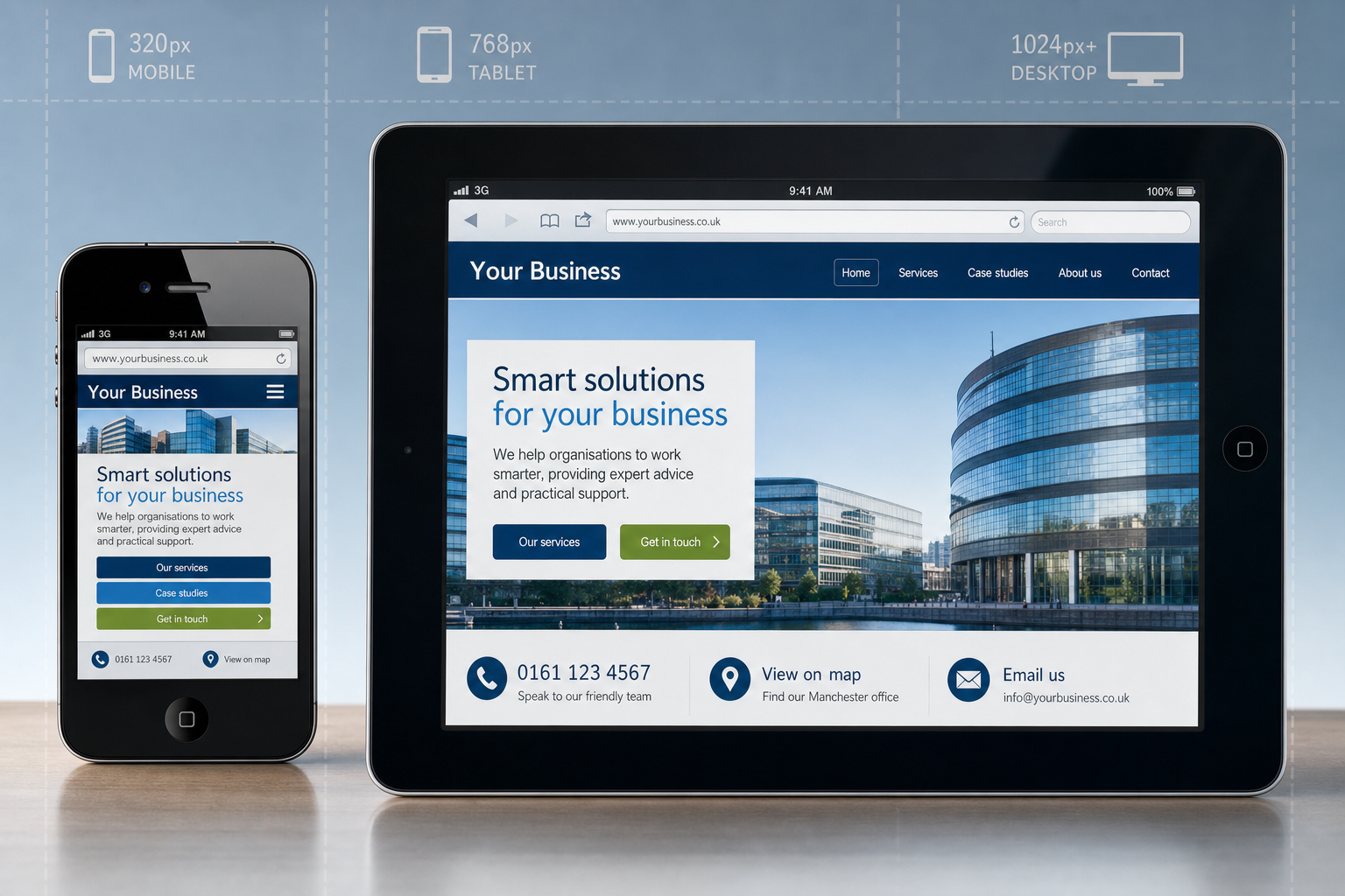
Responsive website design is one of the most practical approaches for businesses planning a new website or improving an existing one. Rather than creating a completely separate mobile site, a responsive design adapts the same website to different screen sizes using flexible layouts, scalable images and style rules. The result is a more consistent experience across desktop computers, tablets and smartphones.
For many businesses, responsive design also keeps the website easier to manage. You can maintain one set of content, one primary web address and one general structure. This can be helpful for search marketing as well as for day-to-day administration, particularly when your team needs to update news, service pages, product information or contact details.
A responsive site should be more than a desktop site squeezed into a narrow column. Good mobile design considers what changes when the screen becomes smaller. Menus may need to collapse into simpler navigation. Image-heavy sections may need to load more carefully. Calls to action may need to move higher on the page. Long rows of features may need to become stacked content that is easy to scroll through.
Make touch interaction comfortable
Mobile visitors use fingers rather than a mouse pointer, so clickable areas need enough space. Links placed too close together can cause accidental taps. Buttons should be large enough to use comfortably, especially for important actions such as calling, submitting an enquiry or adding an item to a basket.
It is also worth reviewing forms carefully. A long enquiry form that works acceptably on a desktop may feel frustrating on a phone. Ask only for the information you genuinely need at the first stage. Use clear labels, simple fields and sensible ordering. If a phone call is often the fastest route to a sale, make the telephone number prominent and consider using a clickable telephone link for compatible devices.
Focus on speed and simplicity
Speed is a major part of the mobile visitor experience. Many users still browse over 3G, public Wi-Fi or patchy rural connections. Even where faster mobile data is available, visitors will not wait patiently for a heavy page to load if a competitor’s site feels quicker and clearer.
Large images are a common cause of slow pages. Product photography, banners and background images should be prepared for the web rather than uploaded directly at full camera size. Scripts, widgets and unnecessary effects can also add weight. A rotating banner or animated feature may look impressive in a meeting, but if it delays access to useful content on a phone, it may be doing more harm than good.
Simple pages are often more effective. Clear headings, concise copy and a logical page structure help both visitors and search engines understand what the page is about. Businesses should review each page and ask: what is the visitor likely to need here, and what action should they take next?
Avoid technology that blocks mobile users
Some older website features cause particular problems on mobile devices. Content dependent on Flash, for example, may not display on many smartphones and tablets. Complex hover menus can also be awkward because touchscreens do not behave like a mouse. If important navigation or content relies on these features, mobile visitors may not be able to use the site properly.
Modern HTML, CSS and carefully chosen JavaScript can support attractive design without creating unnecessary barriers. The aim should be to build a website that feels robust and accessible across the popular phones, tablets and desktop browsers used by your customers.
Put the most useful business information first
Many mobile visits are practical. A potential customer may be checking whether you cover their area, whether you are open, or whether your service is relevant to their problem. This makes information hierarchy especially important.
Consider making the following details easy to find on mobile pages:
- Your main services or product categories, described in plain language.
- Your telephone number and preferred enquiry route.
- Your location, service areas and opening hours where relevant.
- Trust signals, such as accreditations, testimonials or examples of work.
- Clear next steps, such as requesting a quote, booking a consultation or visiting a shop.
For local businesses, directions and contact details deserve particular attention. If a visitor is already nearby and searching from a phone, they should not need to dig through several pages to find your address. A concise contact page with a readable address, map link and telephone number can make a real difference.
Consider mobile search and local visibility
Search marketing and mobile usability are closely connected. Search engines want to send users to pages that answer their query well. If a visitor clicks through from a search result and immediately returns because the page is unreadable or slow, that is not a positive experience.
Businesses should make sure their website can be crawled properly and that mobile visitors can reach the same important content as desktop visitors. If you use a separate mobile version of your site, take care with redirection so smartphone users are sent to the most relevant mobile page rather than simply pushed to a generic homepage. Where separate mobile and desktop URLs are used, appropriate signals should be in place so search engines understand the relationship between them.
For many new builds, a responsive approach avoids some of these complications because the same page address serves different layouts according to screen size. This can simplify sharing, link building and content management. However, responsive design still needs careful implementation: search engines and users both need clear content, sensible headings, descriptive page titles and pages that load efficiently.
Local search deserves particular attention. Ensure your business name, address and telephone details are consistent across your website and reputable online listings. If you serve several towns or regions, explain this naturally within your content rather than creating thin, repetitive pages. A useful location page should help visitors understand whether you can serve them and how they can take the next step.
Remember social media traffic is often mobile
Social media marketing is a significant source of mobile visitors. Many people check Facebook, Twitter, LinkedIn and other social platforms from phones and tablets. If your business shares a blog post, offer, portfolio item or event update, a large share of the audience may tap through on a mobile device.
This means every social campaign should be checked from a mobile point of view. The landing page must load quickly, the headline should match the promise of the social post, and the call to action should be obvious. If you invite users to complete a form, make sure it is comfortable to complete on a small screen. If you want telephone enquiries, place the number where it can be seen and tapped.
Images used in social posts should also be considered alongside the website experience. An attractive image may win the click, but the website must then continue the journey. Consistency in tone, design and message helps visitors feel they have landed in the right place.
Review your domain and brand consistency
Your domain name remains an important part of your digital identity. A good domain is memorable, easy to spell and suitable for use on business cards, signage, email, search results and social media profiles. Mobile use makes simplicity even more important, as visitors may be typing on small touch keyboards or reading your address from printed material while on the move.
When registering a domain, choose something that reflects your brand clearly and avoids unnecessary complexity. Hyphens, unusual spellings and overly long phrases can be harder to remember and more prone to mistakes. For many UK businesses, a relevant UK-focused domain such as a .co.uk address may support customer confidence, while some organisations may also choose to secure other suitable extensions to protect the brand.
Before committing to a domain, check whether the same or a closely matching name is available for your social media profiles. Consistency across your website, email addresses and social accounts makes promotion easier and helps customers recognise you. Avoid building a brand around a domain that may be confused with another business, especially if that business operates in a similar sector.
Test on real devices, not just in the office
A website can look tidy in a designer’s preview and still behave poorly on a real phone. Testing should include a range of screen sizes, browsers and connection conditions. At a minimum, review the website on popular smartphones and tablets as well as desktop computers. Check portrait and landscape orientation, navigation, forms, maps, video, image galleries and any checkout or booking process.
It is also useful to test common journeys rather than individual pages in isolation. For example, imagine a visitor has searched for one of your services, arrived on a service page, read a brief description and wants to contact you. Can they complete that journey easily? Or imagine someone has clicked a link from a social post to a blog article and now wants to learn more about your company. Is the next step clear?
Ask people outside the project team to try the website as well. They are less familiar with the structure and more likely to notice confusing labels, hidden information or awkward interactions. Their feedback can be extremely valuable before a site goes live.
Measure what mobile visitors actually do
Once your website is live, analytics should guide further improvement. Review how much traffic comes from mobile devices, which pages they visit, how long they stay and where they leave. Compare enquiry rates from desktop and mobile visitors. If mobile traffic is increasing but conversions are weak, that may indicate a usability problem rather than a lack of demand.
Look for patterns. A high exit rate on a contact page might suggest the form is too long or the telephone number is hard to find. Poor performance on a product category page might suggest the content is difficult to browse. Strong mobile traffic from social media but few enquiries may suggest the landing page does not match the social message.
Measurement should not be a one-off exercise. Devices, user expectations and marketing activity continue to change, so the website should be reviewed regularly. Small improvements to page speed, wording, forms and calls to action can add up to a more effective digital presence.
Make mobile part of your wider digital strategy
Preparing for more mobile visitors is not just a technical task for a web developer. It touches design, content, branding, search marketing, social media and customer service. A business that treats mobile as a central part of its digital strategy will be better placed to convert visitors wherever they find the website.
Start with the customer. What do they need from you when they are using a phone or tablet? What questions must be answered quickly? What action should be simple to complete? Then make sure your design, content and marketing activity all support that journey.
A strong mobile visitor experience builds confidence. It tells potential customers that your business is professional, attentive and easy to deal with. As more people use mobile devices as their first route to the web, that confidence can be the difference between a missed opportunity and a valuable enquiry.